November 22, 2020 Analysis of USA state data: New hospitalization data
A new data source for hospitalization data has been made available by the US HHS here
The plots shown in this summary can be compared to similar plots that used data from the Covid Tracking Project.
Summary
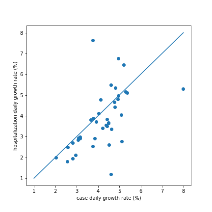
Infection trajectory
For each state, its infection trajectory can be summarized by the observed exponential growth in cases or exponential growth in hospitalization. The plot below compares the current inferred growth rate (in % per day) for each state measured in these two ways. For many states the hospitalization growth (from HHS data) is remarkably close to the case growth.
Fraction hospitalized
To match the hospitalization data with the trajectory estimated from the case data the model parameter for hospitalization fraction is adjusted. The following plot compares the values for that parameter for each state, when using covid tracking project hospitalization data (where available) and when using the HHS data.
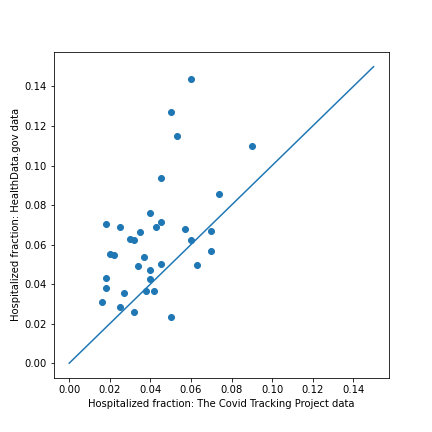
For many states the fraction is significantly larger when using the HHS data. Histograms for the two data samples are shown below.
![]()
Covid tracking project: mean fraction = 0.042
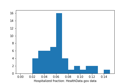
HHS data: mean fraction = 0.064 Overall hospitalization is about 50% larger in the HHS data.
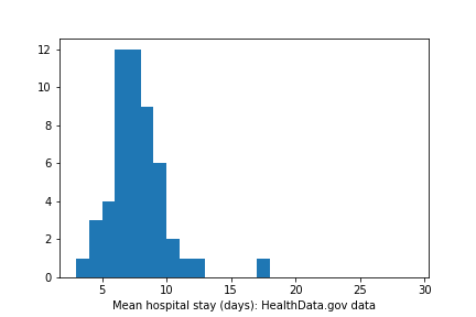
Mean hospital stay (days)
The HHS data has both daily hospitalizations and current hospital occupancy data for every state. Having both, allows one to infer the mean stay for patients.
The Covid Tracking Project provided one or both of these data for many states.
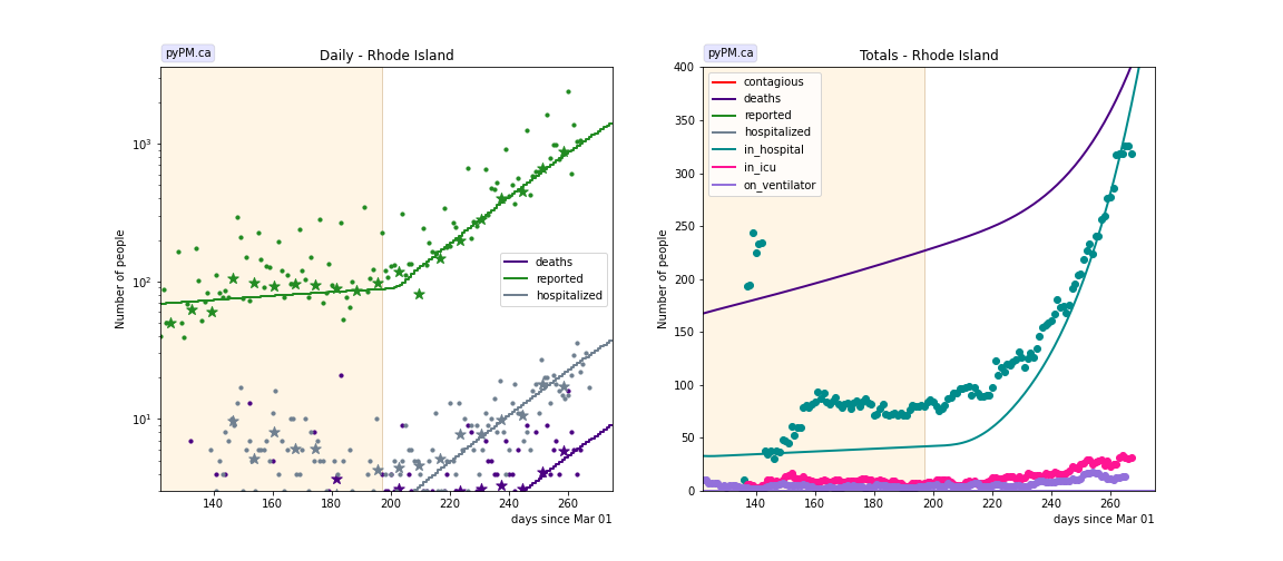
The inferred mean hospital stay time is found to be much more consistent with the HHS data, compared to the Covid Tracking Project data, as shown in the figures below. The only outlier in the HHS data is for the state of Rhode Island.
Inferred from the covid tracking project data:
![]()
Inferred from the US HHS data:
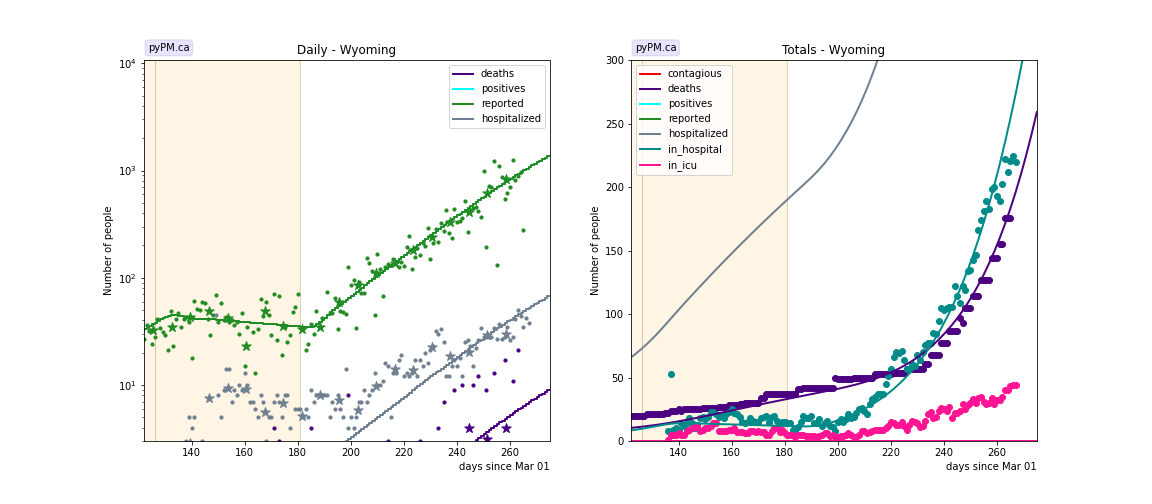
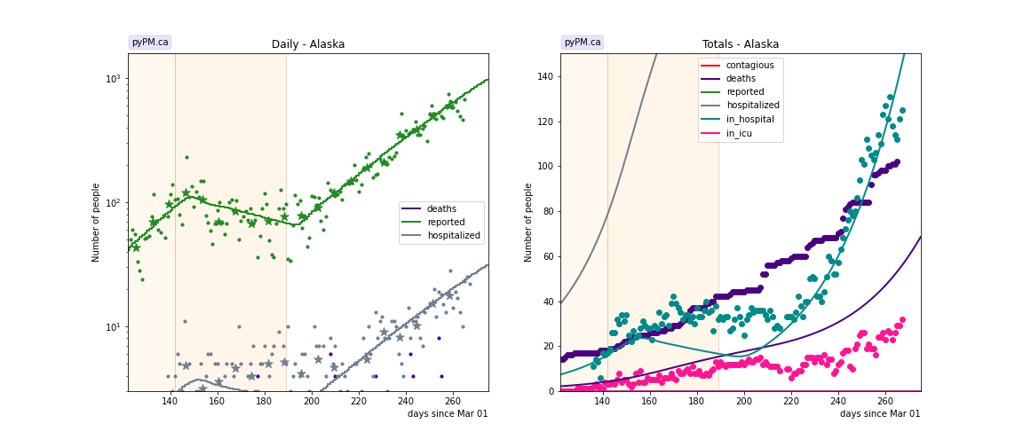
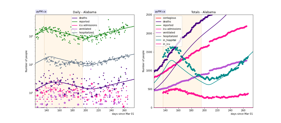
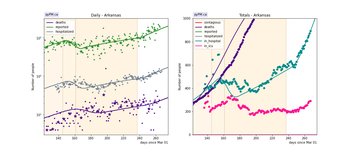
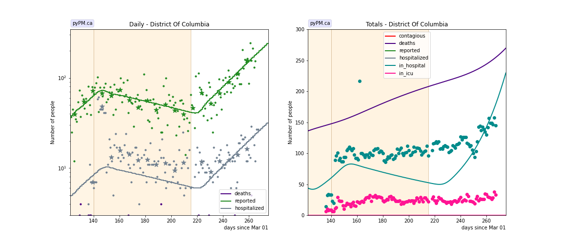
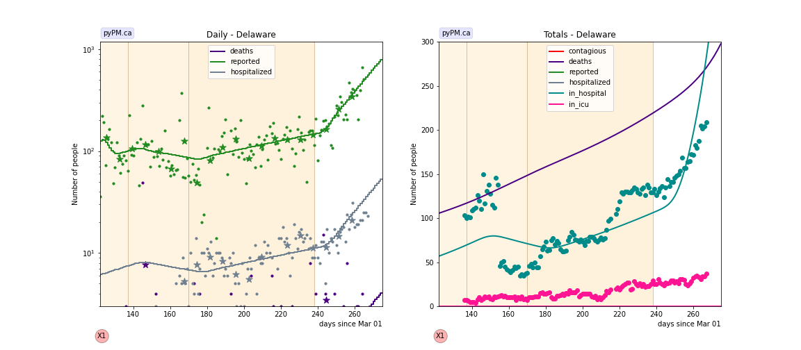
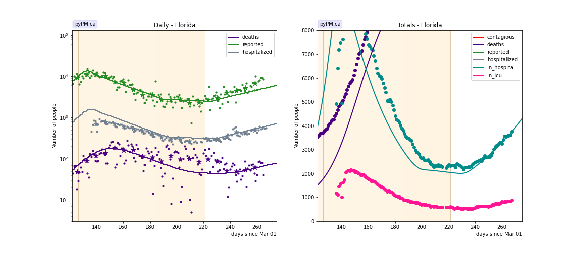
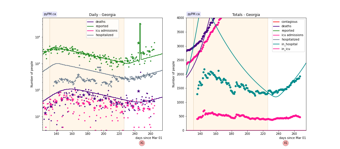
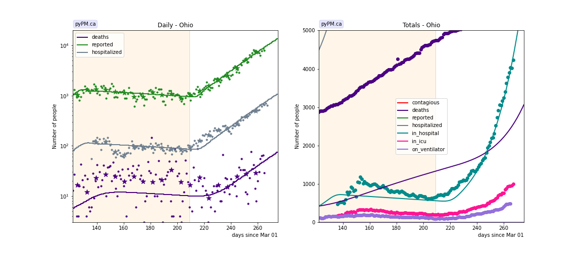
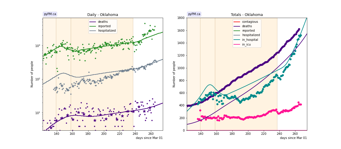
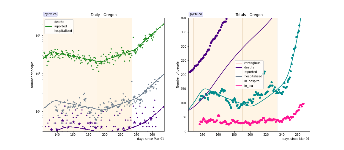
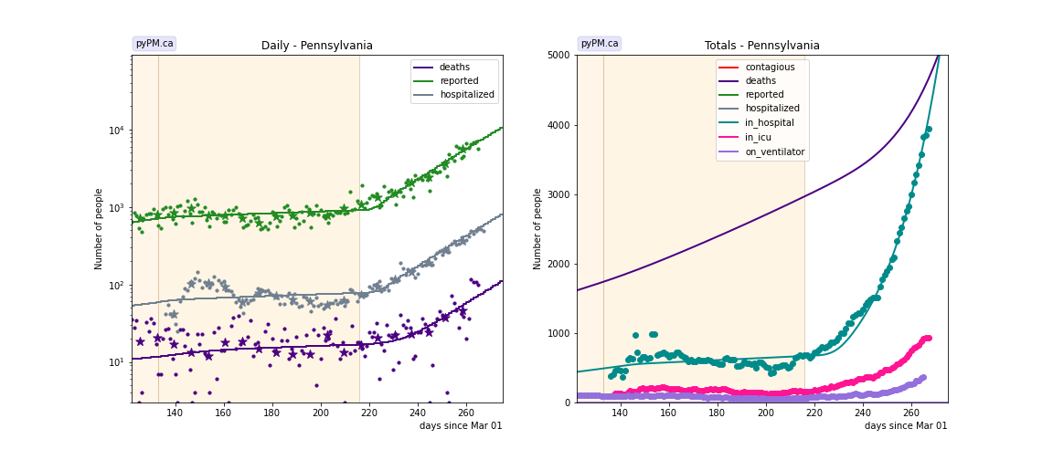
Individual state fits
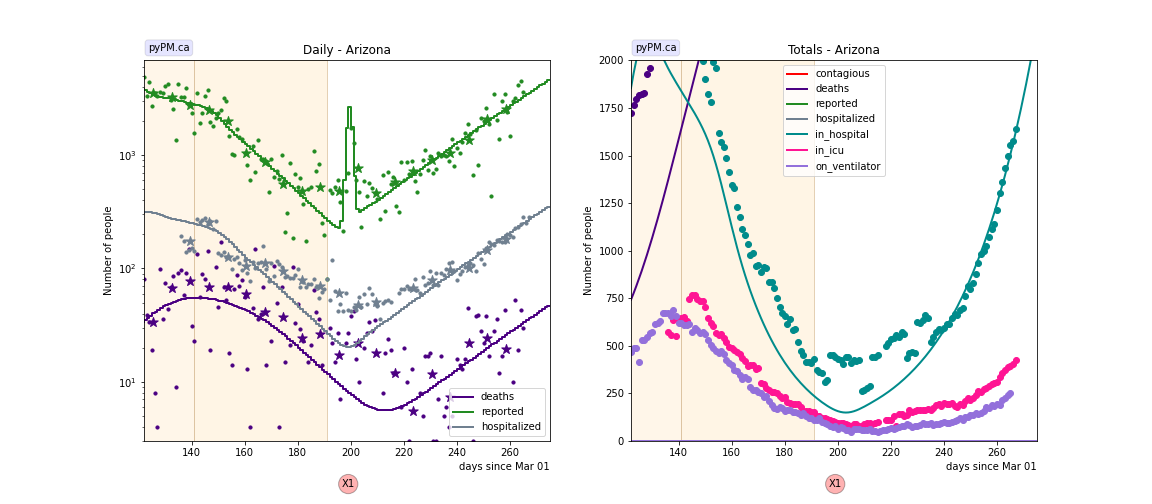
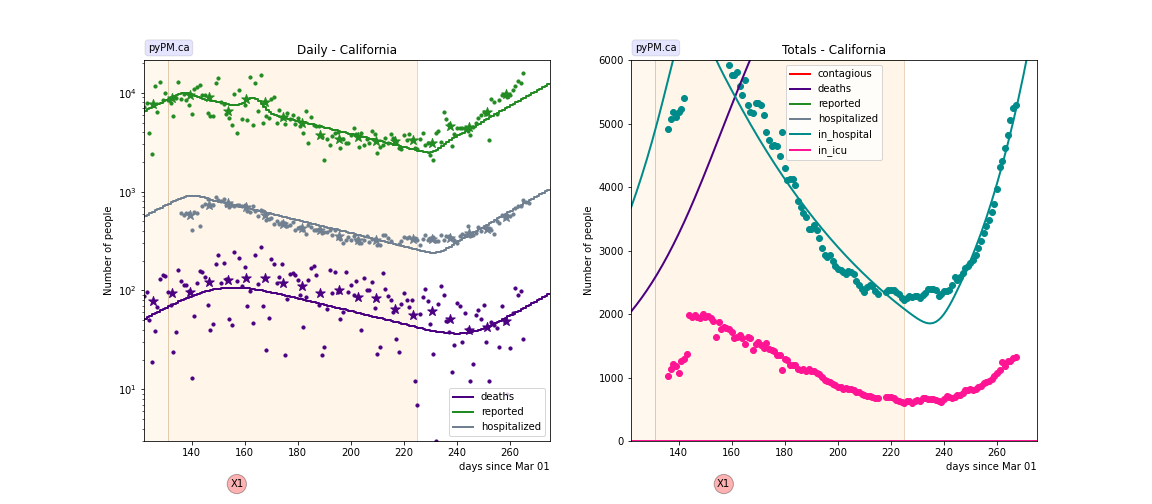
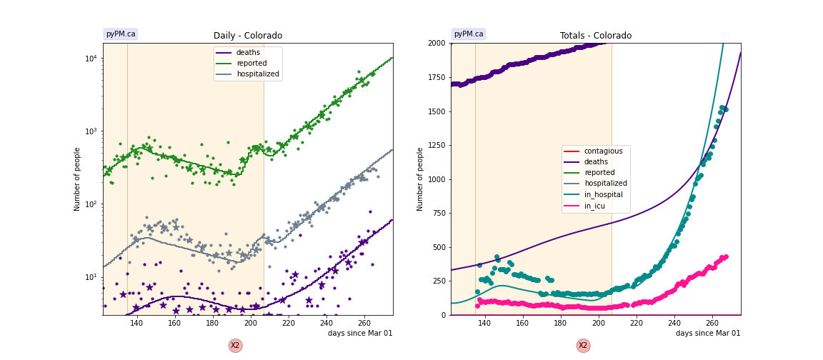
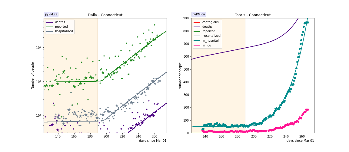
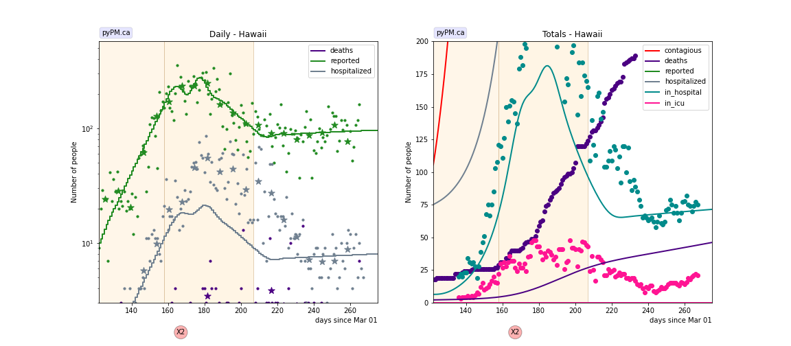
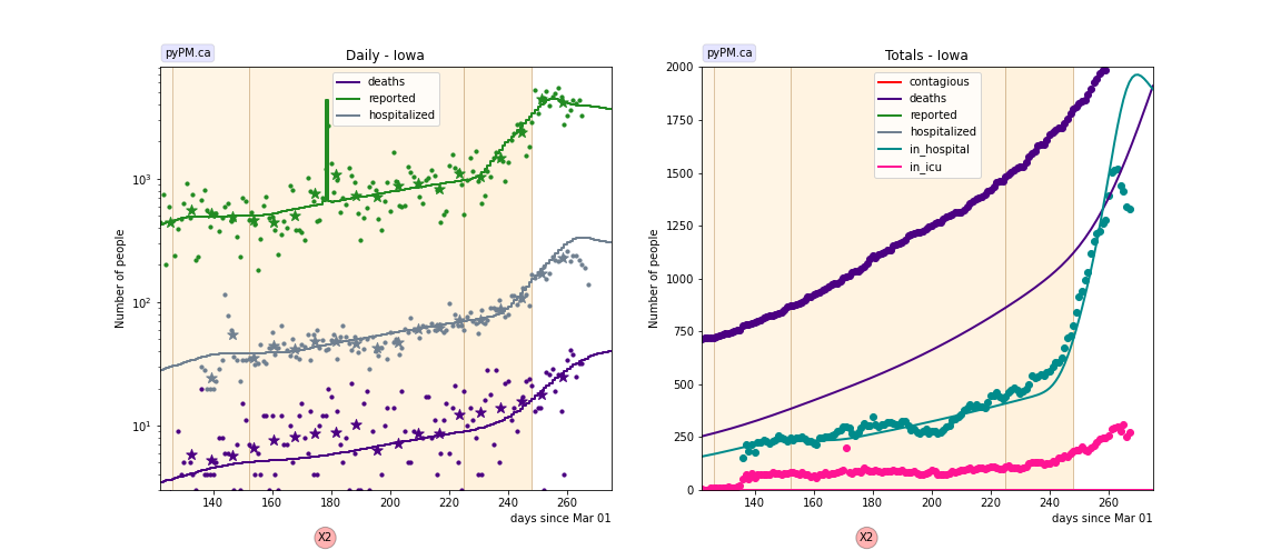
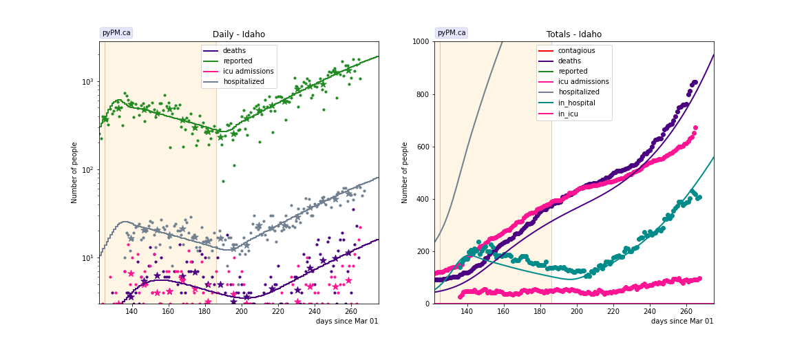
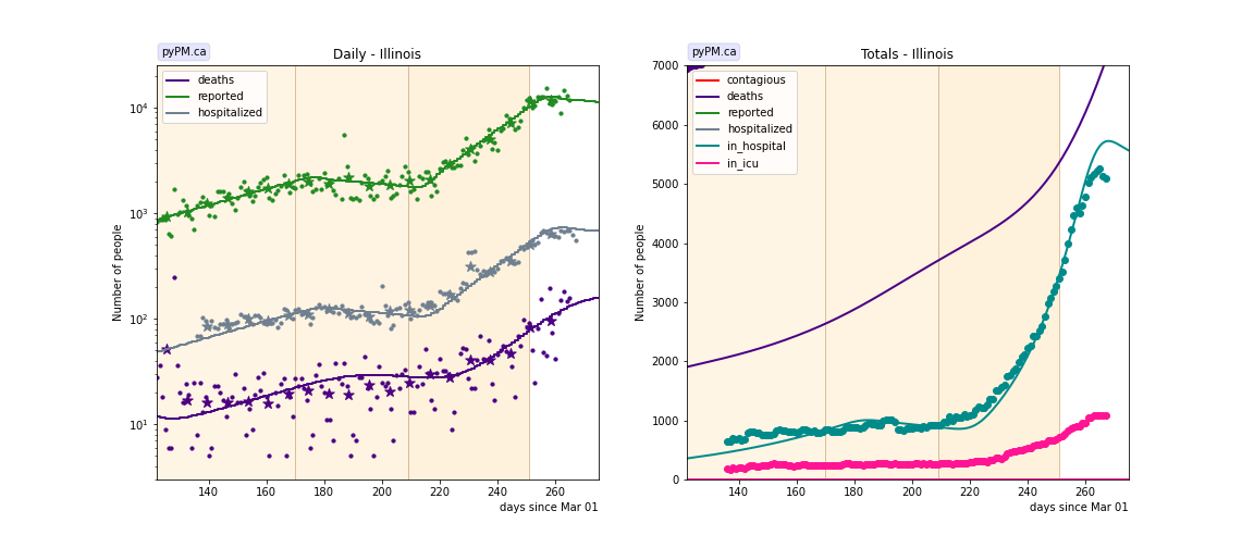
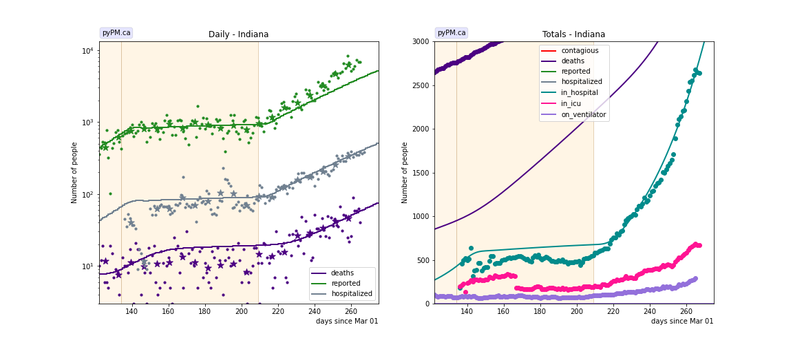
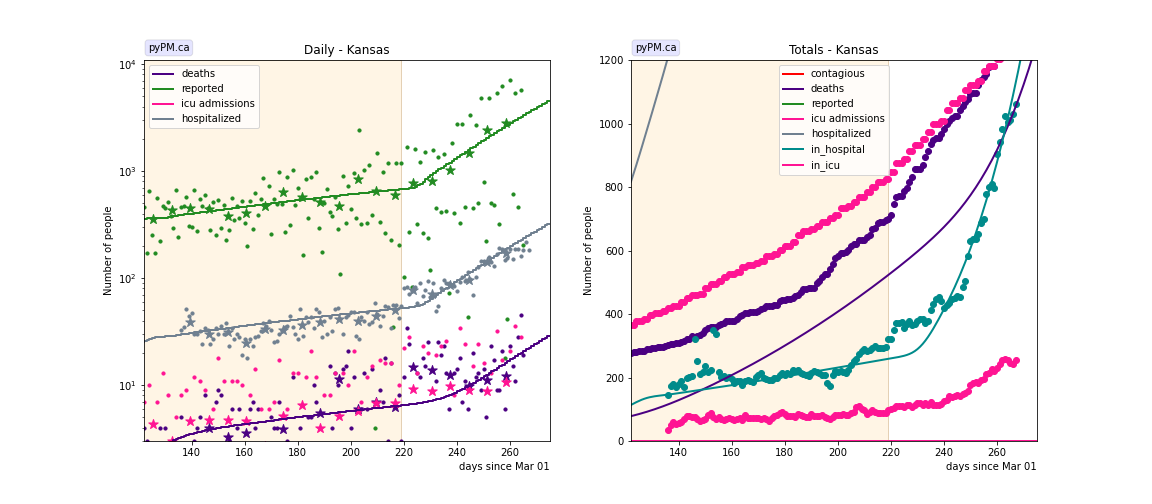
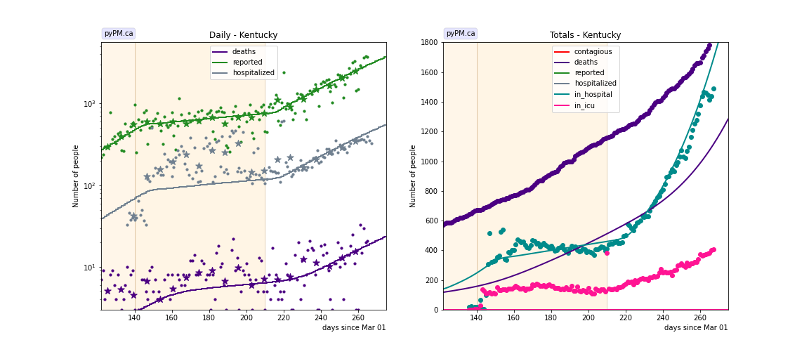
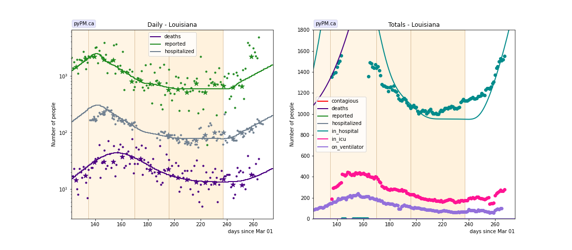
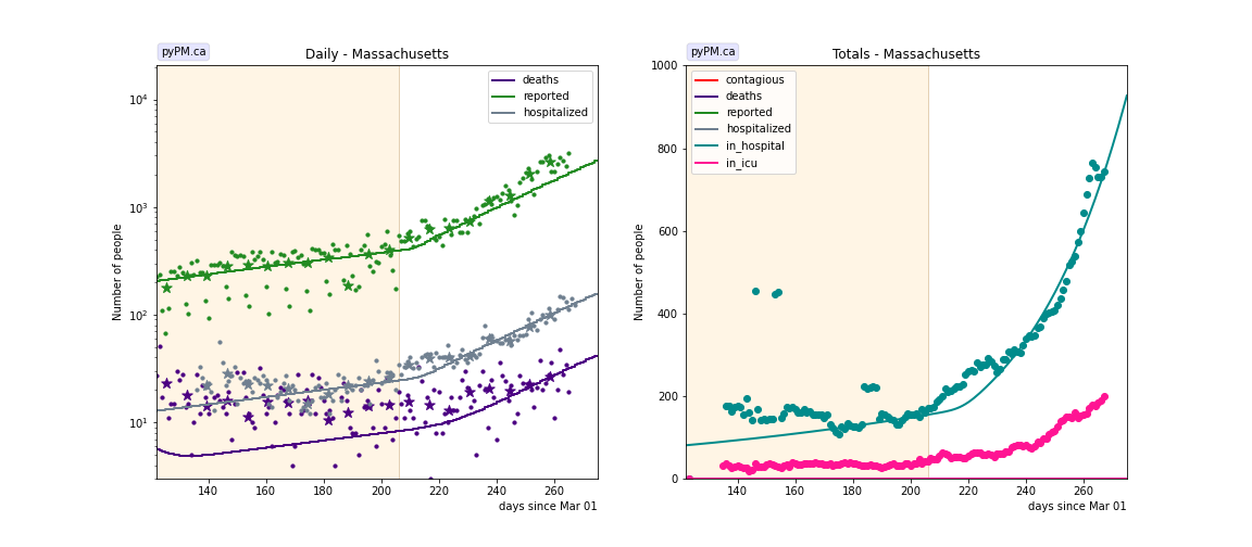
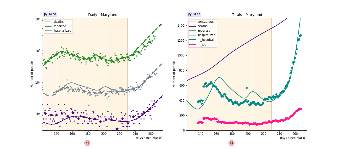
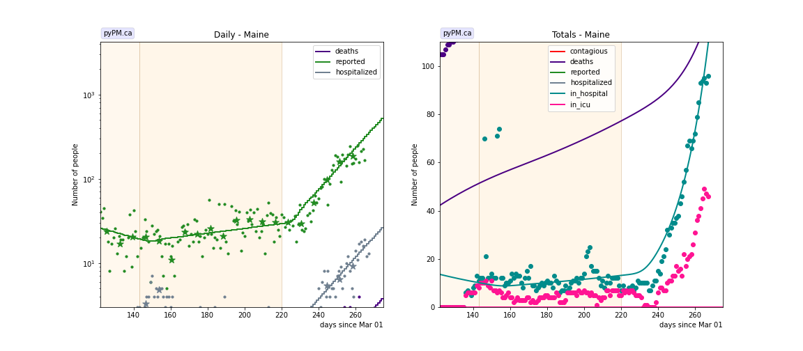
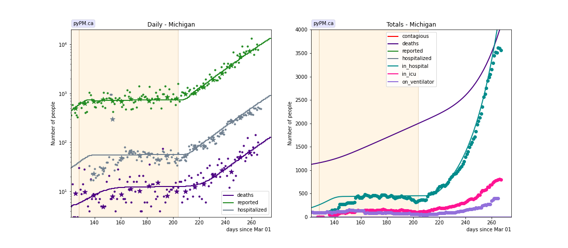
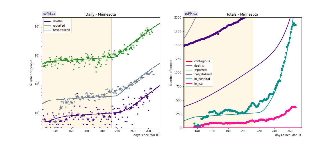
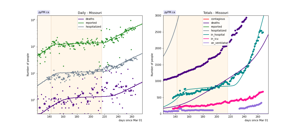
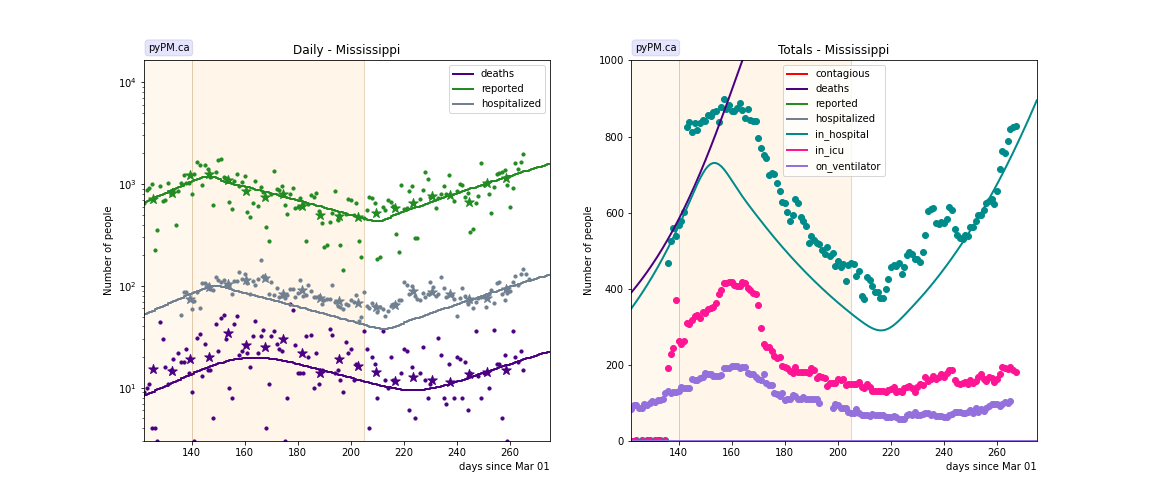
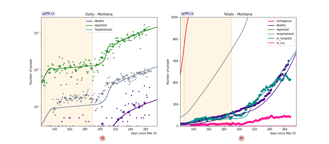
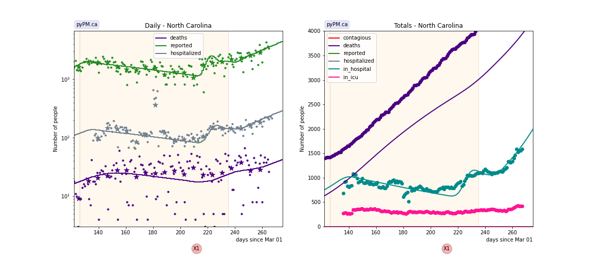
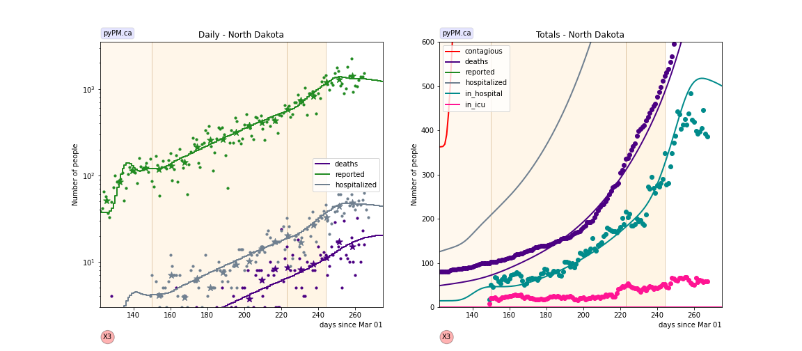
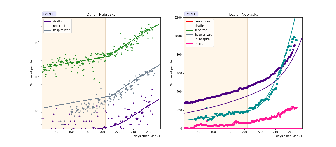
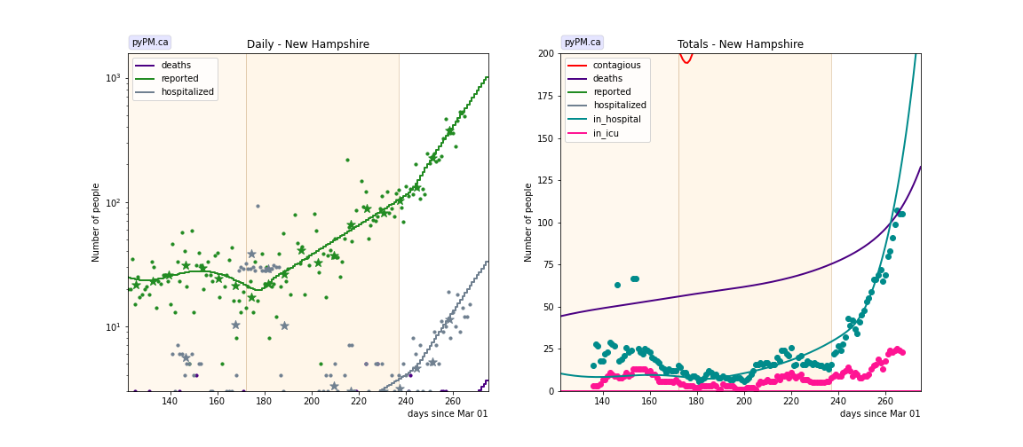
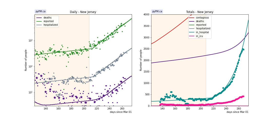
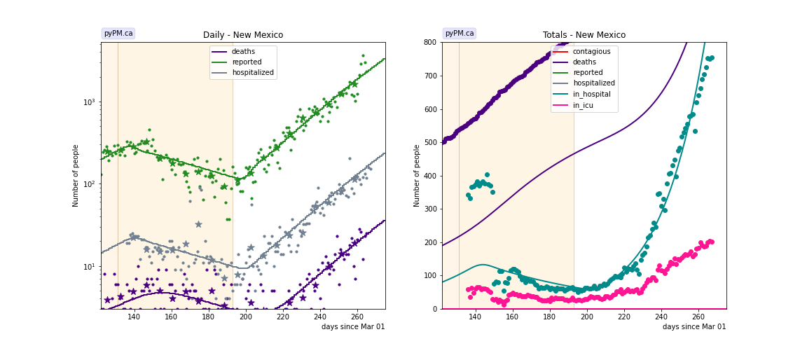
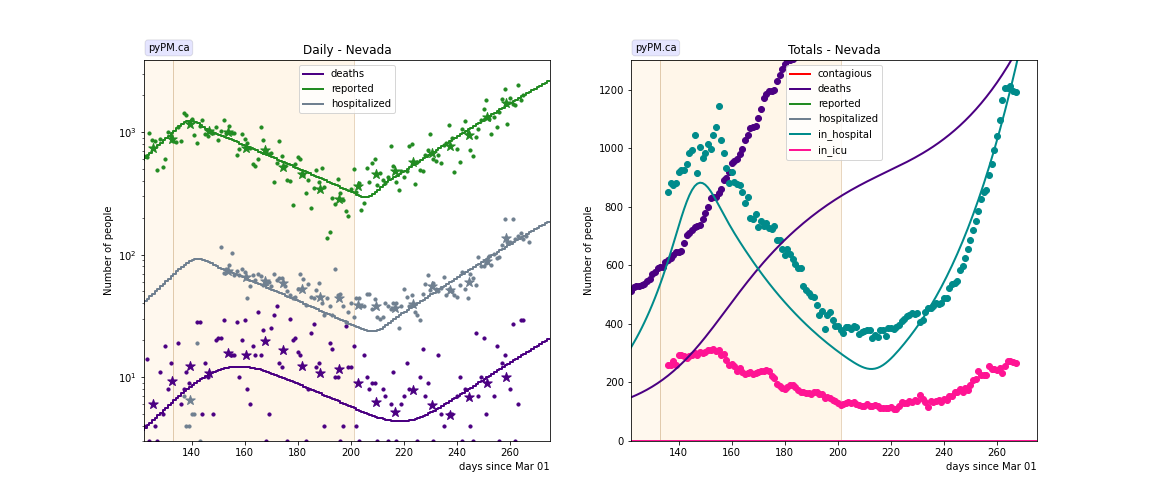
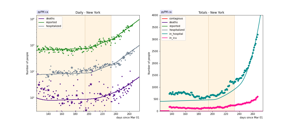
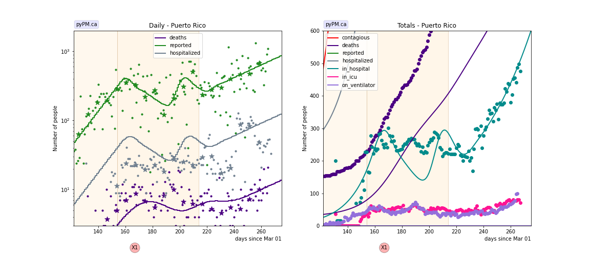
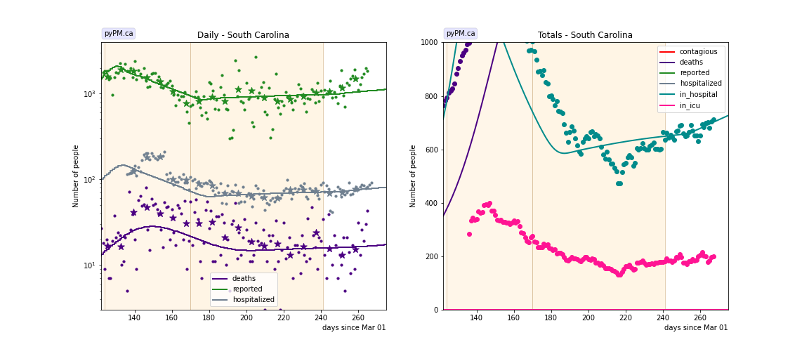
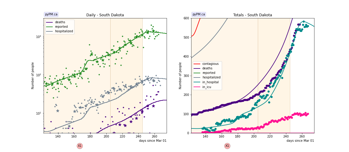
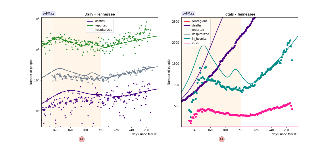
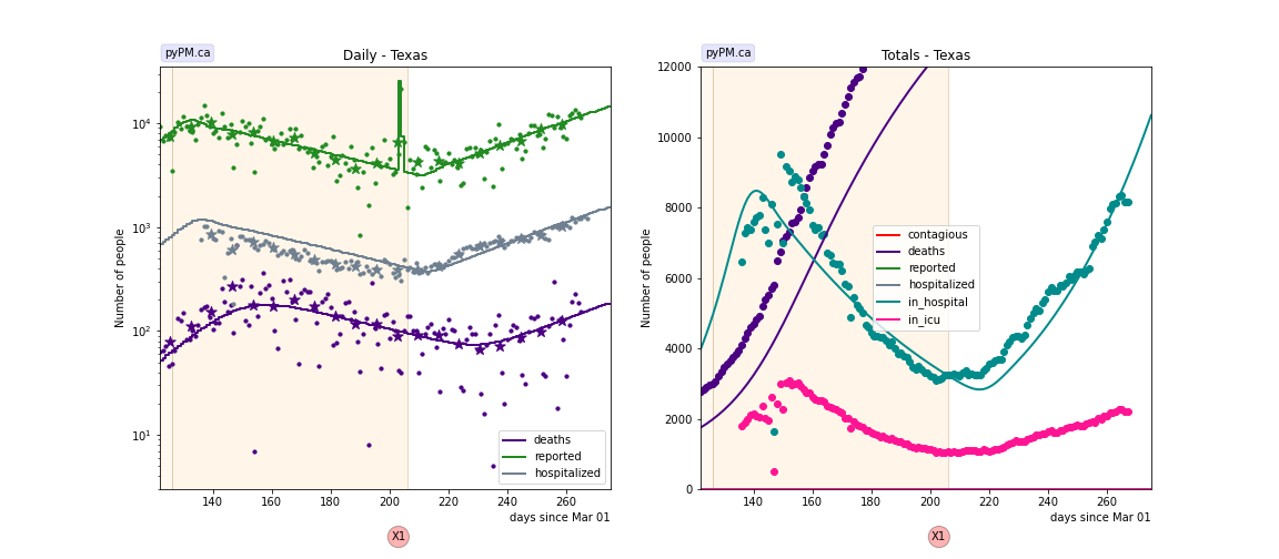
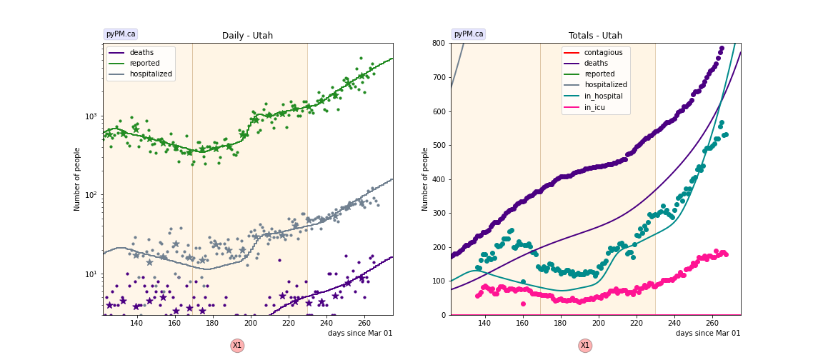
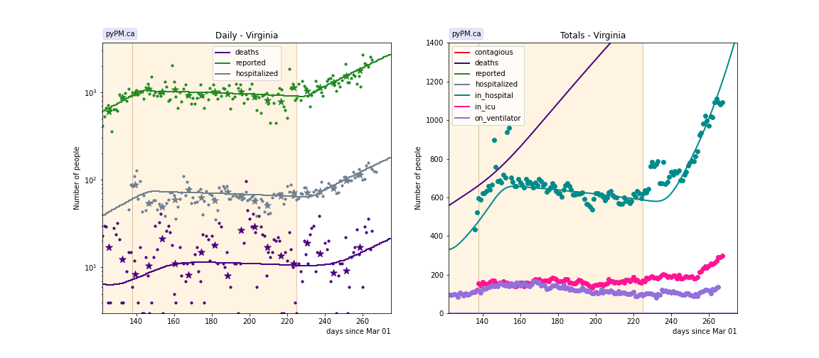
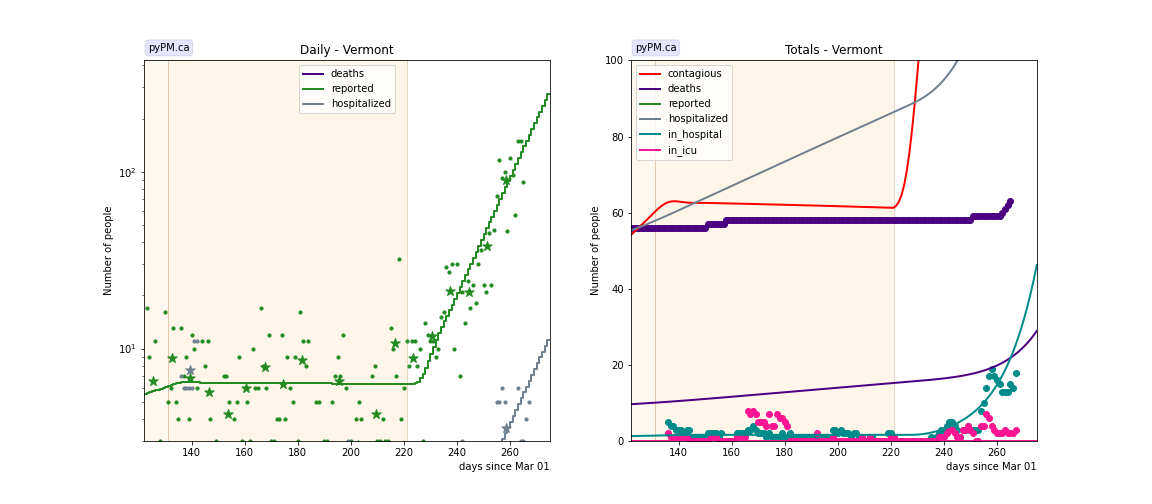
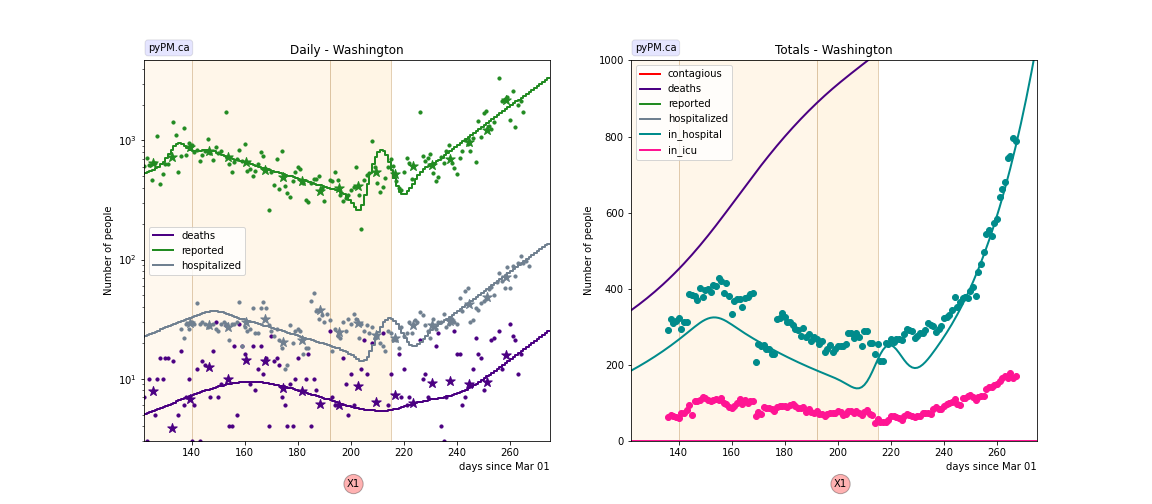
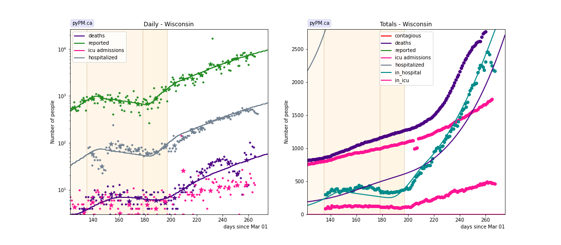
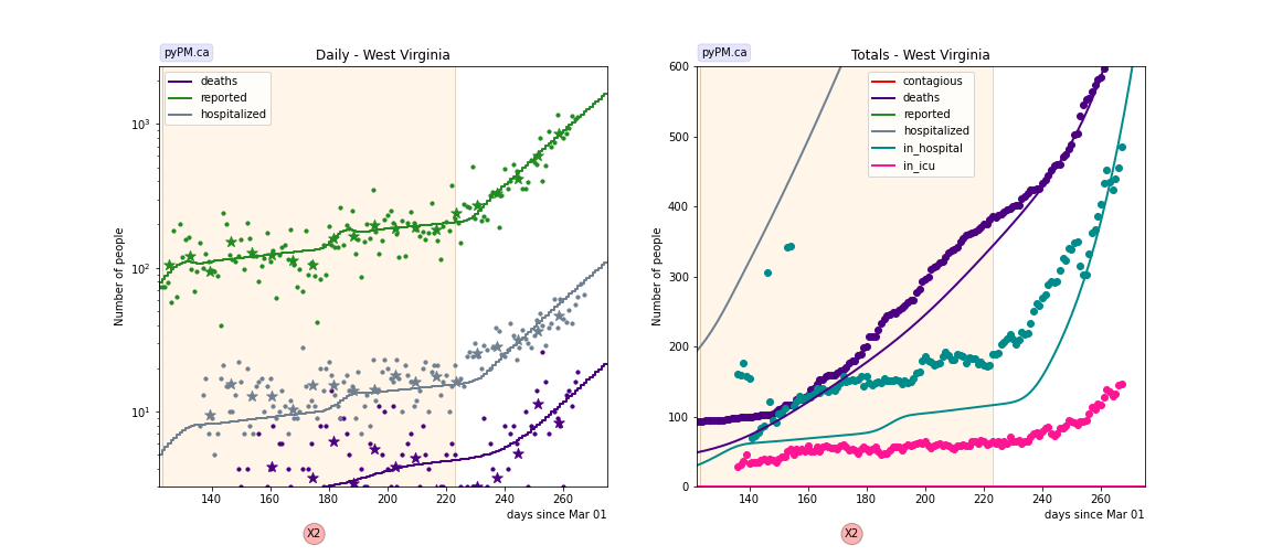
The plots below show the case / hospitalization / deaths data for all 50 states, DC, and PR. The infection trajectory is determined by fits to the cumulative case data. The data fits were done using data up until November 21.
The left figures show the daily cases, hospitalization, and deaths on a log scale, since July 1. The green points are the case data, the stars show the weekly average, and the green curve is the fit of the model to the case data. Hospitalization and deaths are in grey and purple.
For states where the hospitalization indicates a different trajectory, the growth is inferred from the hospitalization data.
The right figures highlight the in-hospitalization numbers (hospital occupancy) in teal. The curve shows the model prediction with the growth inferred from cases (or hospitalization). A single parameter, the mean stay in hospital, is adjusted to fit the data. That parameter value is shown in the histogram above.
Alaska
Alabama
Arkansas
Arizona
California
Colorado
Connecticut
District Of Columbia
Delaware
Florida
Georgia
Hawaii
Iowa
Idaho
Illinois
Indiana
Kansas
Kentucky
Louisiana
Massachusetts
Maryland
Maine
Michigan
Minnesota
Missouri
Mississippi
Montana
North Carolina
North Dakota
Nebraska
New Hampshire
New Jersey
New Mexico
Nevada
New York
Ohio
Oklahoma
Oregon
Pennsylvania
Puerto Rico
Rhode Island
South Carolina
South Dakota
Tennessee
Texas
Utah
Virginia
Vermont
Washington
Wisconsin
West Virginia
Wyoming