January 23, 2022 Analysis of US state data
The characteristic signature of recent rapid growth due to Omicron is visible in all US state case history data. For this analysis, the case and death data source is the New York Times, since it has has more regular updates and fewer irregularities than the JHU data.
For some states, testing capacity limits have changed the fraction of infections that are reported as cases, making interpretation of cases much more difficult. Further complicating matters is the usual effect of holiday periods disrupting testing and reporting. Hospital admission data can be used when cases are no longer reliable.
The report has two sections, the first showing the rapid decline in growth rates for Omicron infections and the second showing studies of hospital demands for Omicron infections.
Rapid reduction in Omicron growth rates
As usual, the infection model is defined by fitting the model to the case data, and the hospitalization and deaths models are derived from the infection model. To estimate the recent transmission rate of Omicron, hospital admission data is used. For many states, case data appears to be reliable and yields similar transmission rate estimates.
The Omicron variant is assumed to have a much larger susceptible population, due to its ability to evade immunity (natural and vaccination immunity). For this study, those immunized against earlier strains only have 20% effective immunity against omicron.
Booster doses have been included in this analysis, and are assumed to raise the vaccine effectiveness from 20% to 80% with a time delay given by a gamma distribution with mean 10 days and standard deviation 5 days.
The Omicron variant is also assumed to produce more infections that go undetected as cases. The reporting fraction of omicron infections is assumed to be 0.6 times that of Delta infections. This has the effect of reducing peak infection and hospitalization rates. The scaling of the reporting fraction had been 0.4 in previous analyses of US data, but is changed to 0.6, given the inclusion of boosters in the model, which increases population immunity.
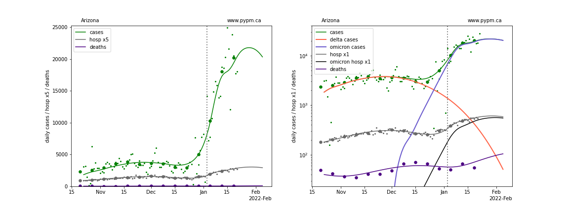
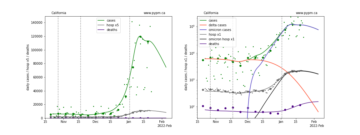
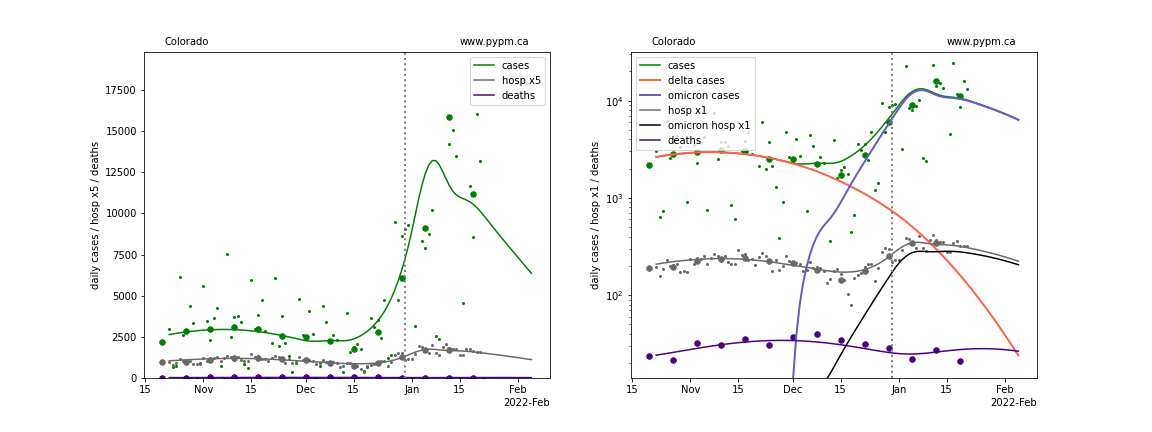
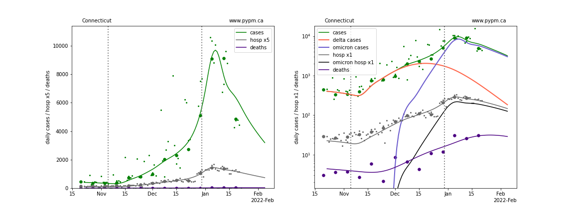
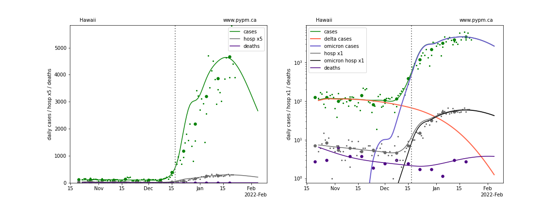
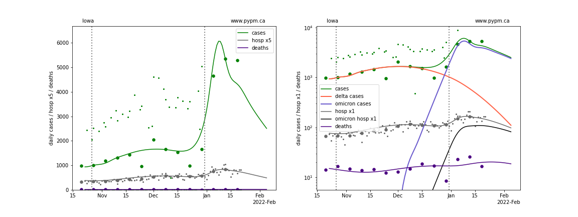
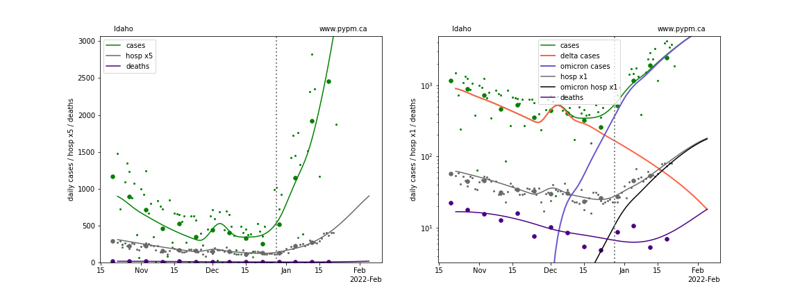
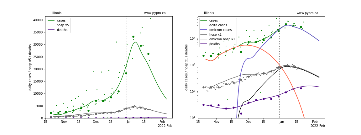
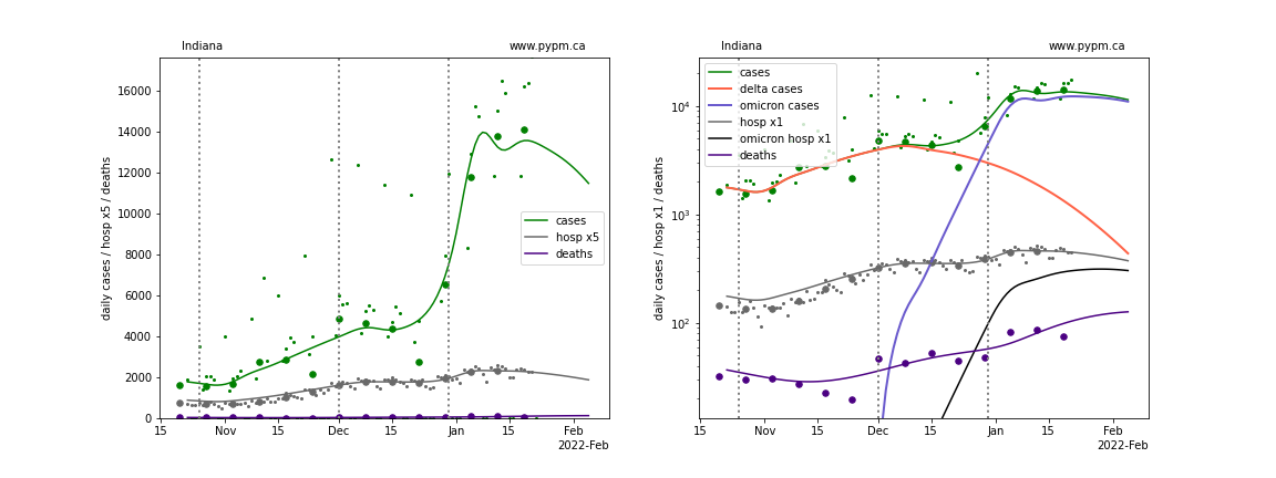
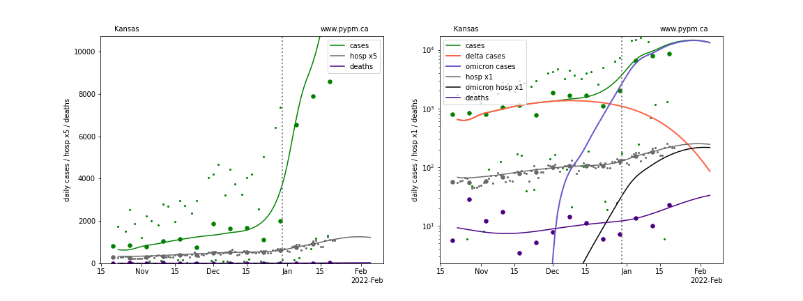
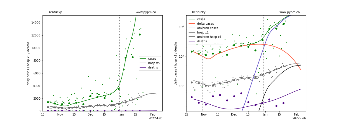
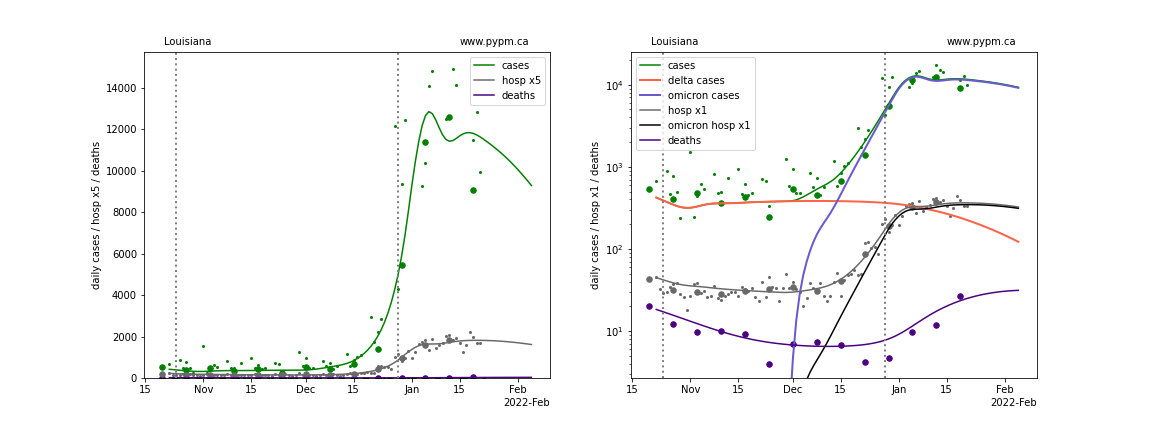
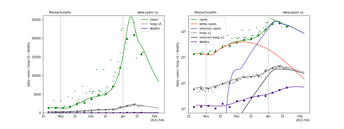
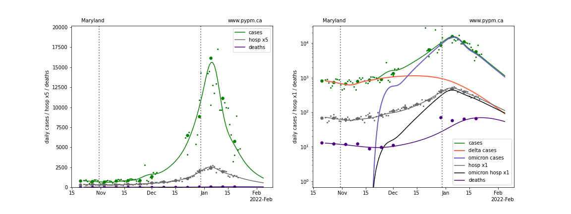
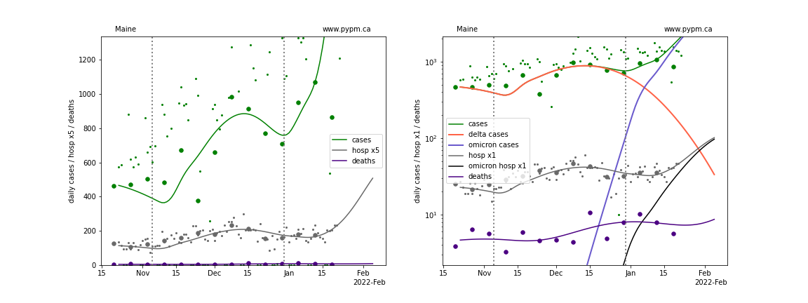
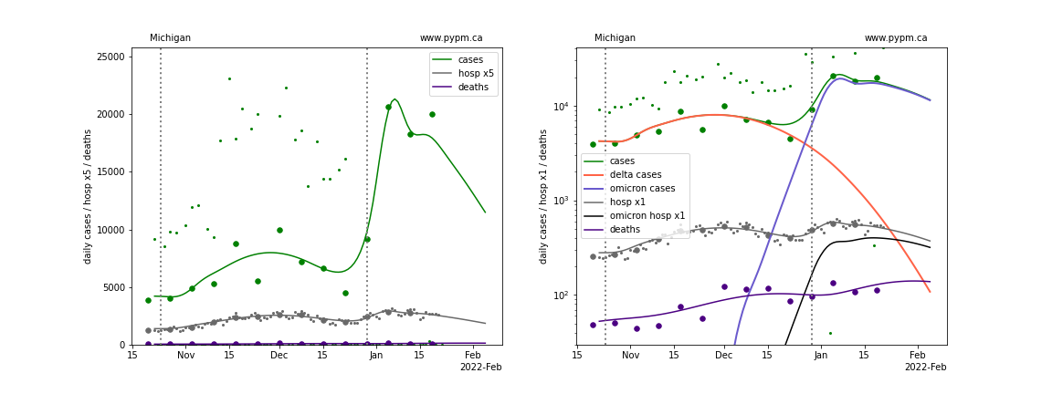
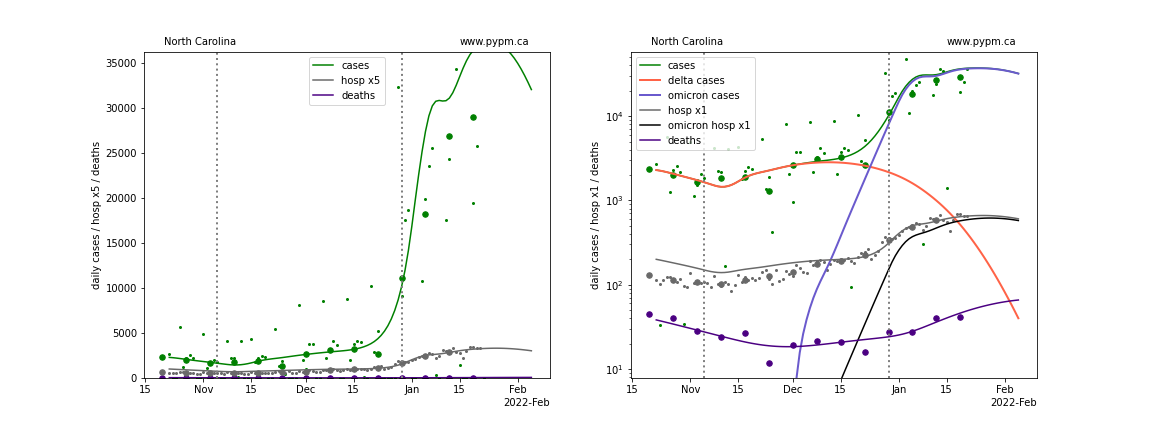
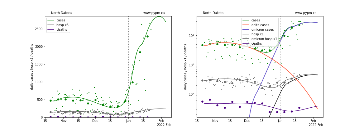
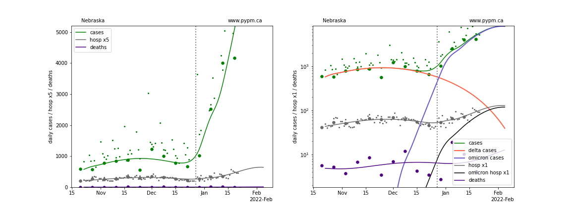
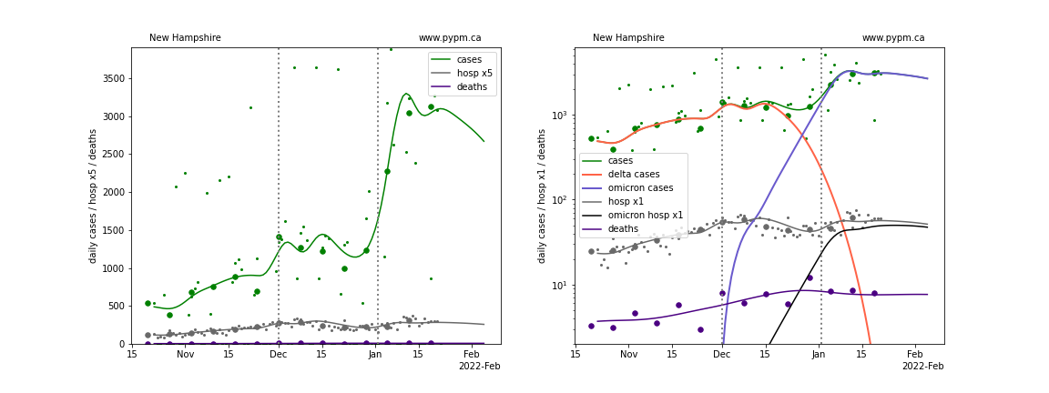
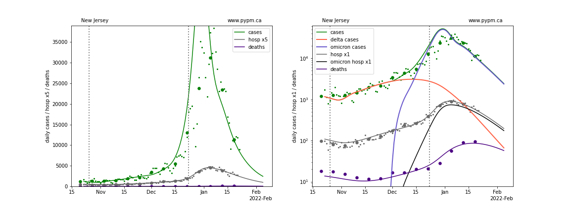
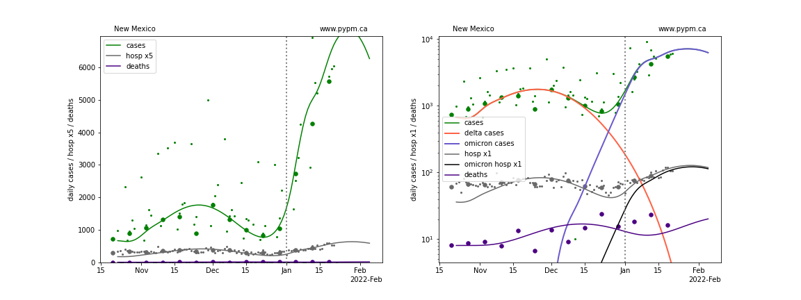
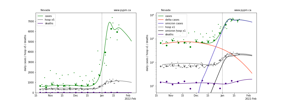
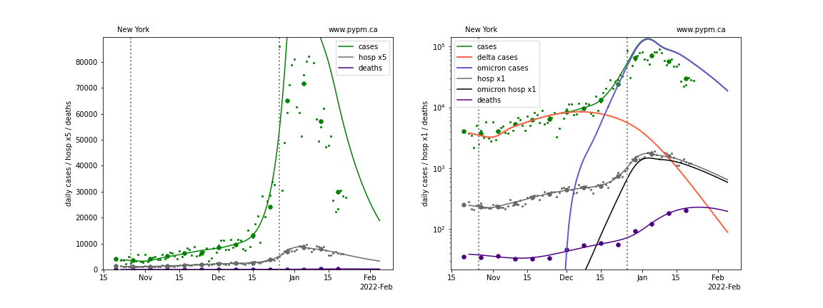
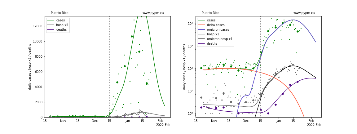
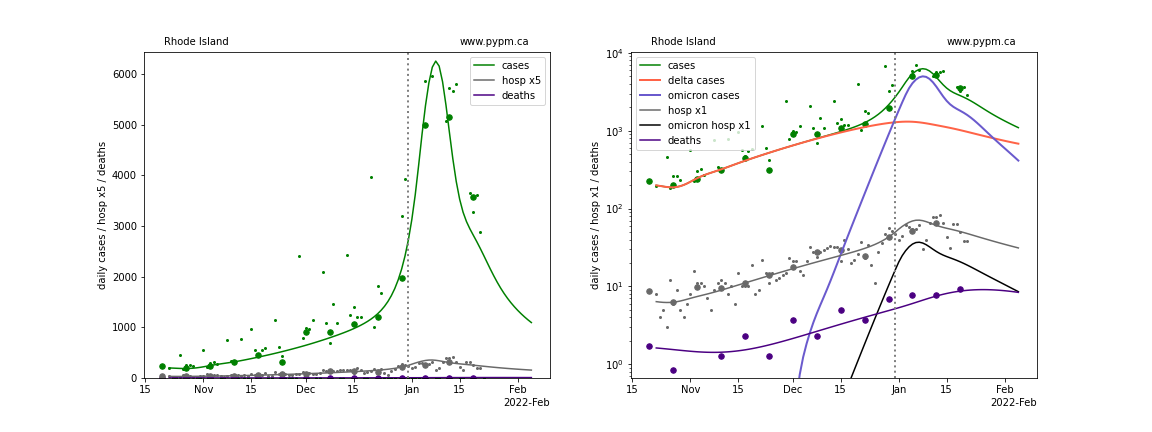
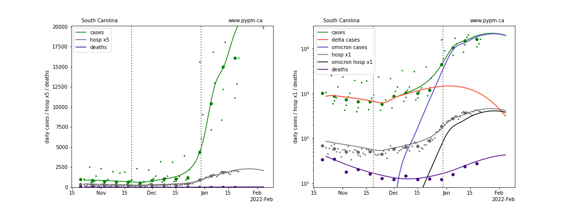
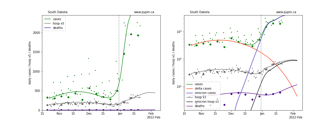
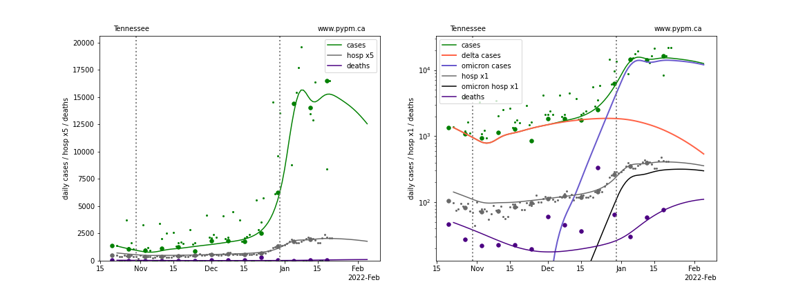
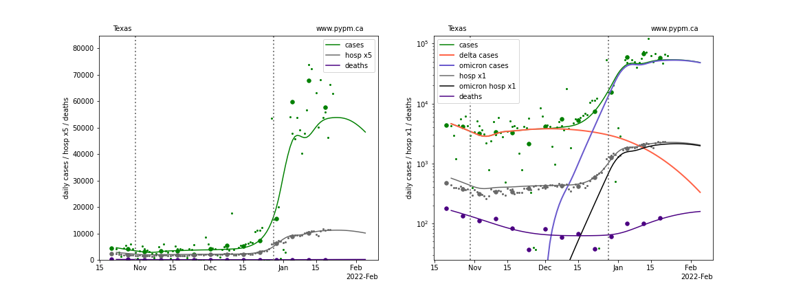
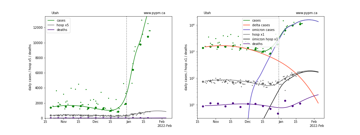
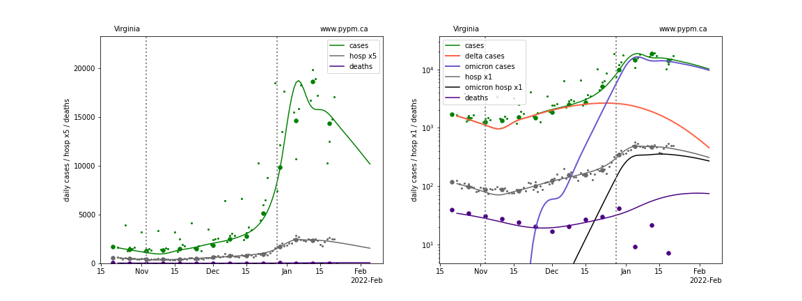
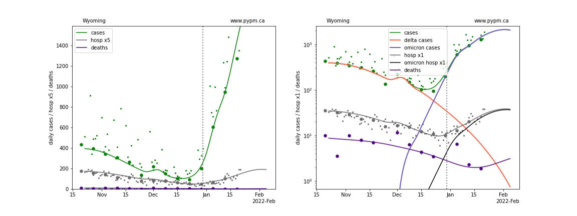
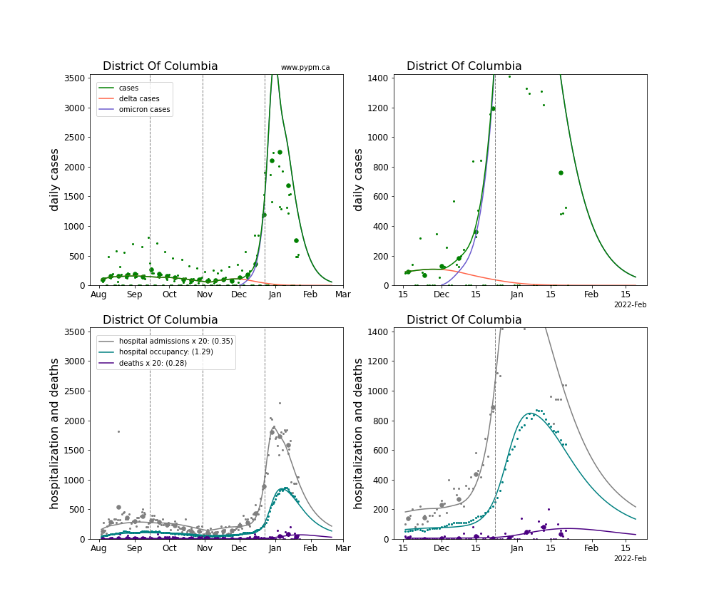
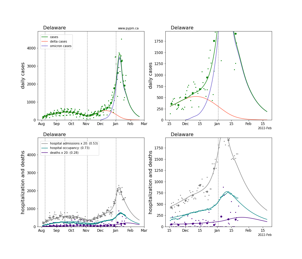
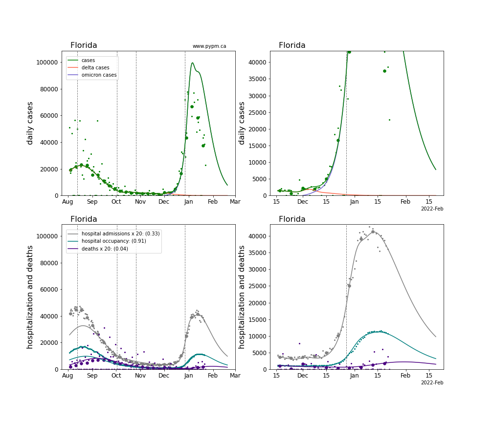
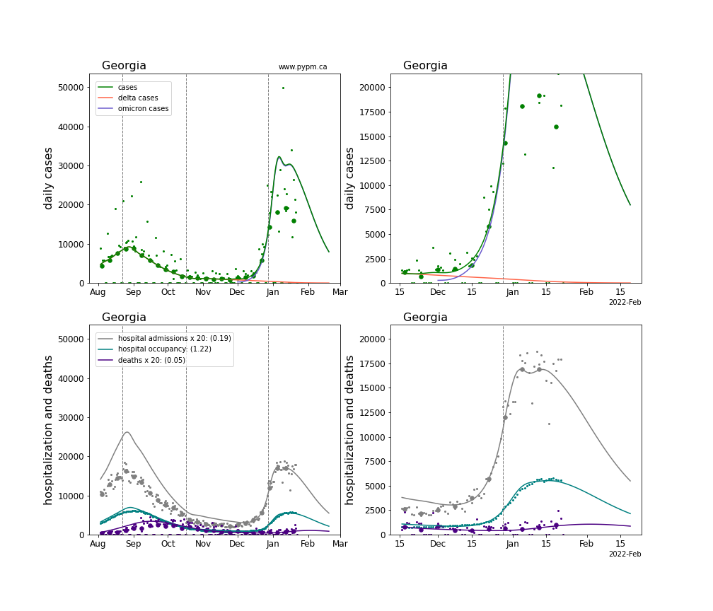
The green points are the daily cases, the grey points the daily hospitalizations, the teal points are hospital occupancy, and the indigo points are the daily deaths. The larger circles are weekly averages to help guide the eye.
The case data are used to define the periods for which transmission rate appears to be constant. The vertical lines show where the transmission rate is changed. If the susceptibe fraction is constant (immunity not changing quickly), constant transmission rates lead to steady exponential growth or decline. With immunity growing, the curves bend downwards due to the herd effect. Interpretting the growth of Omicron with changing Delta rates growth rates leads to additional uncertainty in the interpretations.
Note that for these analyses, hospital admission data were used to estimate the recent infection trajectory, to avoid potential problems with case data no longer being reliable.
Individual state hospitalization analyses
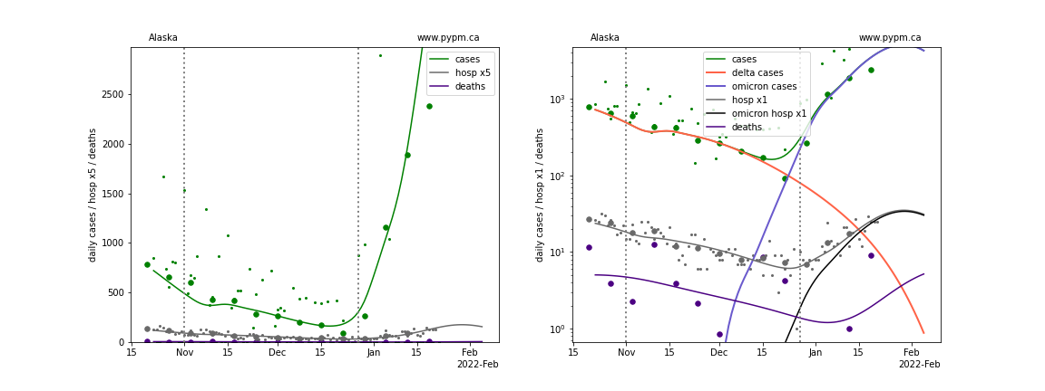
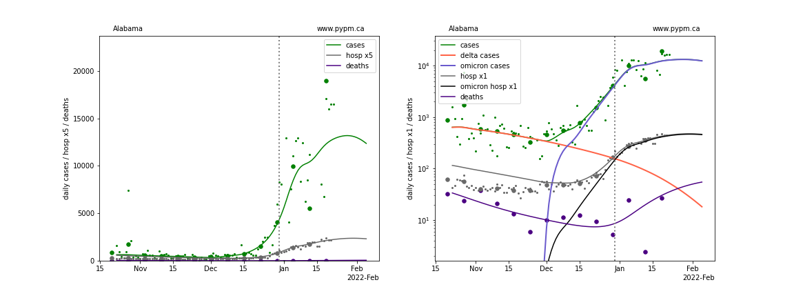
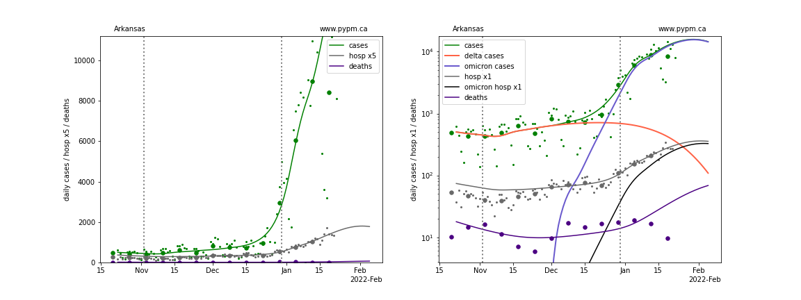
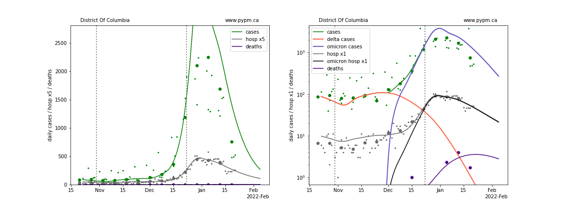
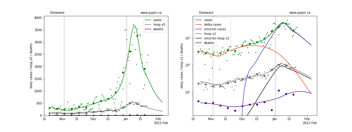
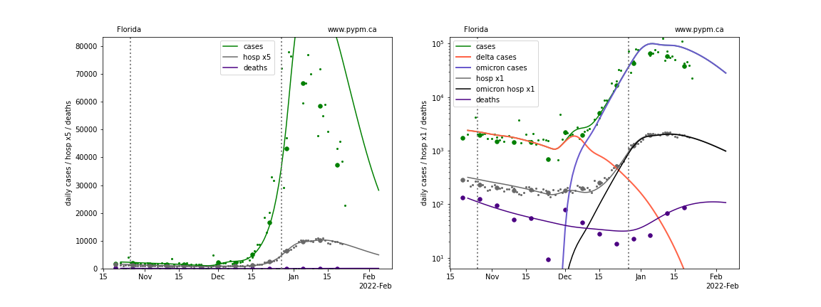
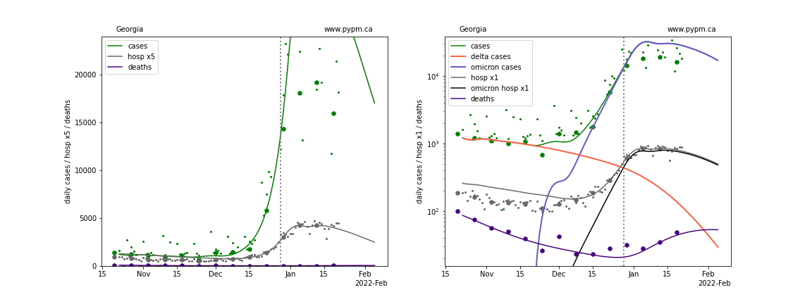
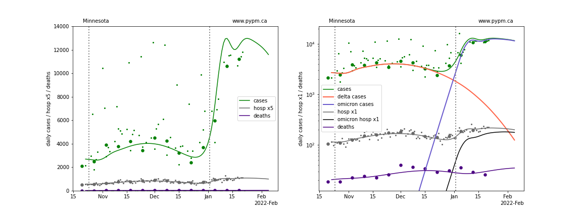
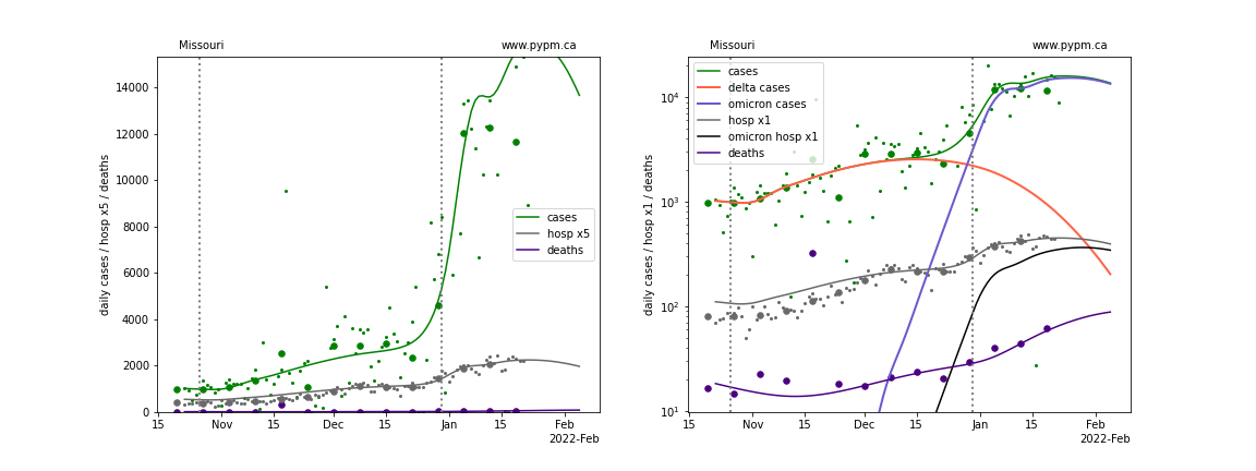
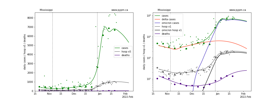
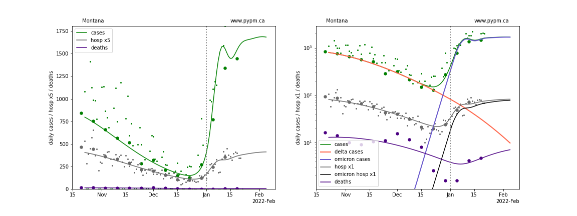
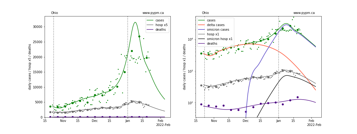
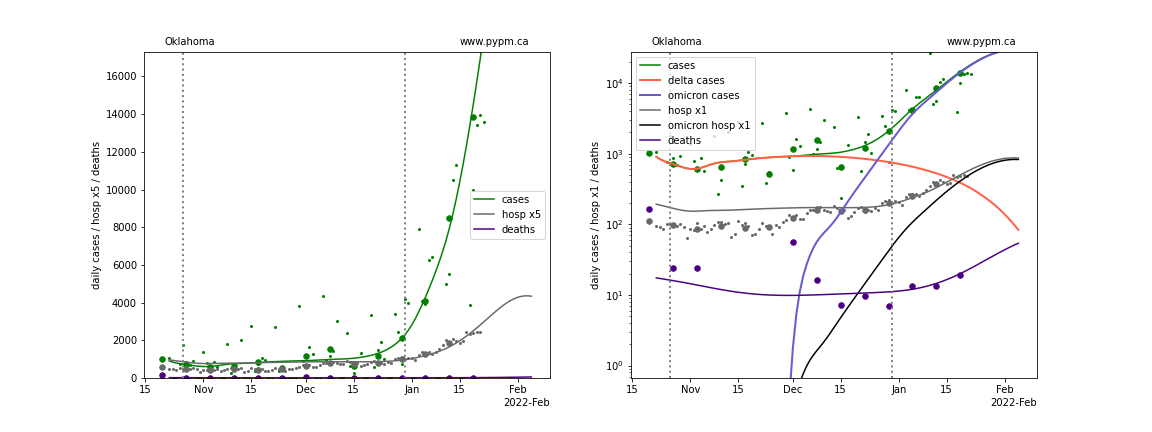
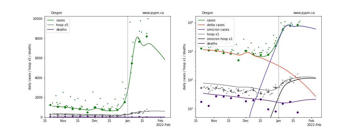
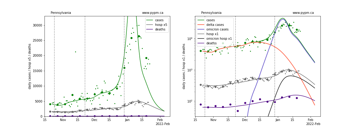
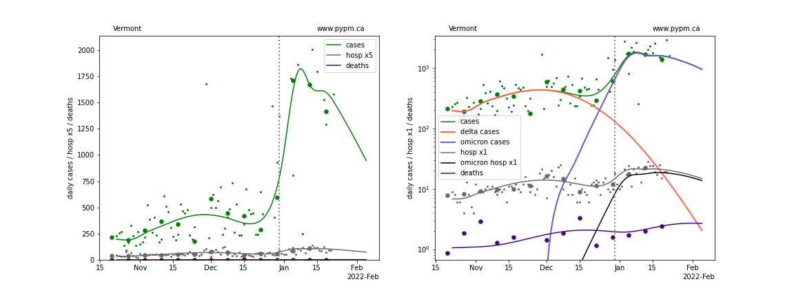
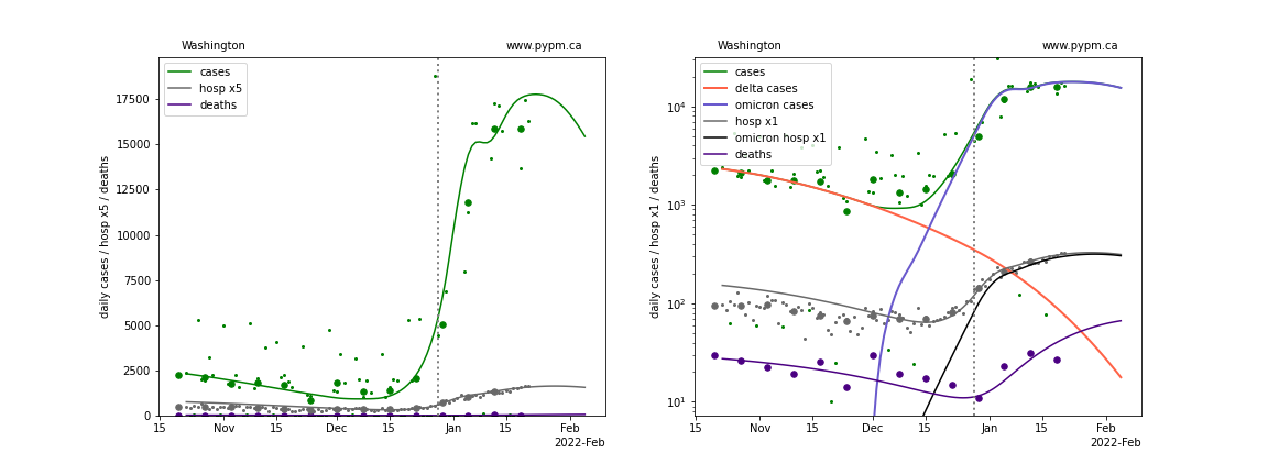
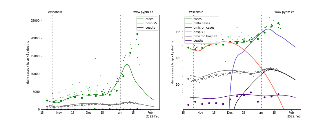
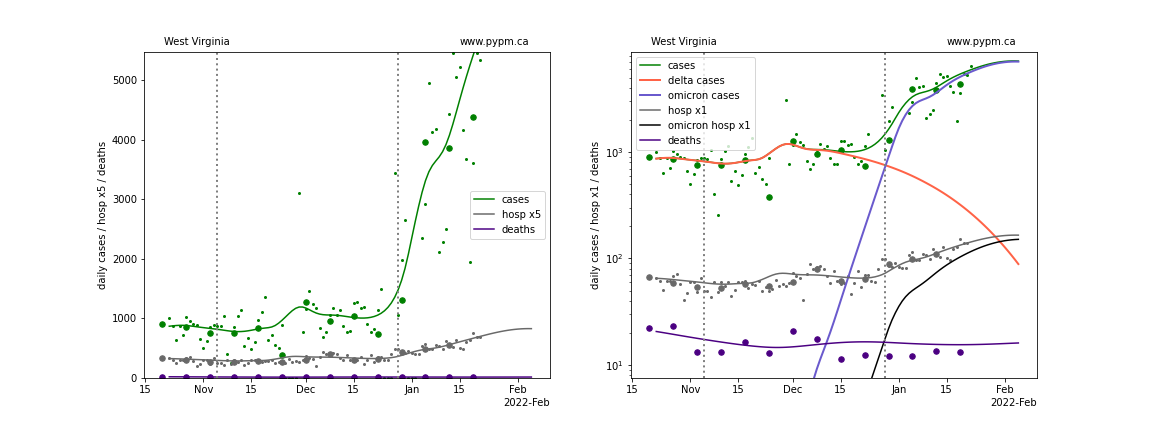
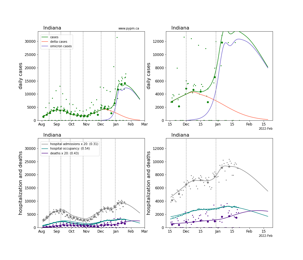
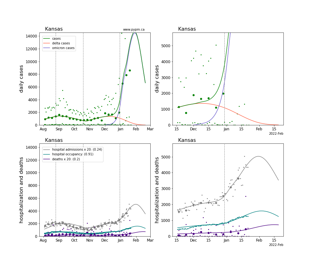
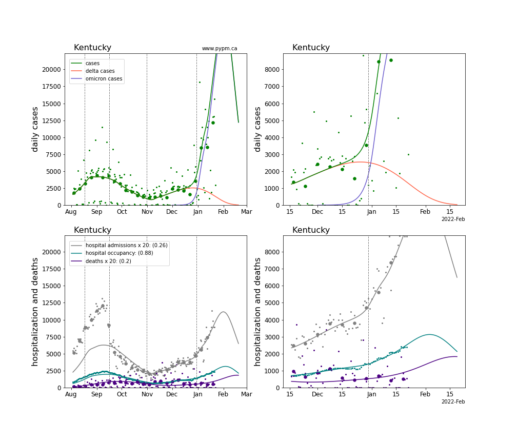
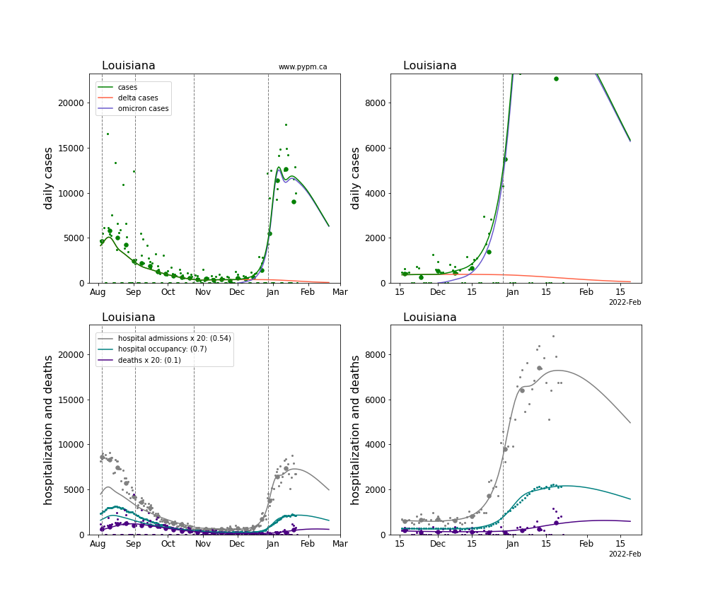
The plots for each state below show the case, hospital admisions, and deaths data since October 15 2021, on a linear scale (left) and log scale (right). Daily hospital admissions are scaled up by 5 to be able to see them on the linear scales. The right figures show how the model attributes cases from Delta and Omicron infections, and the hospital admissions from Omicron infections. Omicron hospital admissions make a useful metric to compare the growth of Omicron across different states, removing the widely variable Delta hospital admissions.
The model is able to describe data from the states by introducing a transition to lower transmission rate near the end of December 2021. This introduces a kink in the log scale plots (as constant transmission rate corresponds to straight lines, if population immunity is roughly constant).
Following the individual state plots, summaries of all states are shown below.
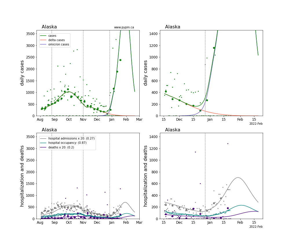
Alaska
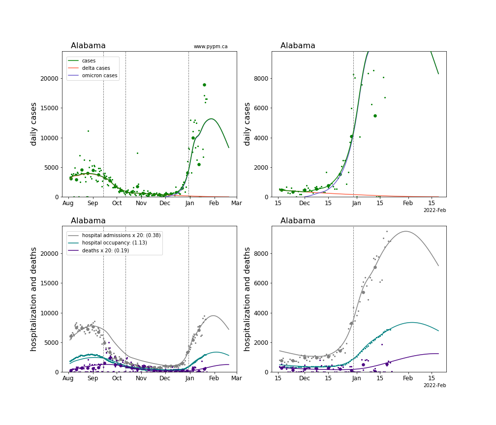
Alabama
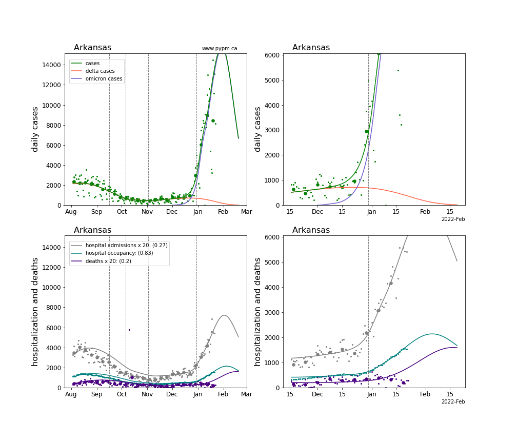
Arkansas
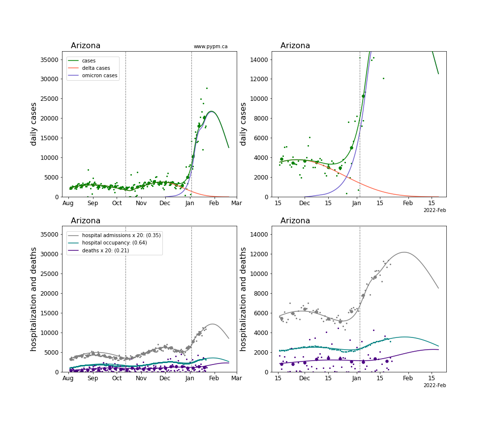
Arizona
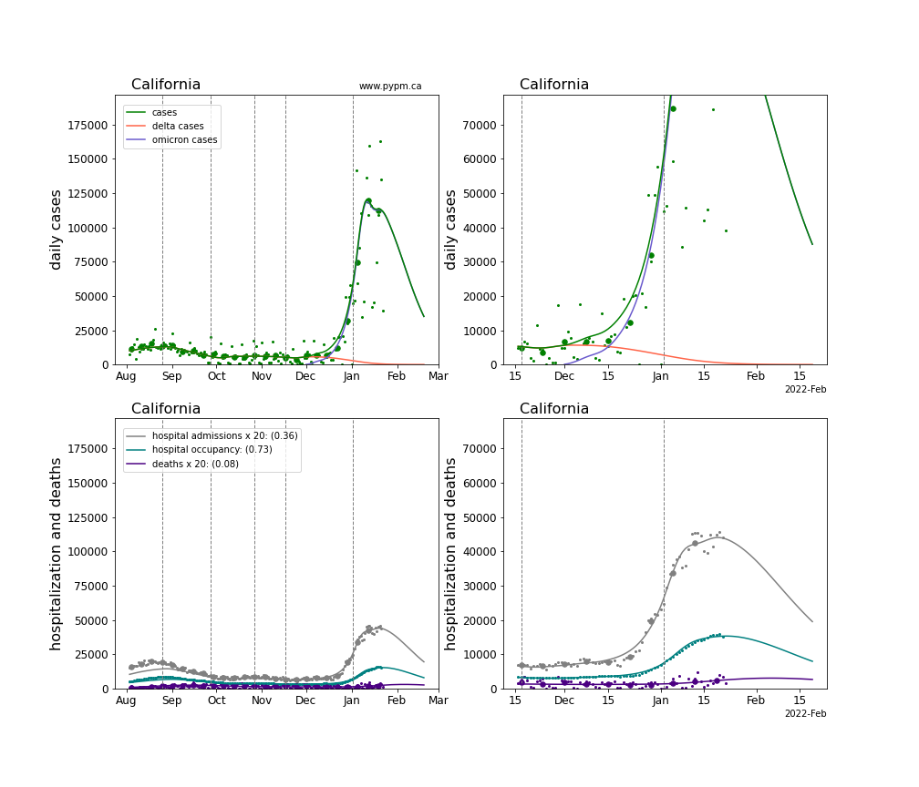
California
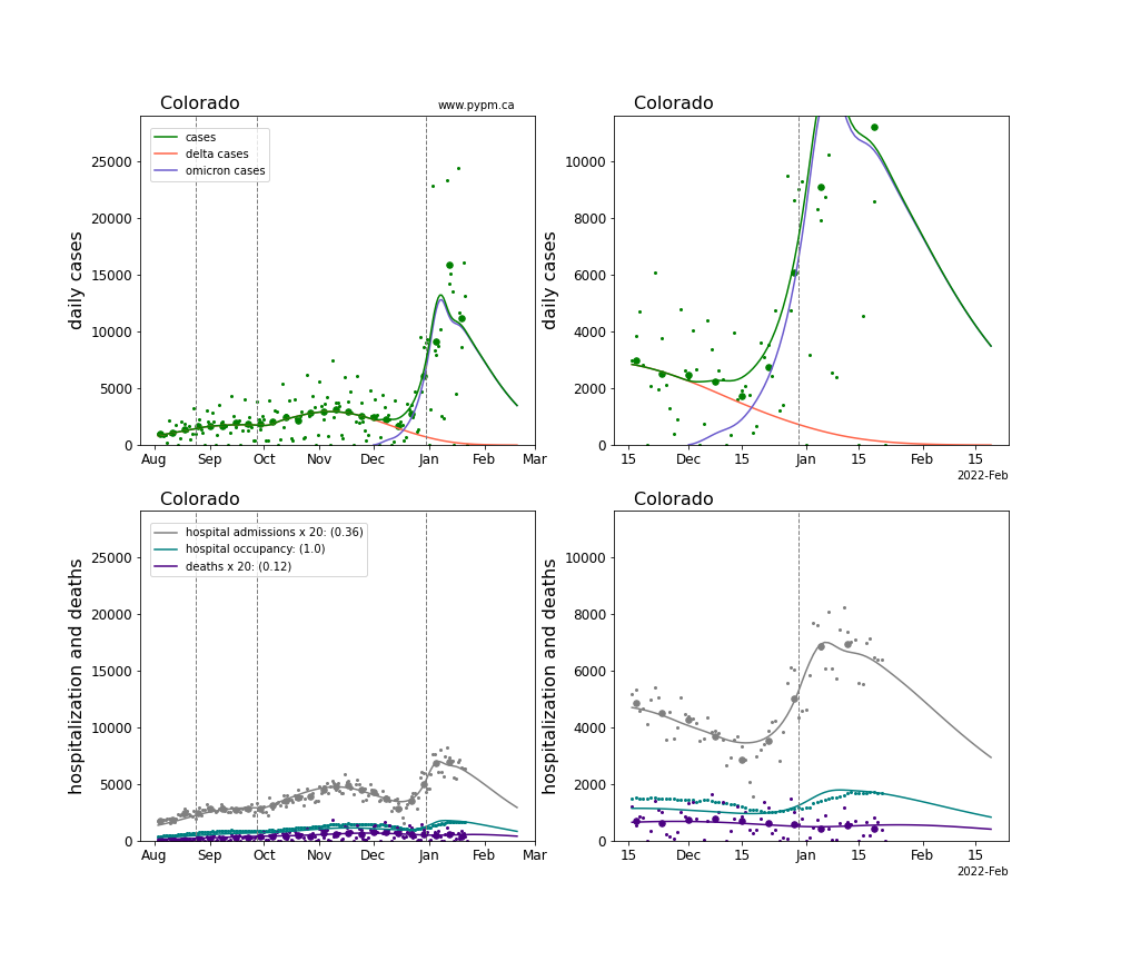
Colorado
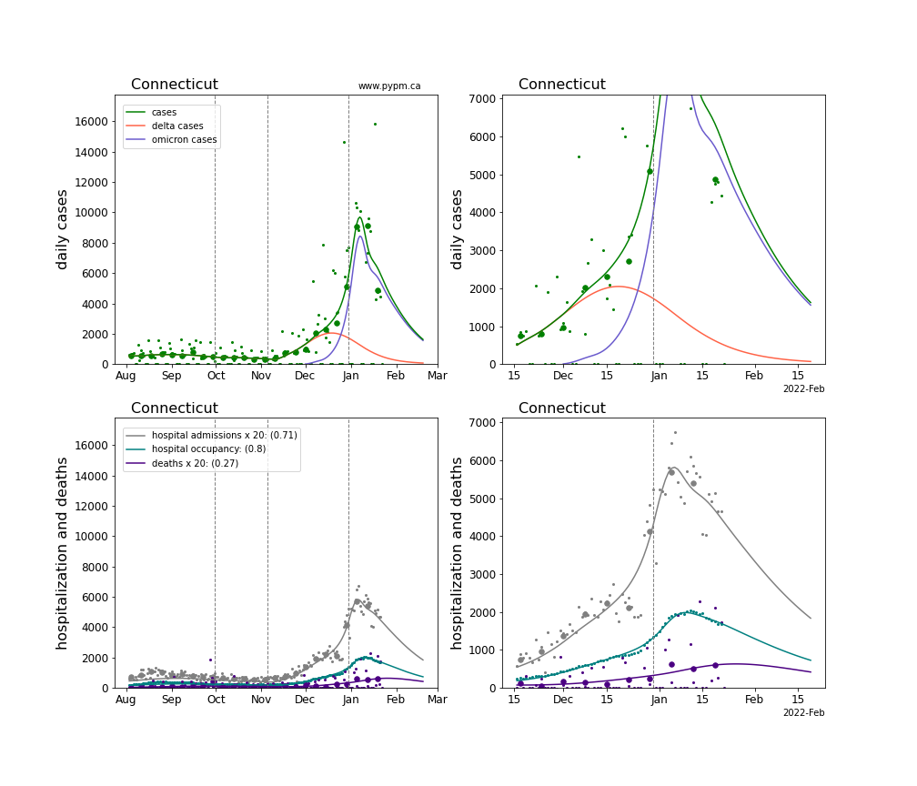
Connecticut
District Of Columbia
Delaware
Florida
Georgia
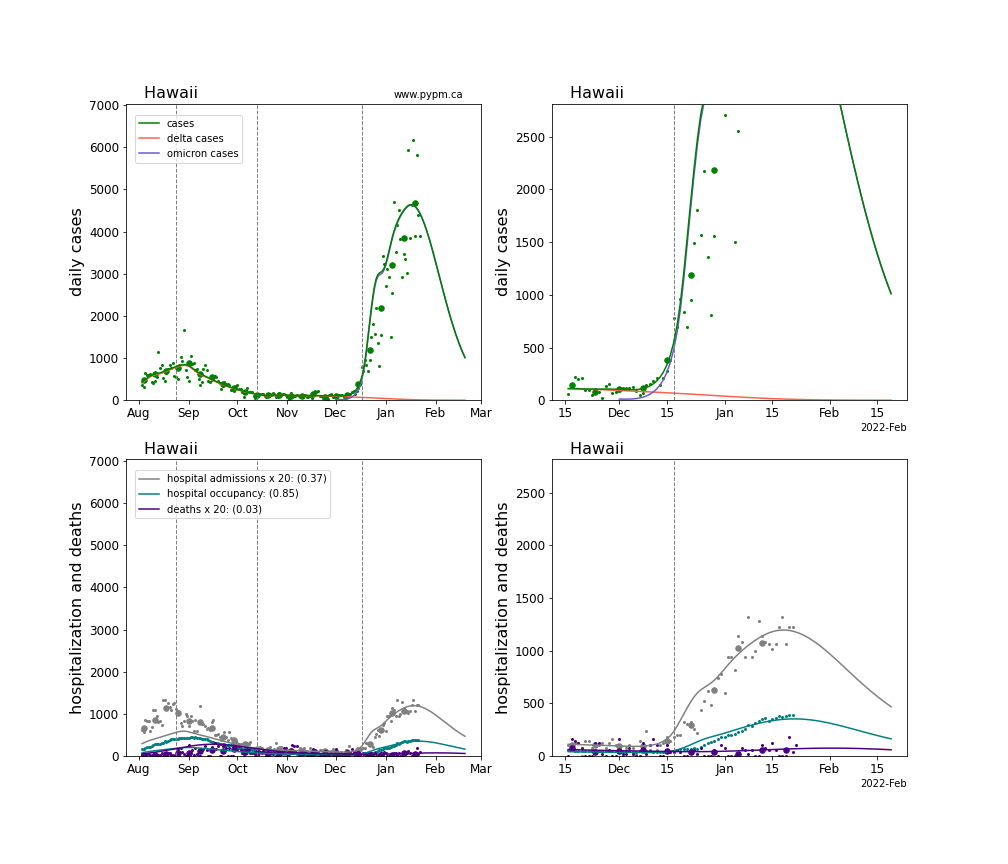
Hawaii
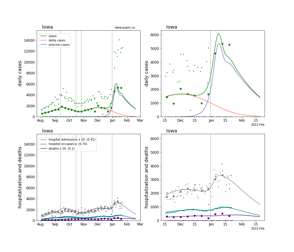
Iowa
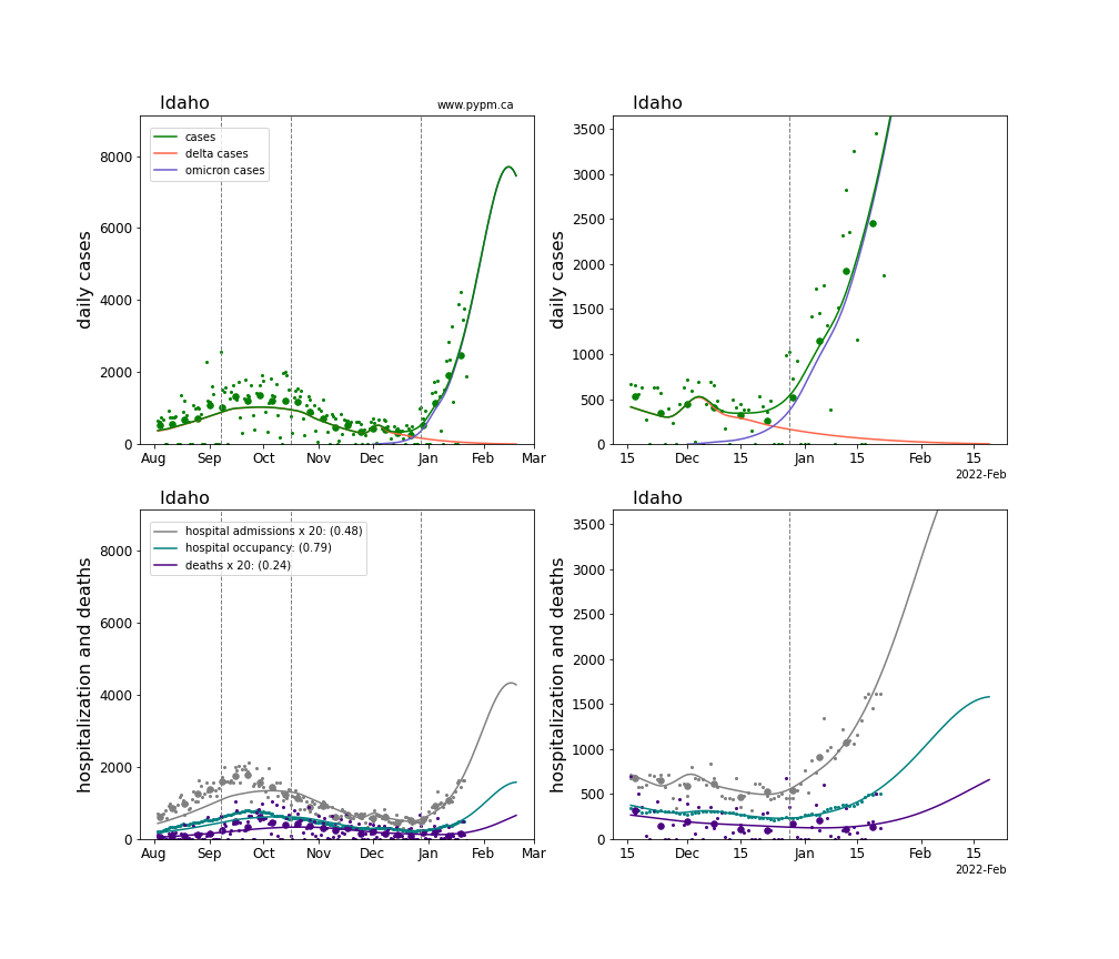
Idaho
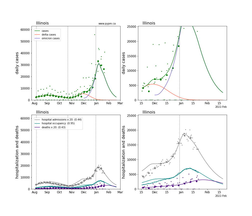
Illinois
Indiana
Kansas
Kentucky
Louisiana
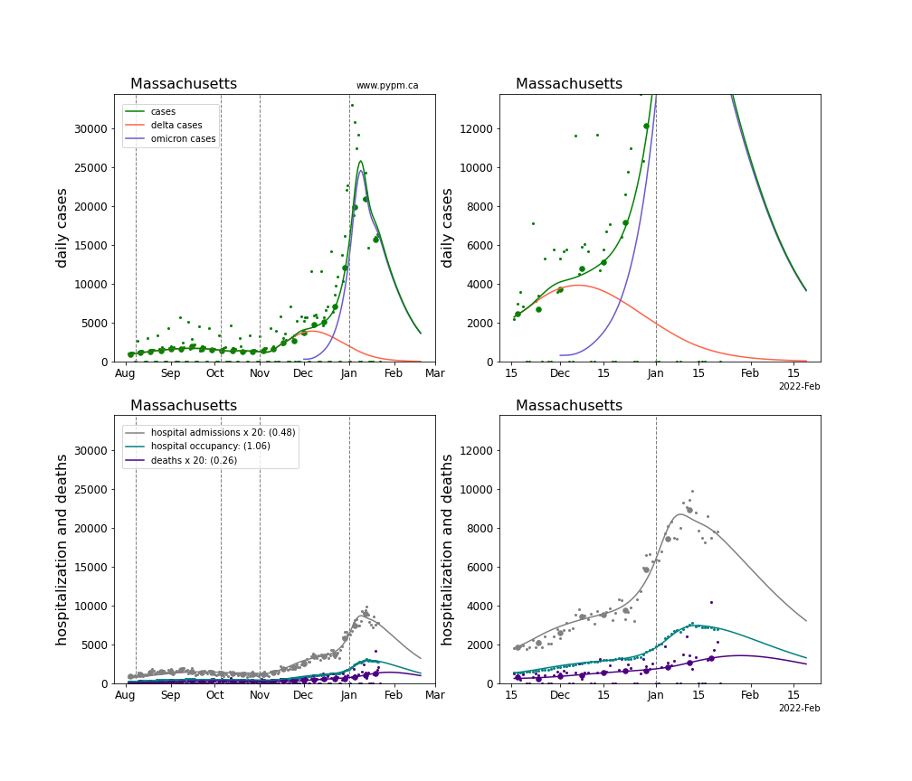
Massachusetts
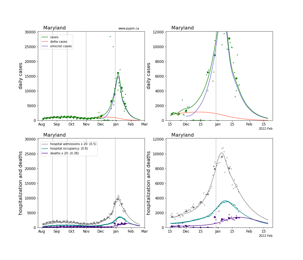
Maryland
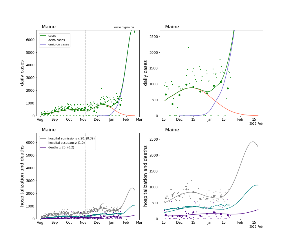
Maine
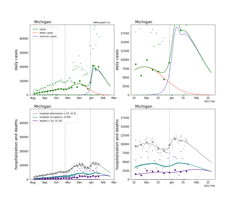
Michigan
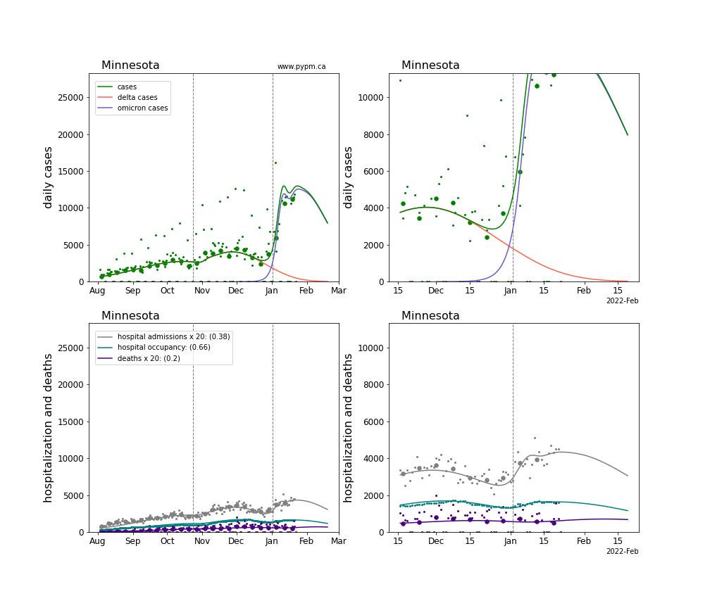
Minnesota
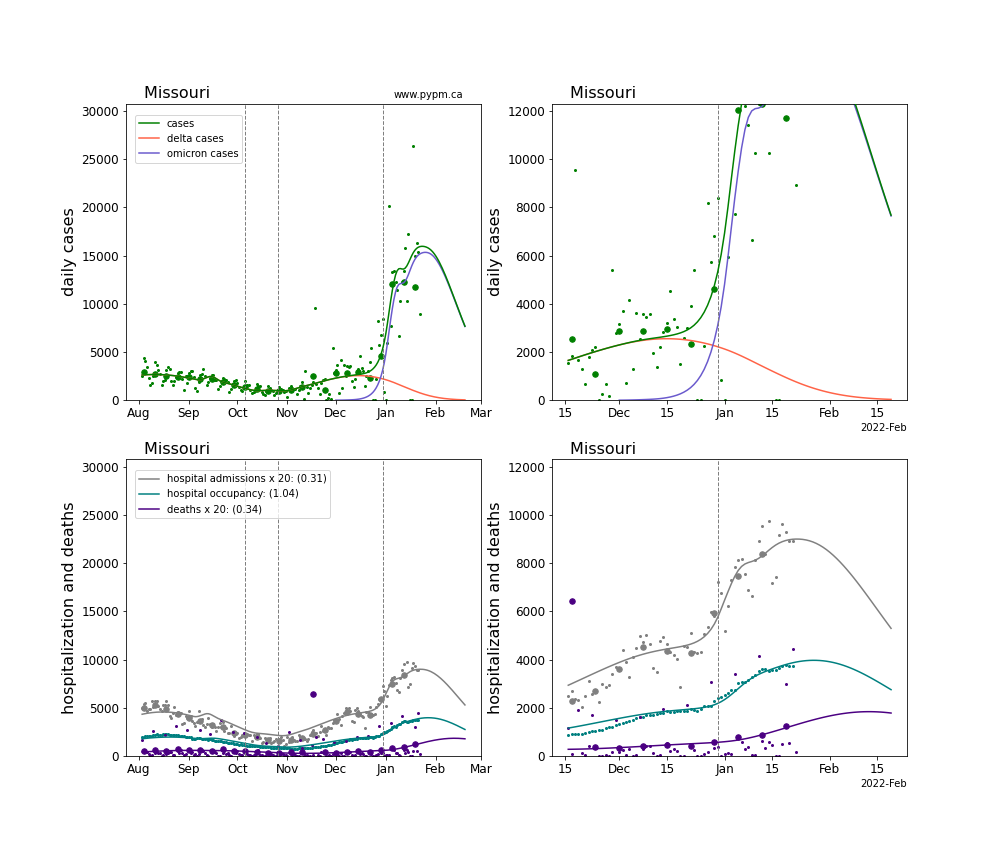
Missouri
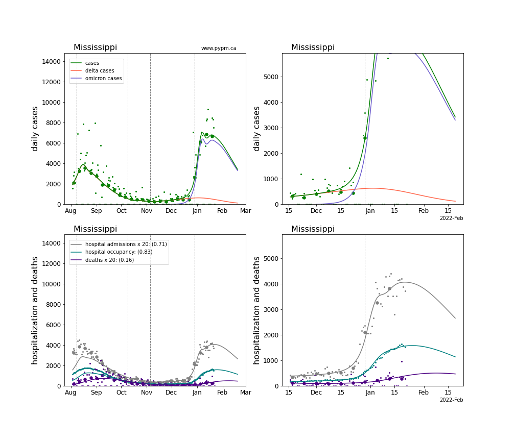
Mississippi
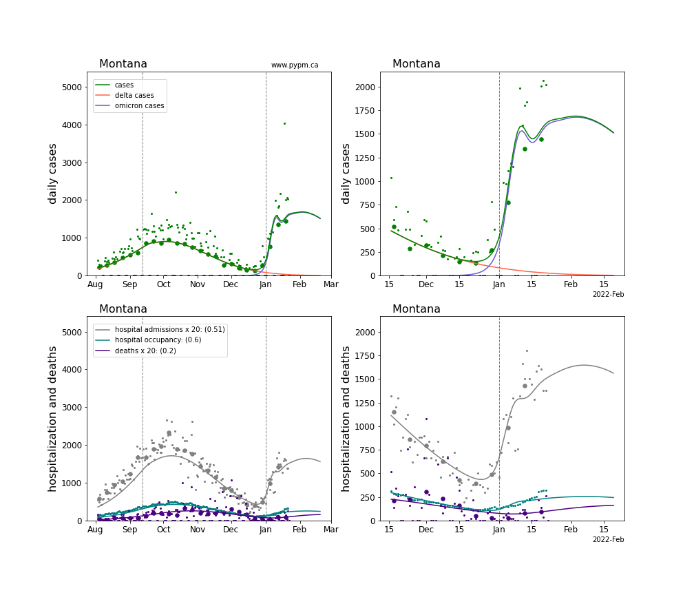
Montana
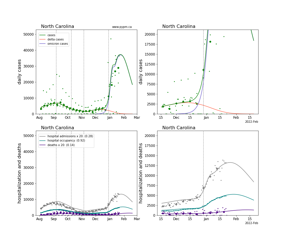
North Carolina
North Dakota
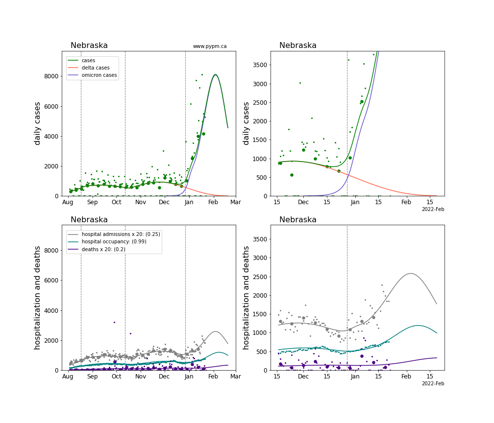
Nebraska
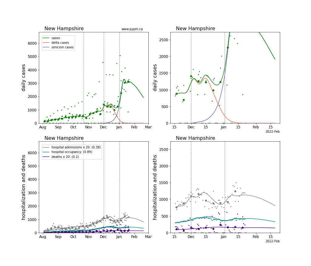
New Hampshire
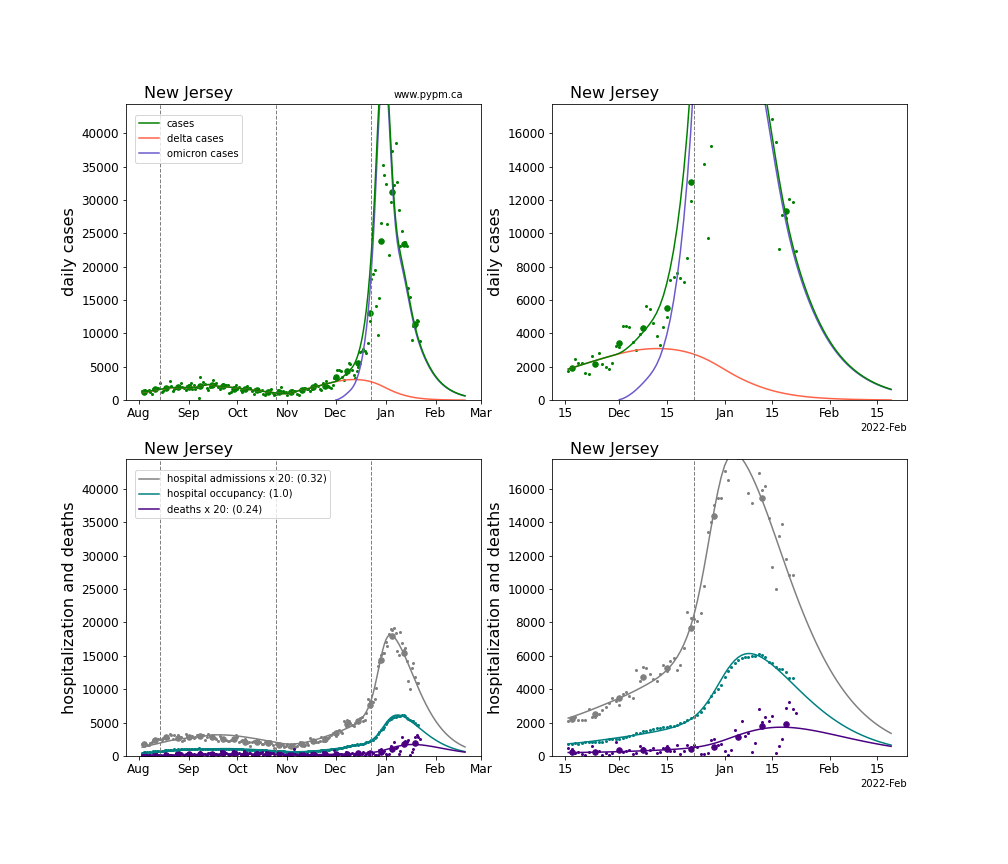
New Jersey
New Mexico
Nevada
New York
Ohio
Oklahoma
Oregon
Pennsylvania
Puerto Rico
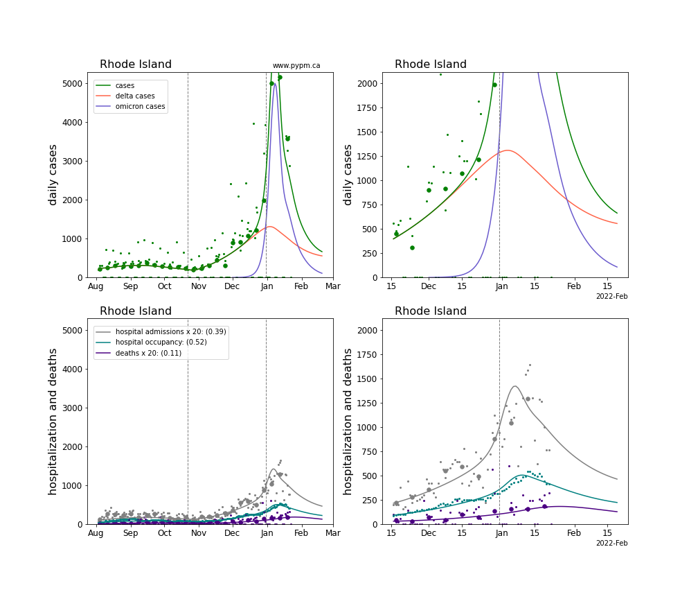
Rhode Island
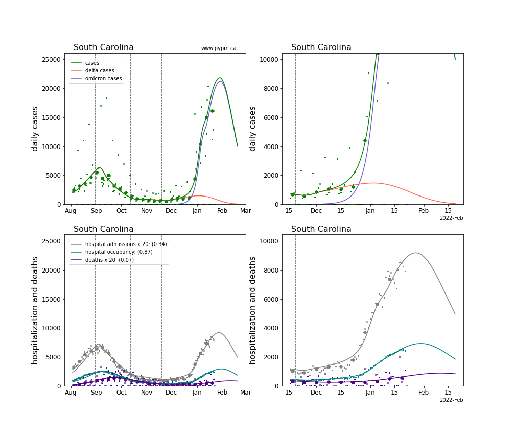
South Carolina
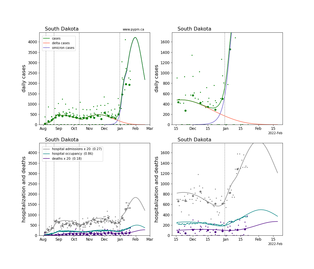
South Dakota
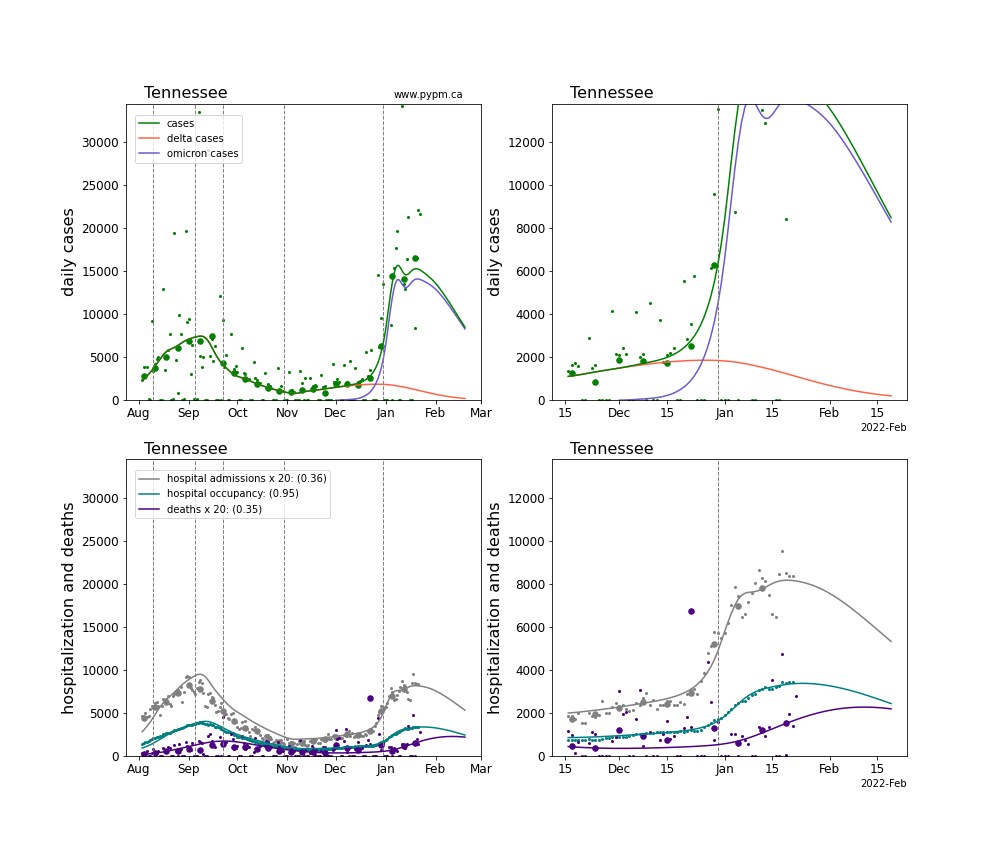
Tennessee
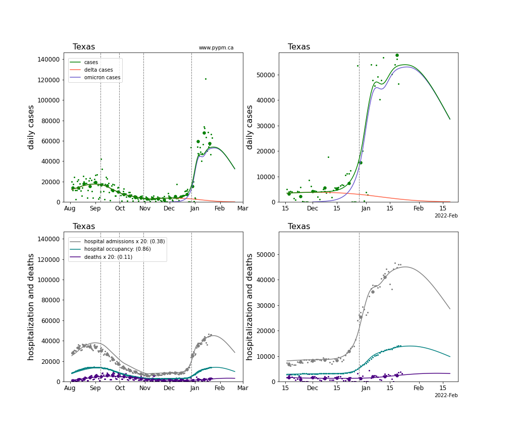
Texas
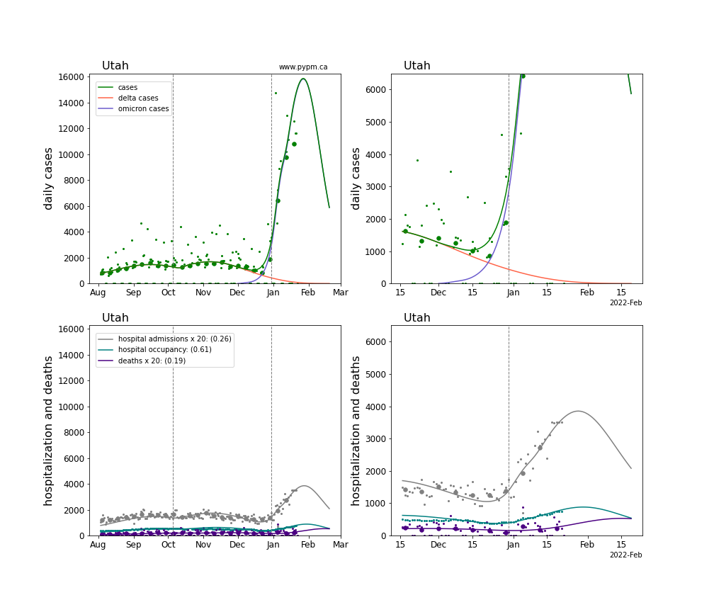
Utah
Virginia
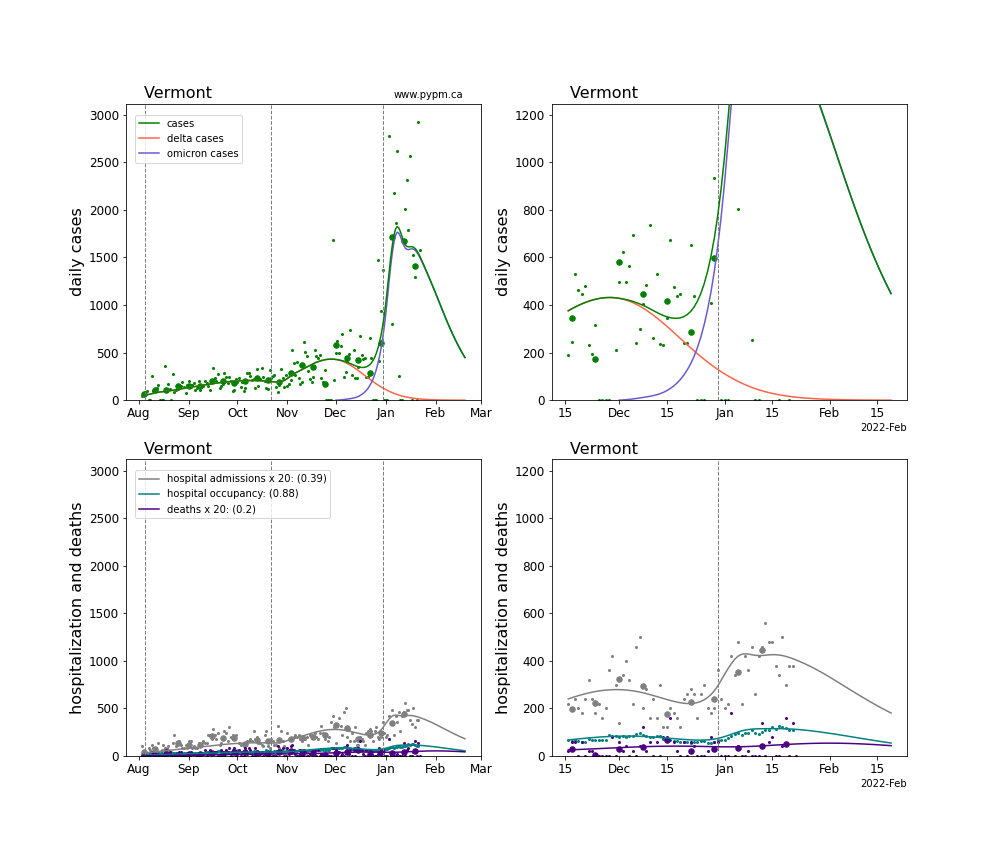
Vermont
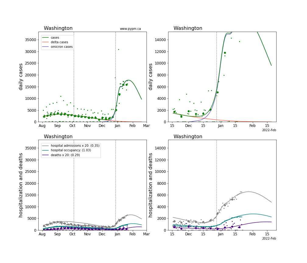
Washington
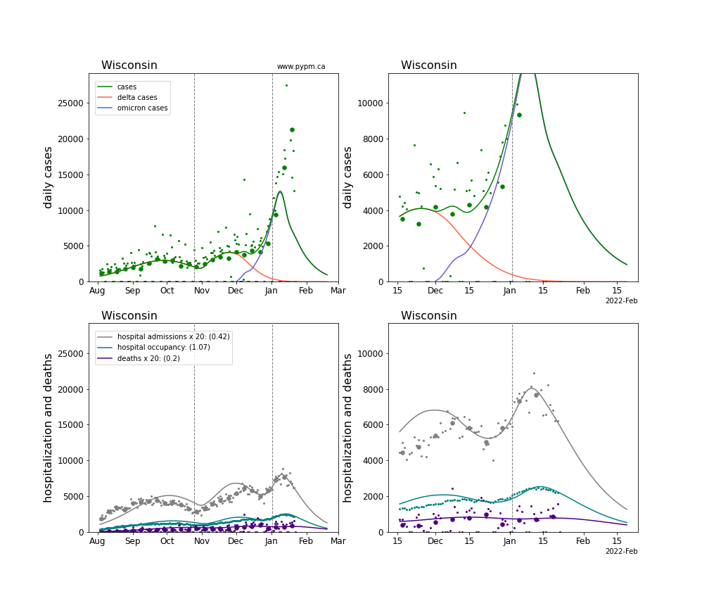
Wisconsin
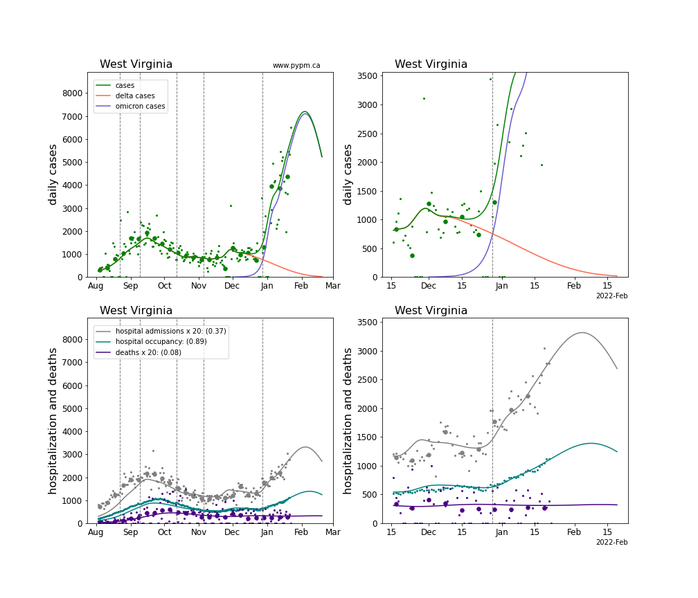
West Virginia
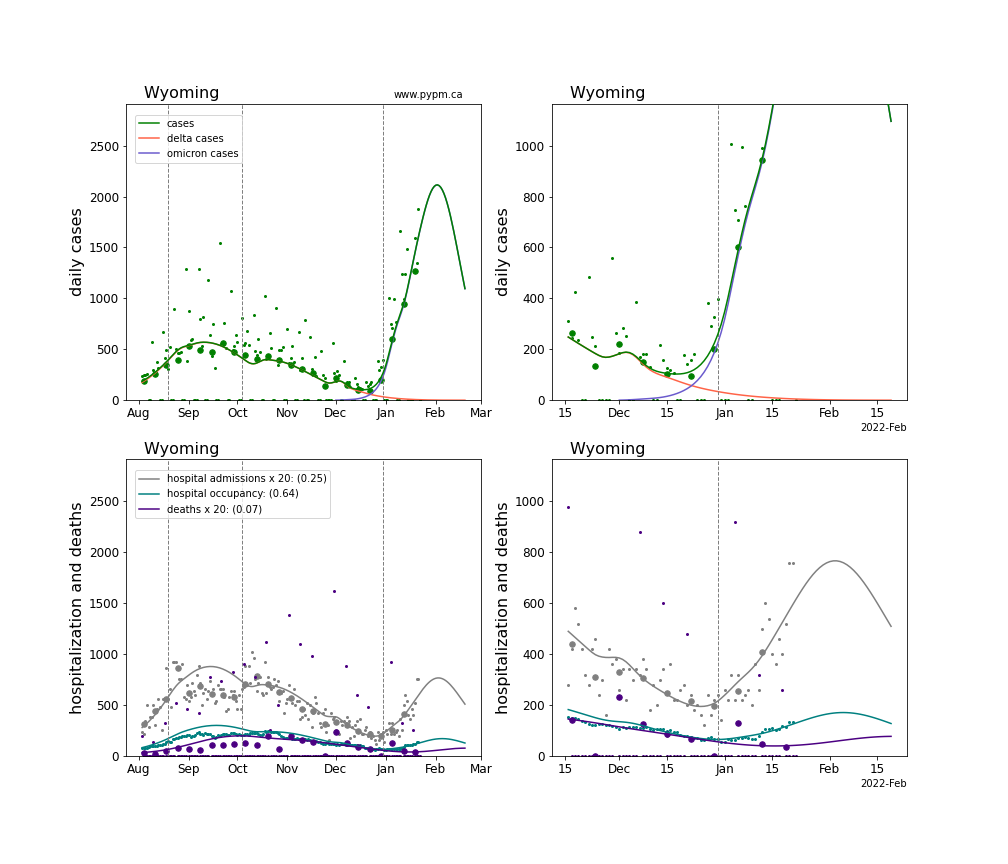
Wyoming
Comparisons of Omicron daily hospital admissions
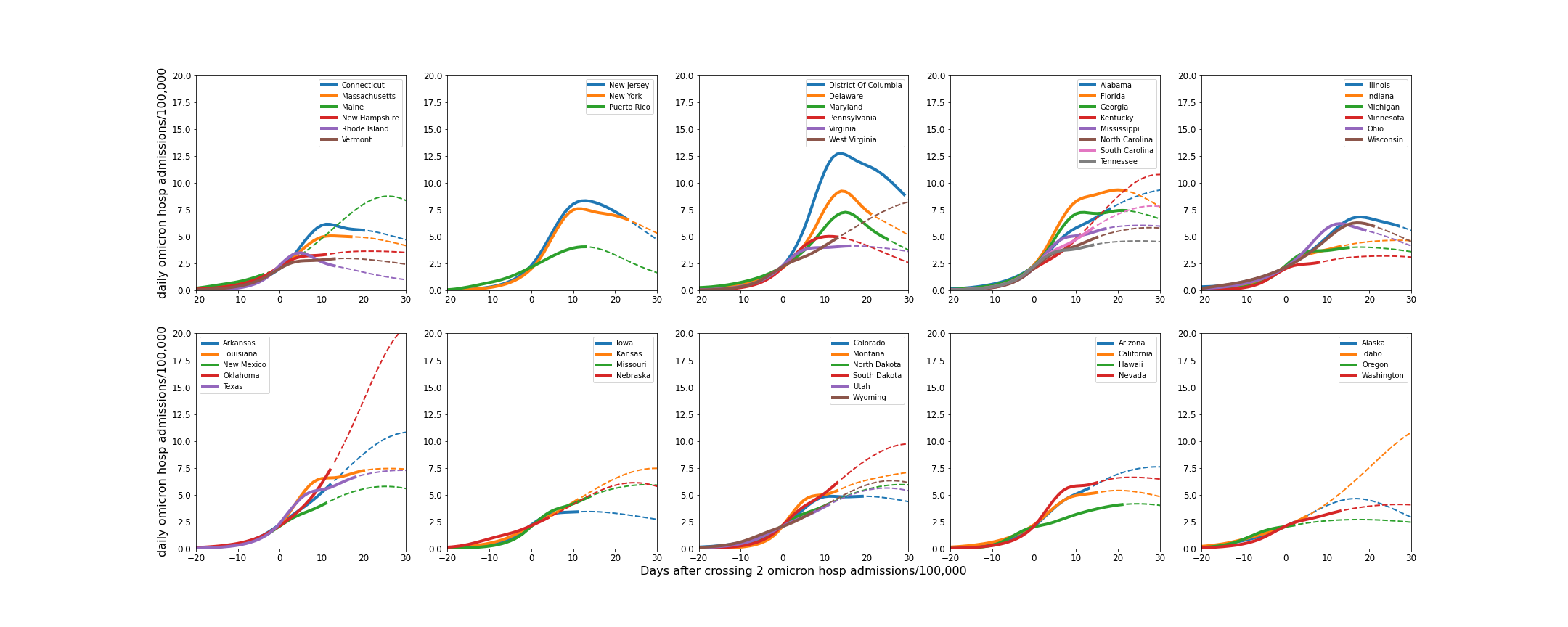
Hospital admissions can be used in a per-capita comparison of infections between states, avoiding potential issues with test capacity. Using Omicron hospital admissions removes the variability of the Delta hospital admissions taking place during the emergence of Omicron. This metric relies on a model to attribute hospital admissions during the phase when Delta contributes a substantial fraction of hospital admissions.
The plot below shows this metric, aligned on the day that Omicron hospital admissions first exceeded 2 per day per 100,000. The solid lines end on January 23, and the dashed lines show model projections.
The same figure shown in log scale:
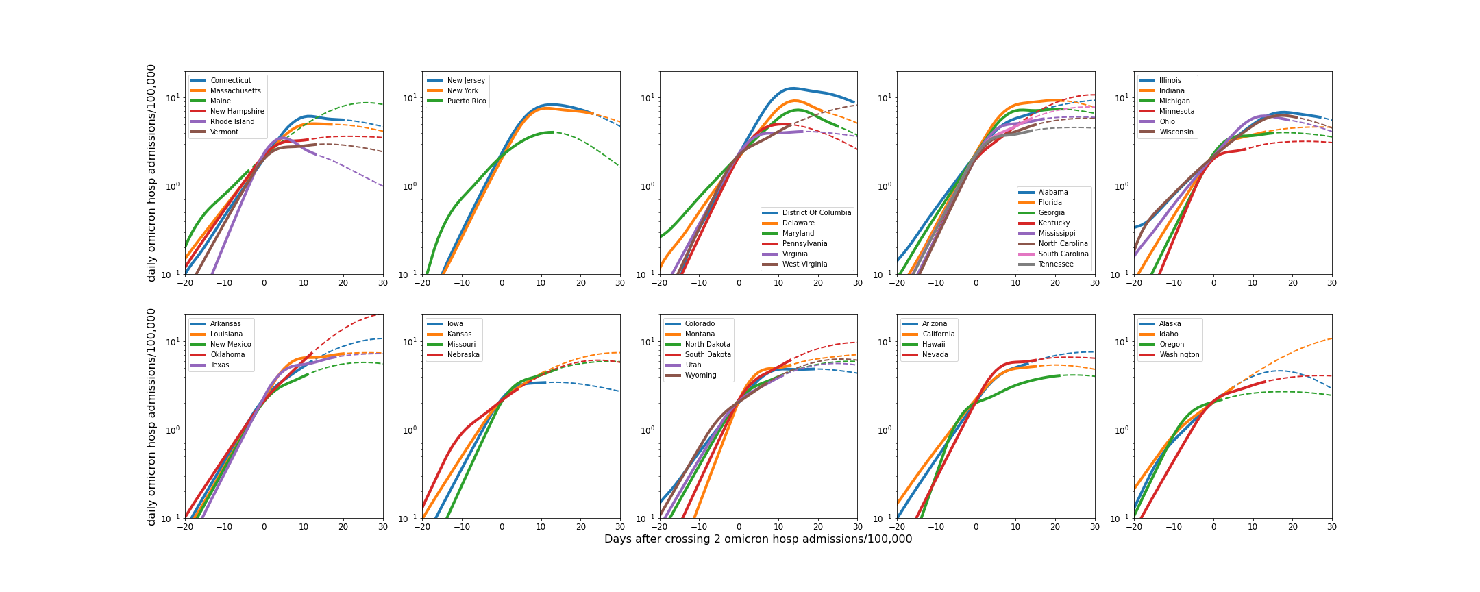
The growth pattern is remarkably similar across the states, considering the large variety of populations and environments.
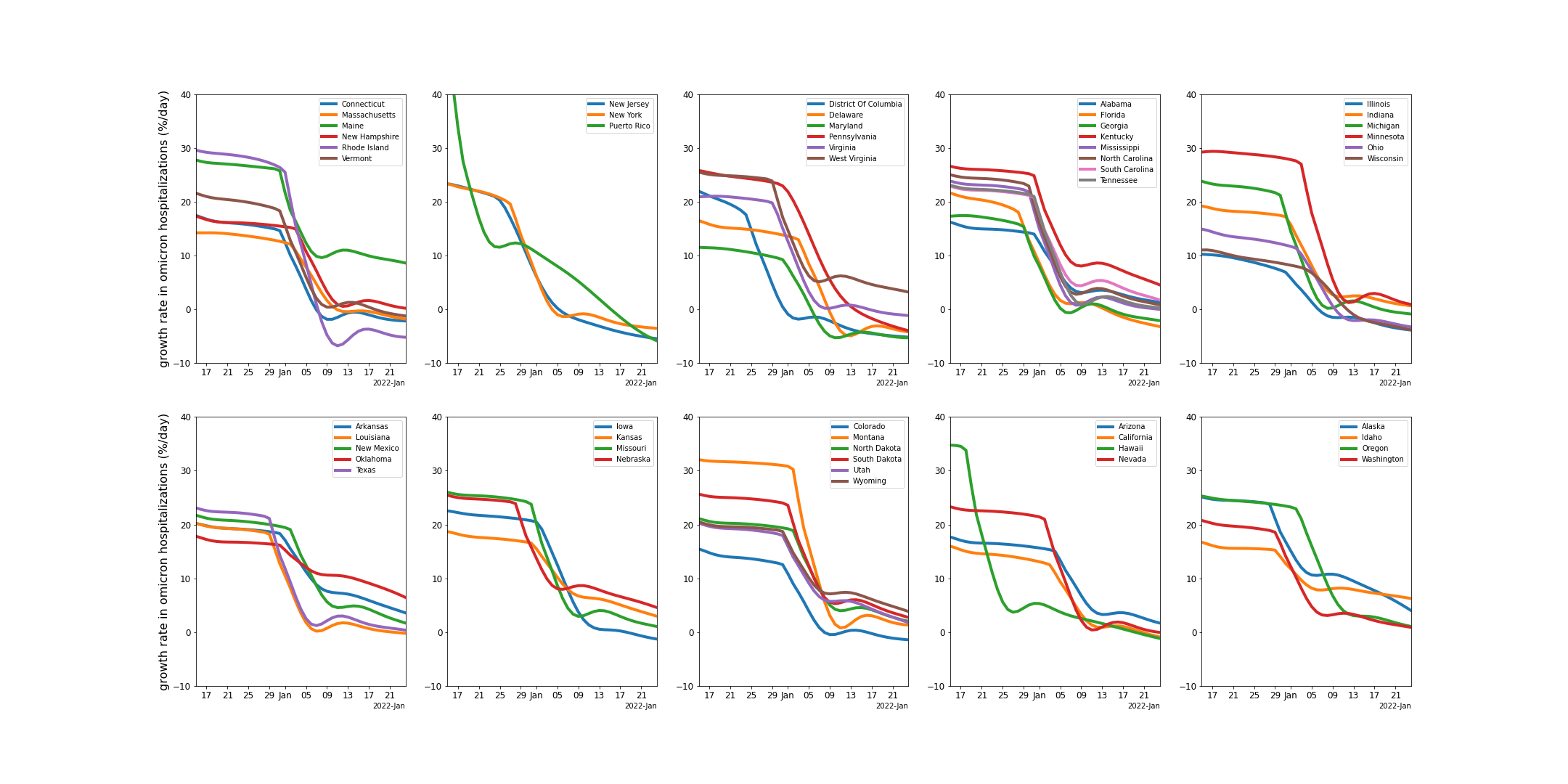
The figure below shows the daily growth rate of Omicron hospital admissions (as derived from the models). A remarkable drop in Omicron infection rates is apparent. The reason for the rather sudden and persistent change in transmission rate is not understood.
Omicron and hospitalization
The analysis presented here, fits multi-strain models to case data in each state and use hospital data to compare Omicron to Delta in terms of:
-
the relative severity of omicron infections (odds ratio for hospital admission) and relative
-
duration of hospital stays (ratio of mean duration)
Case and hospital data broken down by variant(using genomic information) are not available. Instead, the multi-strain model fit uses the characteristic signature of rapidly growing cases to describe the transition from Delta to Omicron cases. Fits are illustrated for each state showing the resulting curves for Delta and Omicron daily cases and their sum compared to overall cases.
Having the infection model defined for each variant separately allows for parameters for their relative hospitalization rate and hospital treatment durations to be fit for each state.
The Omicron severity is defined as the fraction of symptomatic Omicron infections that lead to hospitalizations, relative to the same fraction for Delta infections. Assuming that both case and hospital admission data remain consistent indicators for infections, previous analyses here have established the severity to be approximately 0.4, indicating that Omicron infections are significantly less severe than Delta infections.
For these analyses, hospital admission data were primarily used to estimate the recent infection trajectory, which could affect estimates of severity.
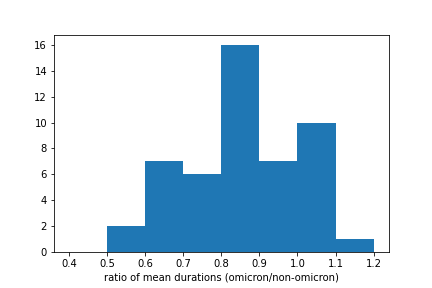
By using hospital admission and occupancy data, the duration of hospital stays can be estimated. The figures below show the estimate mean durations for Omicron and Delta hospitalizations, and their ratio. The mean ratio of durations is 0.9 with a standard deviation of 0.2. The duration of treatment does not appear to be significantly shorter for Omicron hospitalizations.

Individual state hospitalization analyses
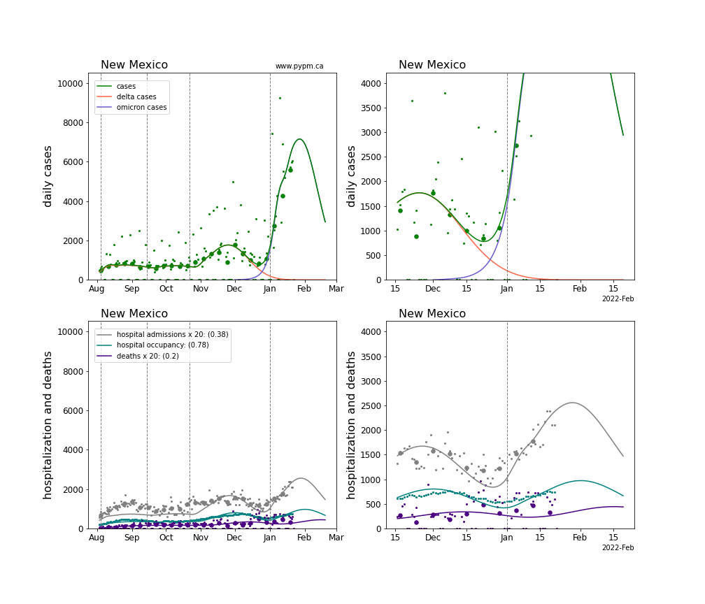
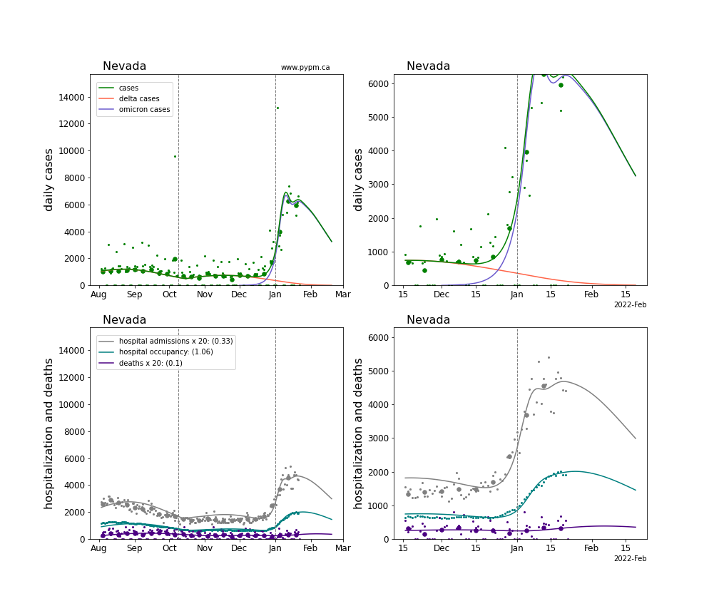
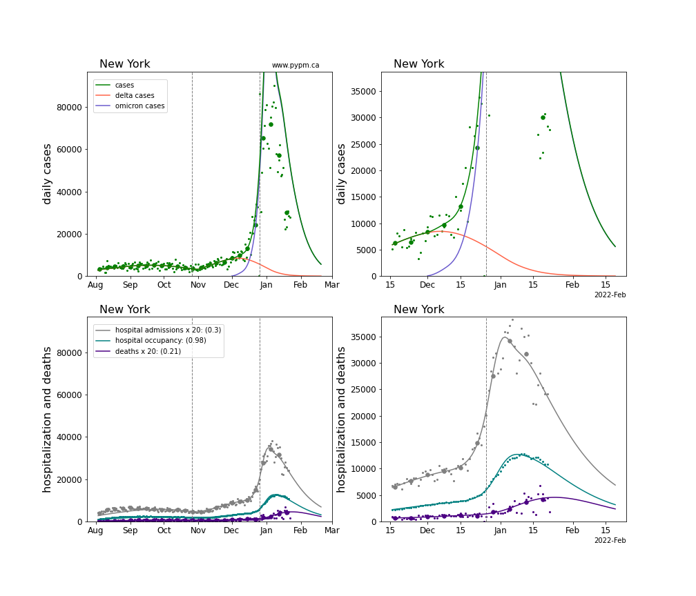
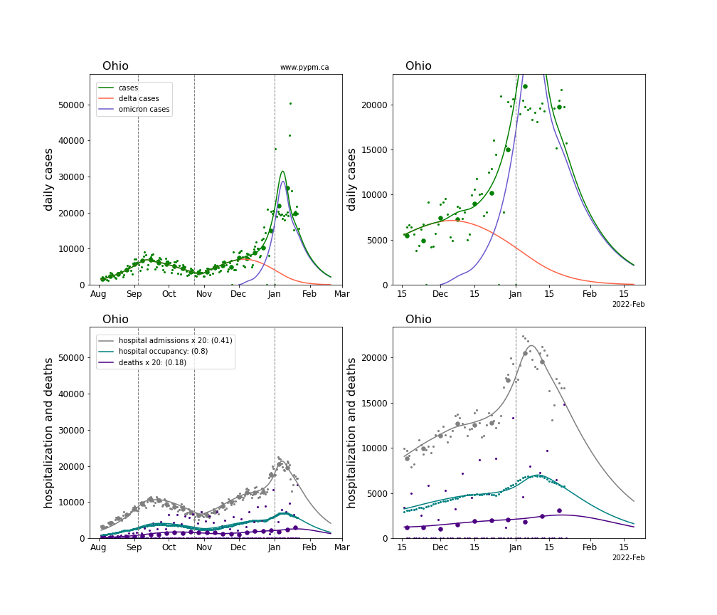
The plots for each state below show the case, hospitalization, and deaths data since August 2021 (left) and since November 15 2021 (right). The maximum vertical axis values for cases are 500/100k (left) and 200/100k (right). Daily hospital admissions and deaths are scaled up by 20 to be able to see them on a single plot.
The severity is estimated from the hospital admission data, and its value is shown in the legend. The hospital durations (mean Omicron duration and mean Delta duration) are estimated from the hospital occupancy data, and the ratio (Omicron divided by Delta) is shown in the legend. Omicron and Delta hospital parameters can both be estimated from these data only because of the different relative prevalence by date, as indicated by the fits to the case data.
For many states there are now sufficent data to estimate the relative death rates for Omicron and Delta infections, with values shows in the legend. For the remaining states, round estimates of 0.1 or 0.2 are shown.
Alaska
Alabama
Arkansas
Arizona
California
Colorado
Connecticut
District Of Columbia
Delaware
Florida
Georgia
Hawaii
Iowa
Idaho
Illinois
Indiana
Kansas
Kentucky
Louisiana
Massachusetts
Maryland
Maine
Michigan
Minnesota
Missouri
Mississippi
Montana
North Carolina
North Dakota

Nebraska
New Hampshire
New Jersey
New Mexico
Nevada
New York
Ohio
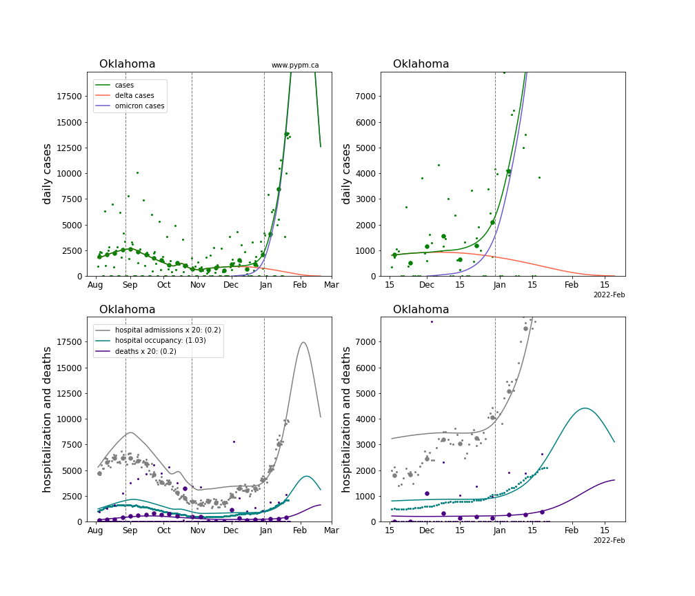
Oklahoma
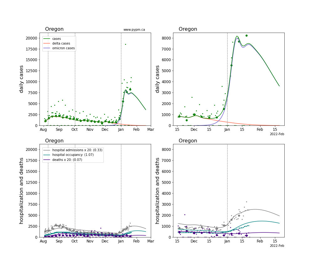
Oregon
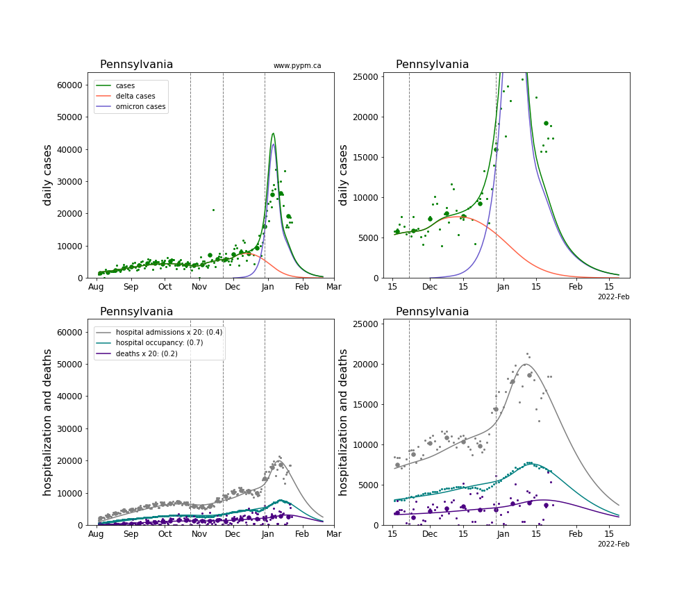
Pennsylvania
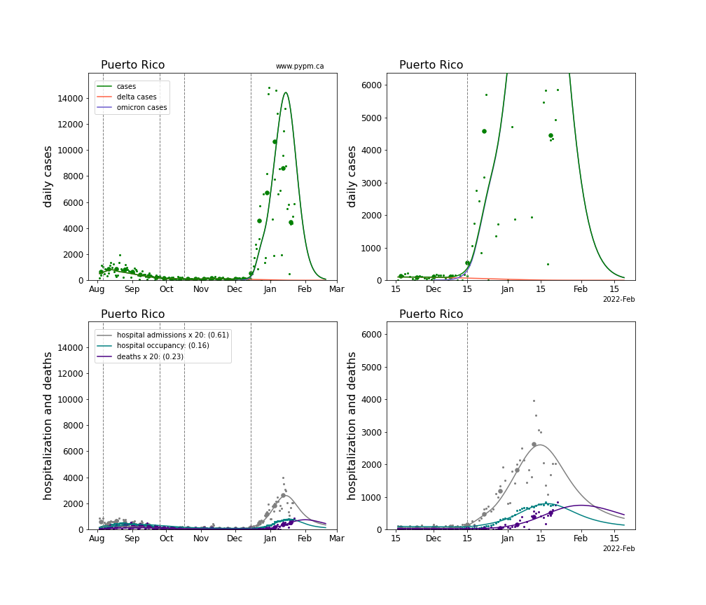
Puerto Rico
Rhode Island
South Carolina
South Dakota
Tennessee
Texas
Utah
Virginia

Vermont
Washington
Wisconsin
West Virginia
Wyoming
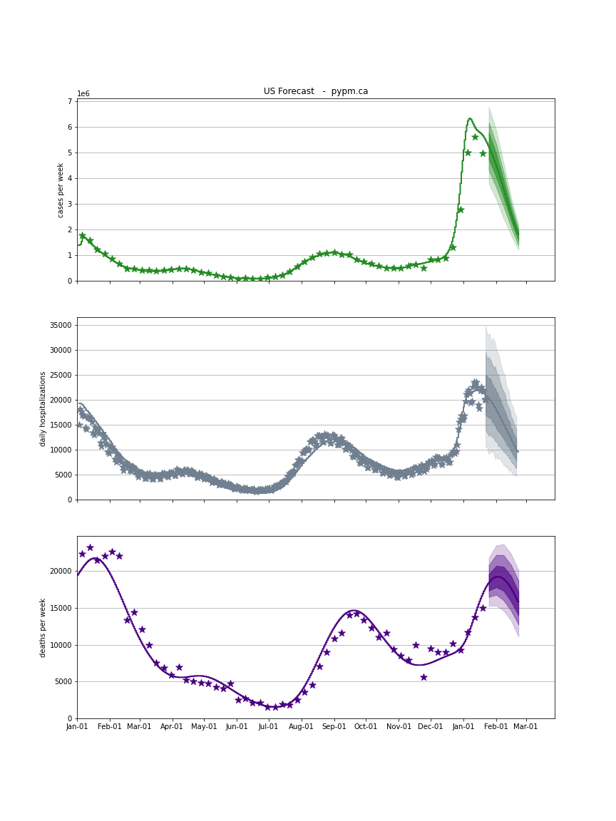
USA Forecast
The following plots show the combined US 4 week forecast. The shaded areas are 50%, 80%, and 95% intervals. Overall, case rates and hospitalizations are expected to begin declining while deaths are forecast to grow.
USA