December 26, 2021 Omicron projections for US states
Omicron infections are spreading rapidly around the globe. Doubling times of 2-3 days are found in many jurisdictions.
For several US states, omicron produces most of the cases resulting in significant increases in case growth rates. Unlike earlier studies posted on this site, only a subset of states are included in this report, namely those with an apparant omicron signature in their case data.
Fitting models to these data at this stage gives estimates for omicron growth rates and current case fraction, but with rather large uncertainty. Detailed error analysis is not performed, given the rapidly changing situation.
As a first attempt to estimate severity of omicron infections, an omicron scaling parameter is fit. The hospitalization probability for omicron infections is given by the product of tha parameter and the probability for hospitalization for delta infections.
The mean fit value is 0.28 and the standard deviation is 0.16. It appears that omicron infections that lead to cases is less severe than delta infections that lead to cases.
Individual state projections
For this analysis, the data source was switched from JHU to the New York Times, since the latter has more regular updates and fewer irregularities.
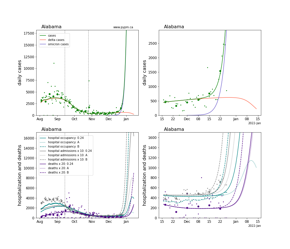
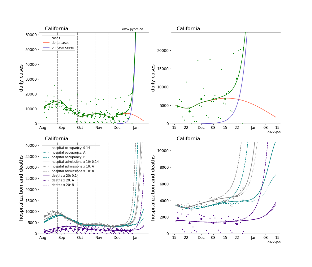
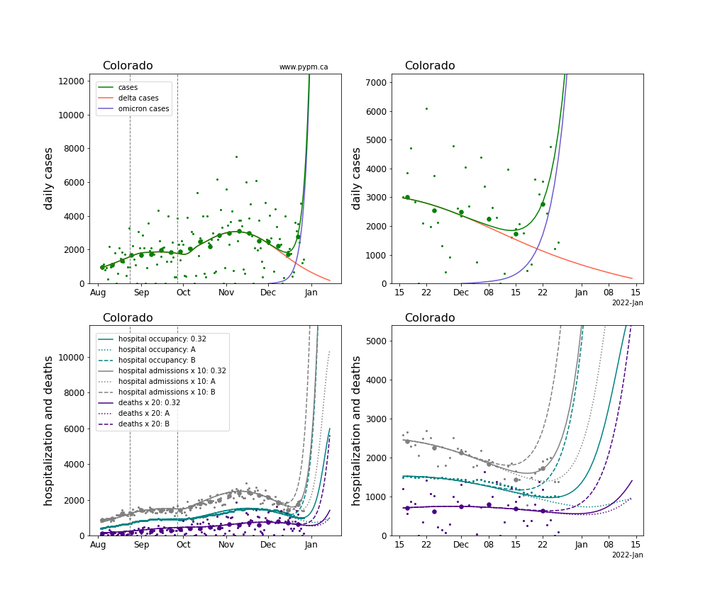
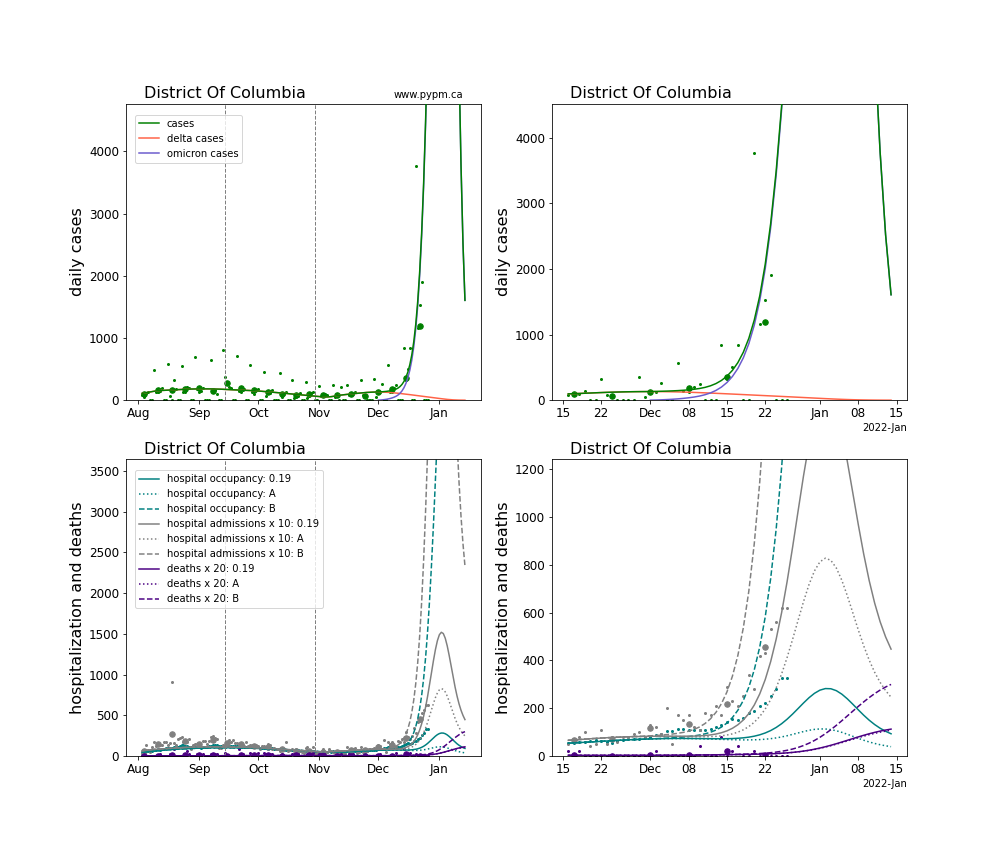
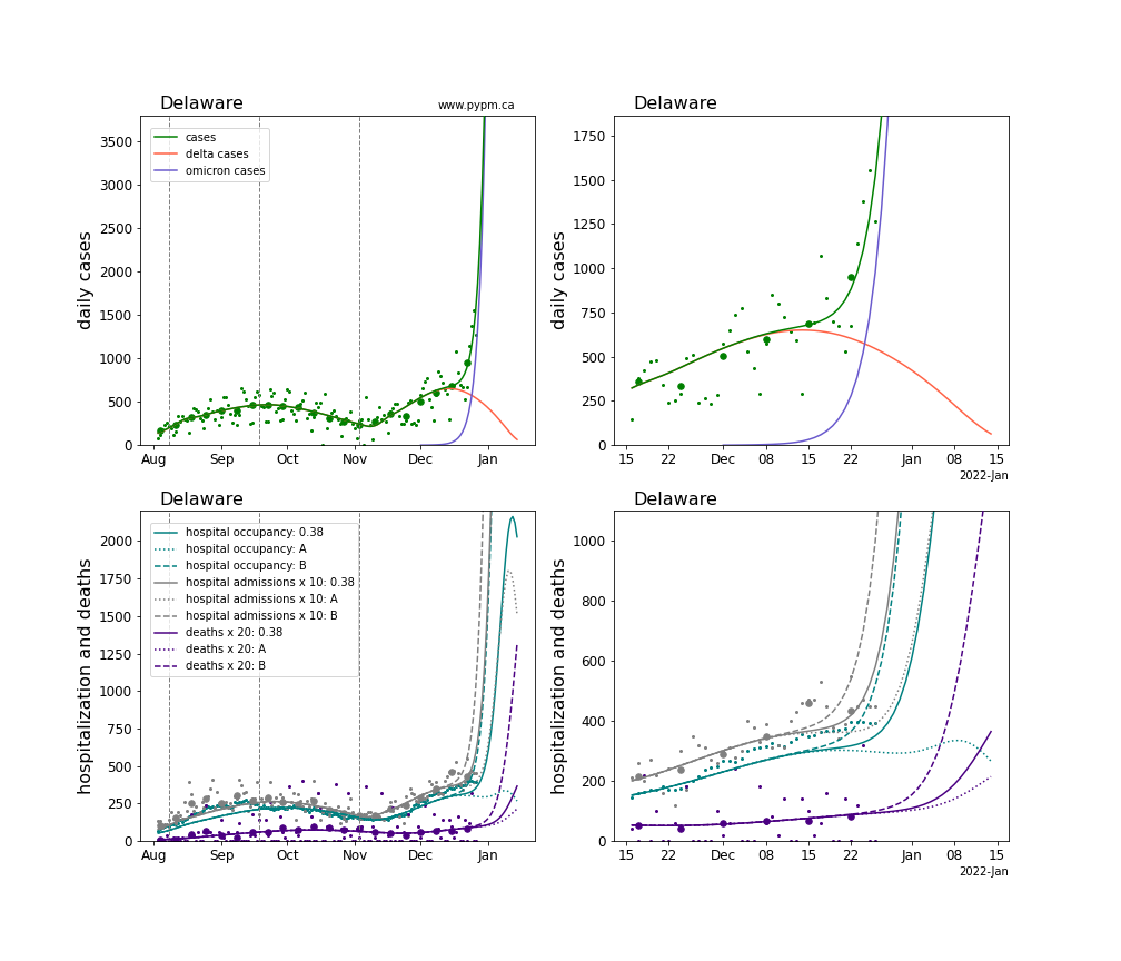
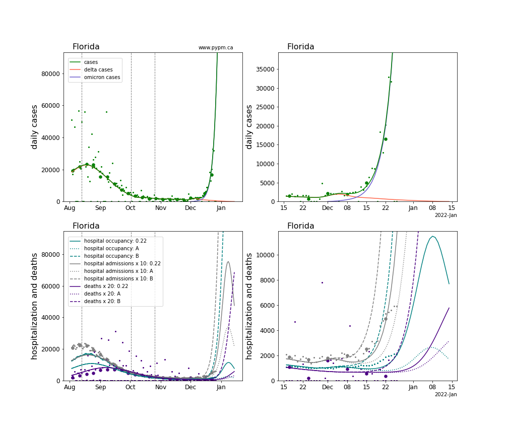
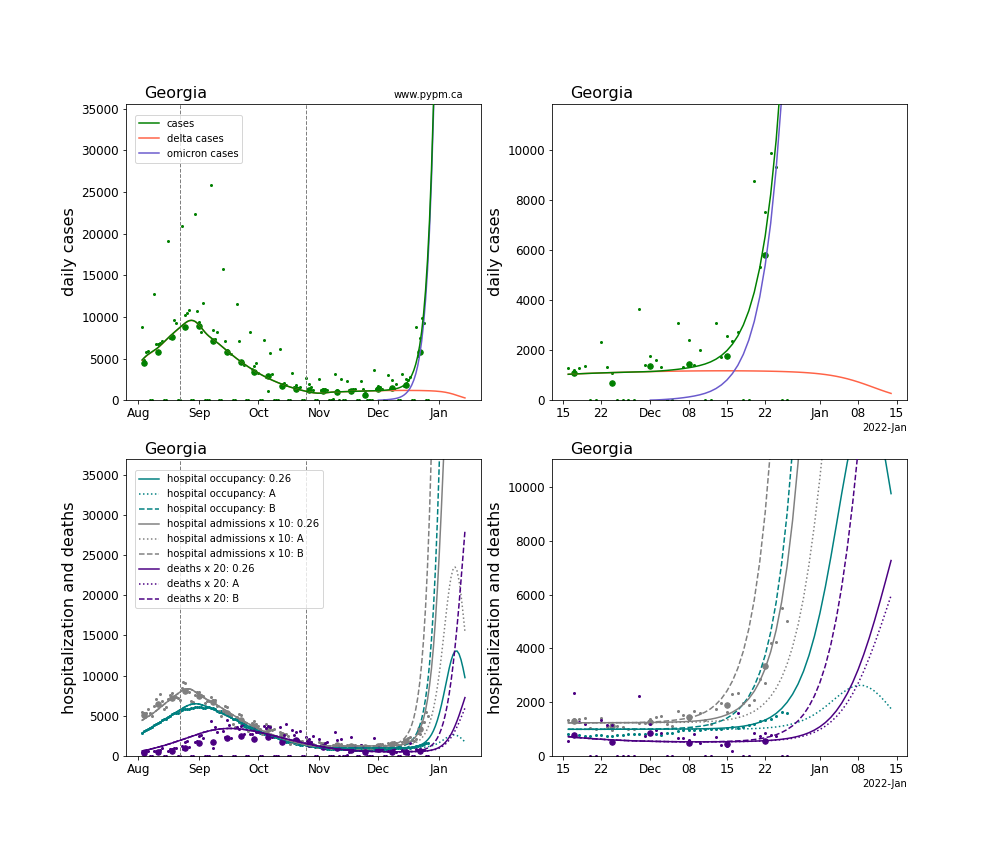
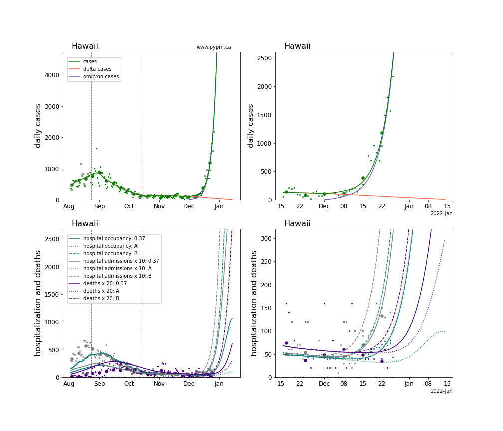
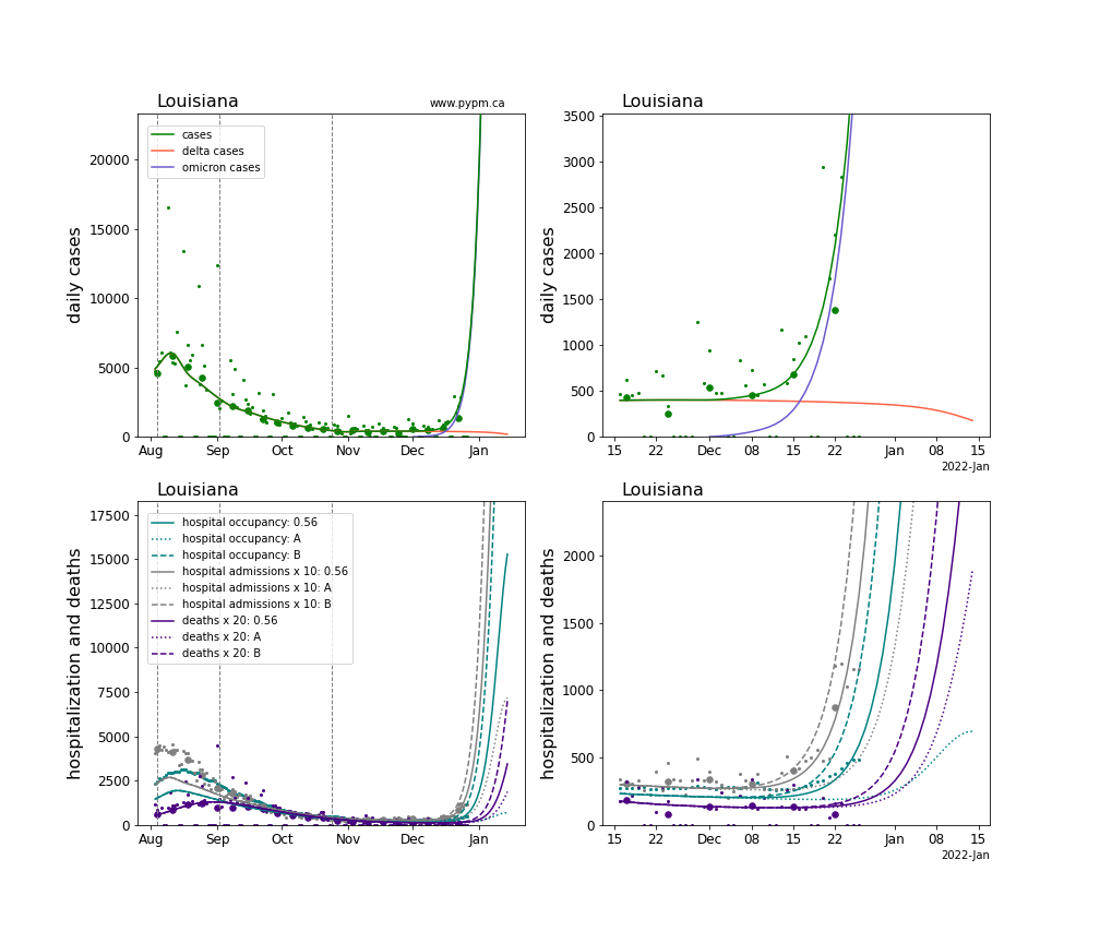
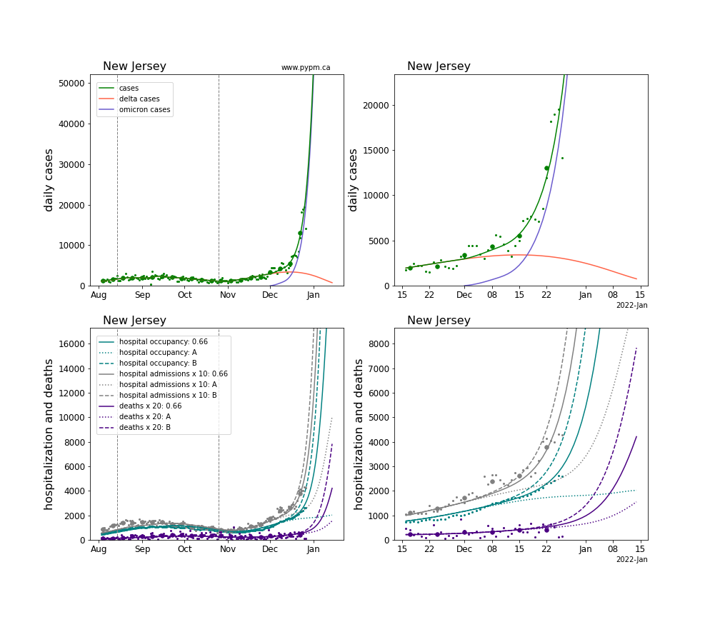
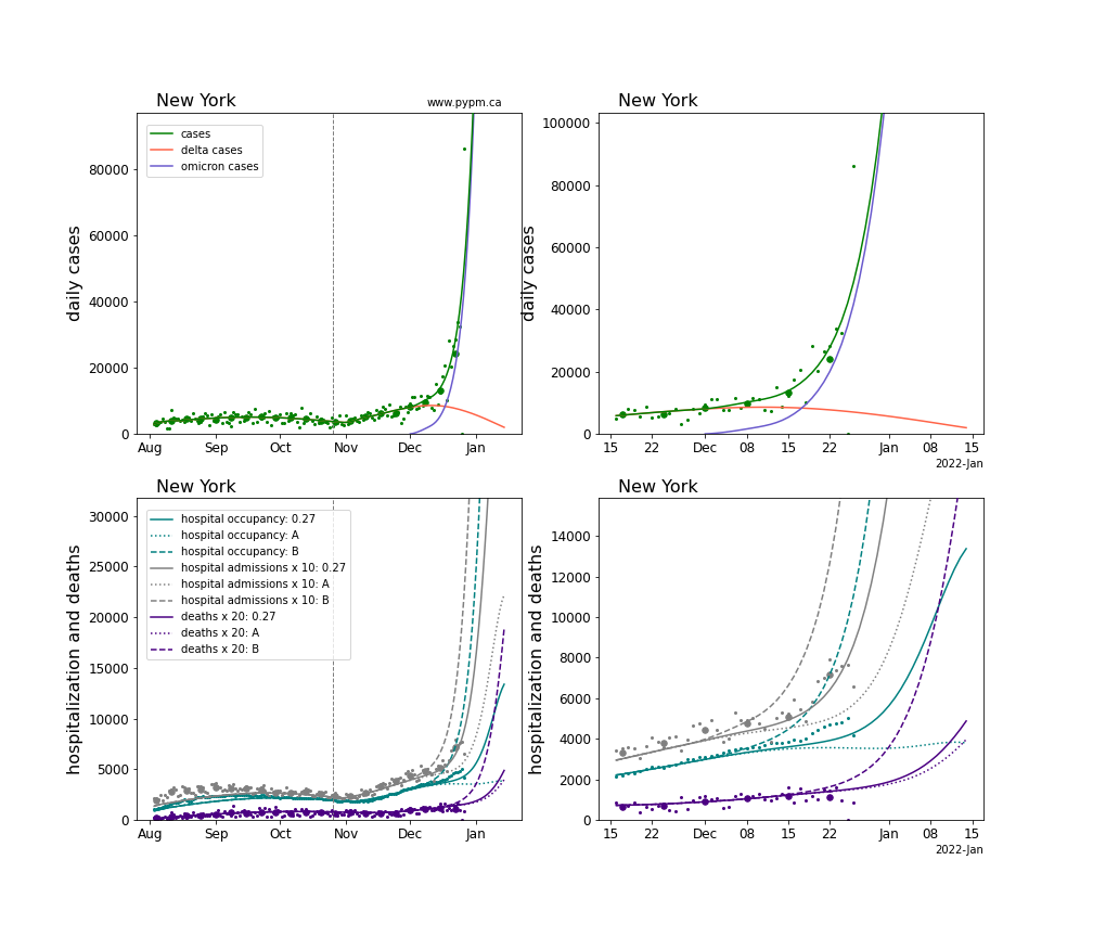
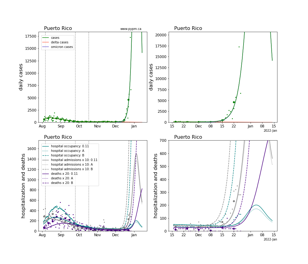
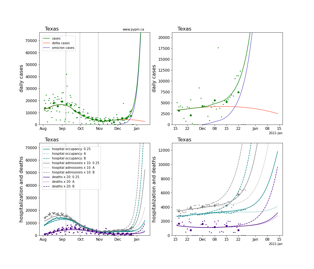
The plots for each state below shows the case, hospitalization, and deaths data since August 2021 (left) and since November 15 2021 (right).
Generally, the infection model is defined by fitting the model to the case data, and the hospitalization and deaths models are derived from the infection model.
The omicron variant is assumed to have a much larger susceptible population, due to its ability to evade immunity (natural and vaccination immunity). For this study, those immunized against earlier strains only have 20% effective immunity against omicron.
In addition to the fit severity, two other severity levels are considered:
- A: Probability for an omicron infected person to need hospitalization is reduced by the multiplicative factor of 0.1 and the probability of death is reduced by that factor squared. The length of hospital stays for all are reduced by the same factor.
- B: The severity factor is 1., or in other words, there is no reduction in severity as compared to delta infections.
The plots below show projections for hospitalization (daily admissions and hospital occupancy) and for deaths, for the three severity levels.
The green points are the daily cases, the grey points the daily hospitalizations, the teal points are hospital occupancy, and the indigo points are the daily deaths. The larger circles are weekly averages to help guide the eye.
The case data are used to define the periods for which transmission rate appears to be constant. The vertical lines show where the transmission rate is changed. If the susceptibe fraction is constant (immunity not changing quickly), constant transmission rates lead to steady exponential growth or decline. With immunity growing, the curves bend downwards due to the herd effect. Interpretting the growth of omicron with changing delta rates growth rates leads to additional uncertainty in the interpretations.
The curves are the model expectations for cases, hospitalizations, and deaths, and all three are determined from the case data.
There are several challenges arising from data issues, in particular Thanksgiving closures and possible infection outbreaks, and Christmas closures. In the past few months, hospitalization per case has generally declined, whereas the model assumes constant probability for an infection to lead to hospitalization.
The numerical value indicate in the plot legend is the fit value for the omicron severity parameter.
Alabama
California
Colorado
District Of Columbia
Delaware
Florida
Georgia
Hawaii
Louisiana
New Jersey
New York
Puerto Rico
Texas
Virginia
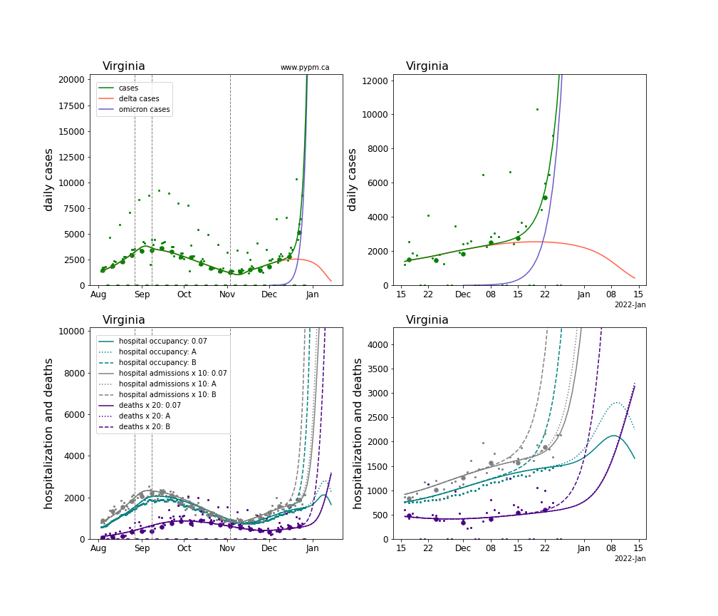
Table of omicron parameter estimates
| State | growth (%/day) | current case fraction (%) |
|---|---|---|
| AL | 37 | 87 |
| CA | 30 | 75 |
| CO | 26 | 86 |
| DC | 26 | 99 |
| DE | 36 | 72 |
| FL | 29 | 99 |
| GA | 30 | 95 |
| HI | 23 | 98 |
| LA | 28 | 94 |
| NJ | 20 | 88 |
| NY | 20 | 88 |
| PR | 31 | 99 |
| TX | 18 | 77 |
| VA | 37 | 86 |