October 24, 2021 Analysis of USA state data
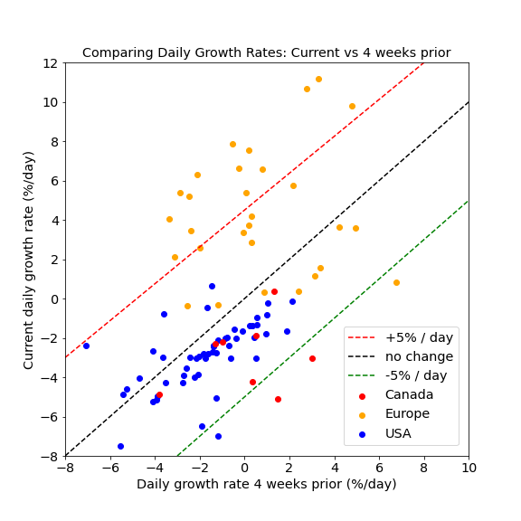
Summary: For all states, daily growth rates for cases are negative, meaning that infection rates are in decline. Furthermore, the daily growth rates themselves are trending more negative for many states. These states have a growth rate that is 2%/day less than they were 4 weeks ago. That rate of change of the growth rate is consistent with the effect of increasing immunity in the population.
The comparison of growth rates now and 4 weeks ago are shown in the figure below for US states, Canadian provinces, and European nations. The situation in Europe is very concerning, showing an increase in growth rates by 5%/day or more, resulting in rapid growth in the majority of Europe. European studies are posted here.
Individual state histories
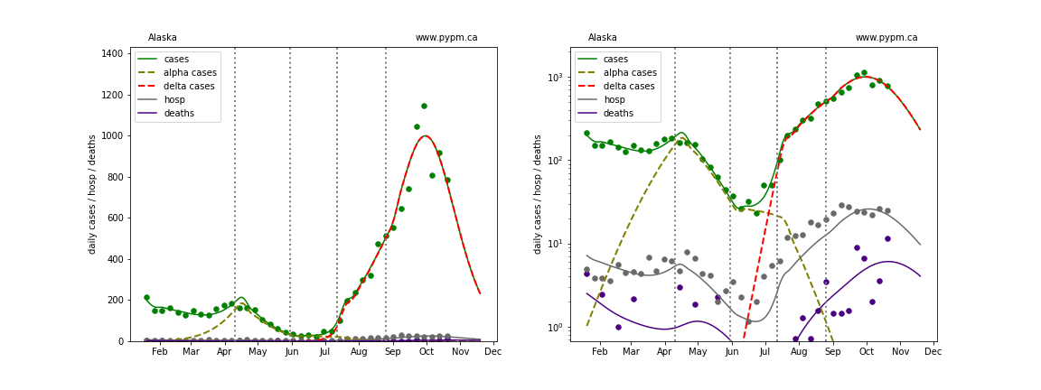
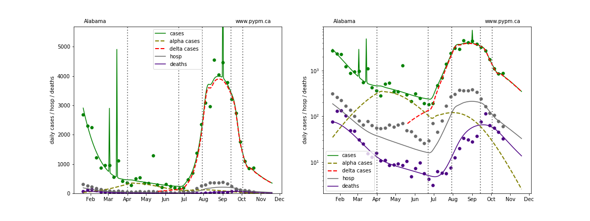
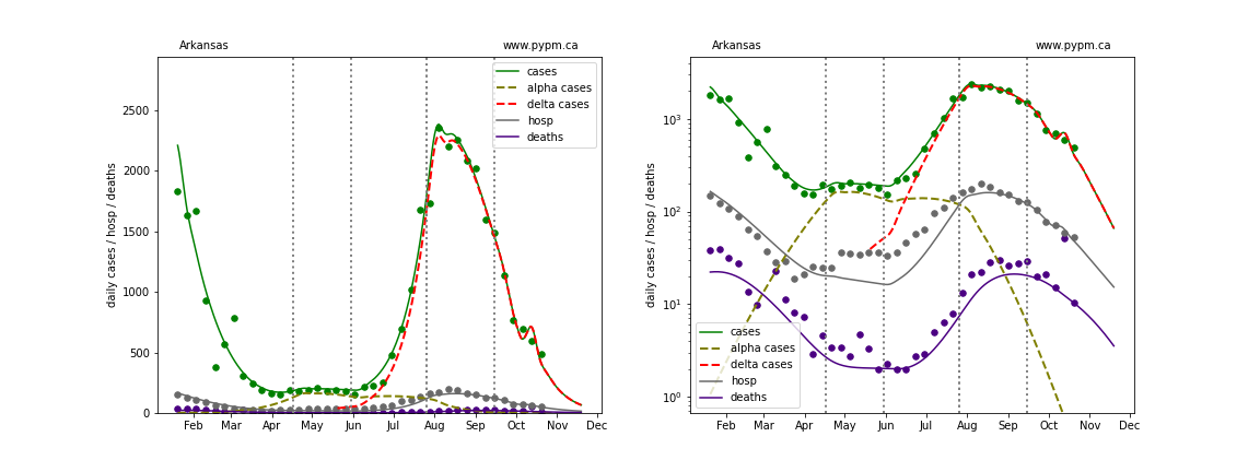
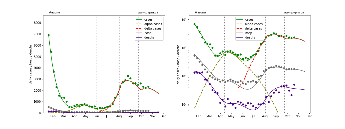
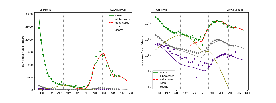
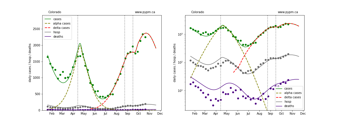
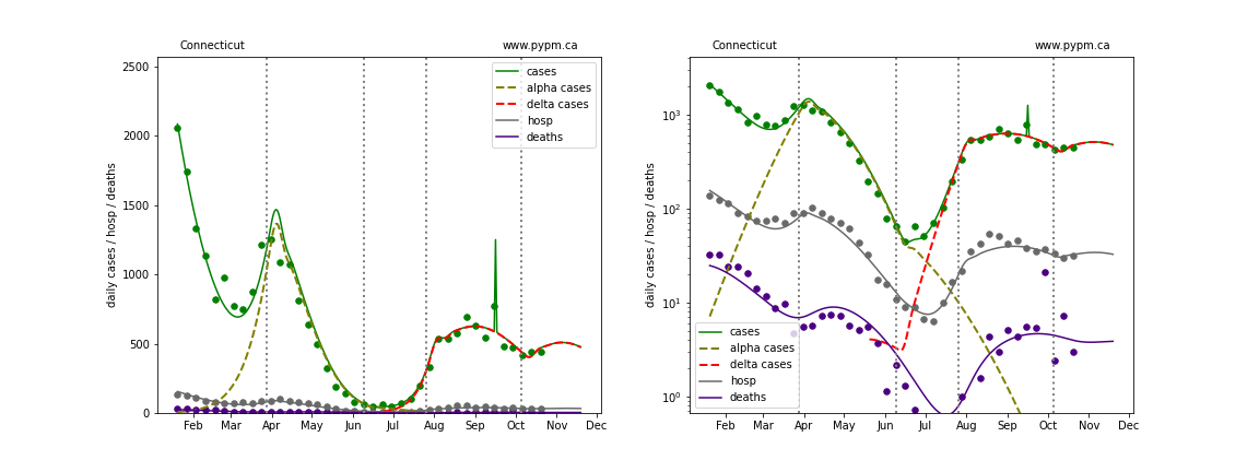
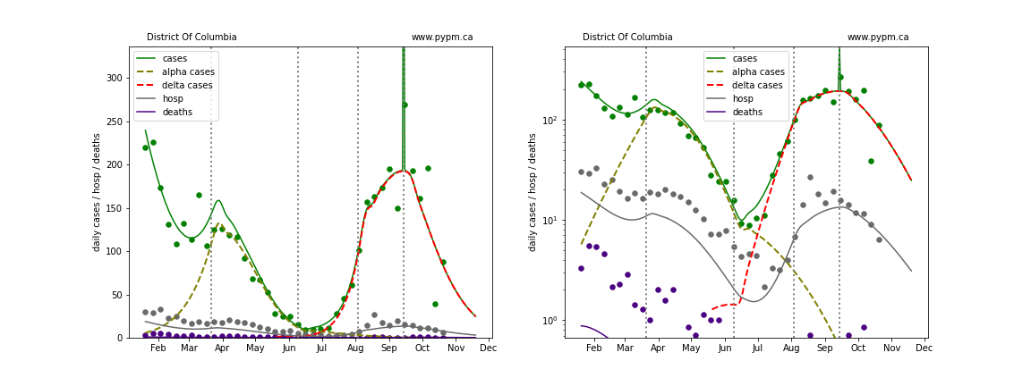
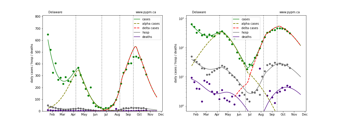
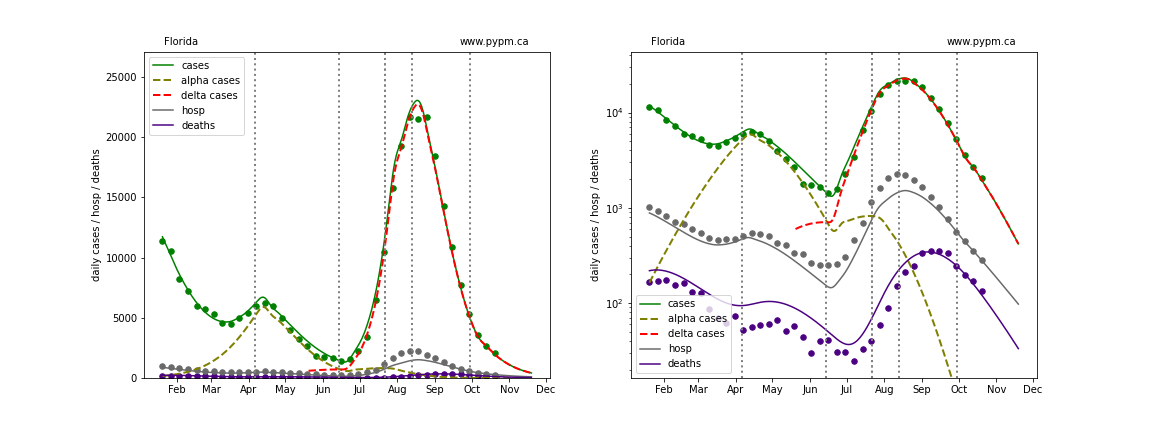
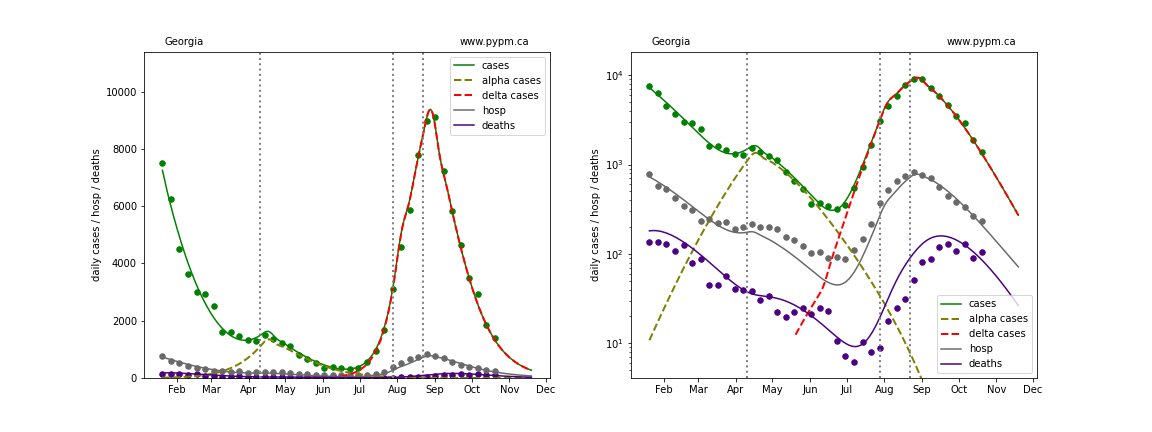
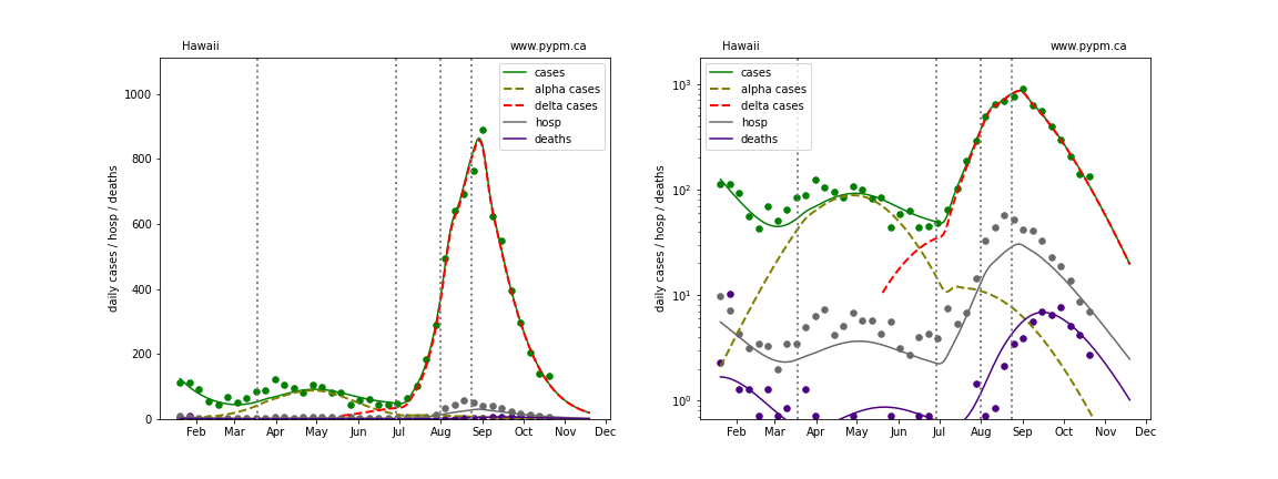
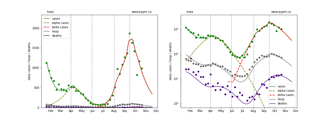
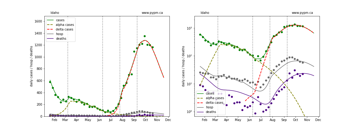
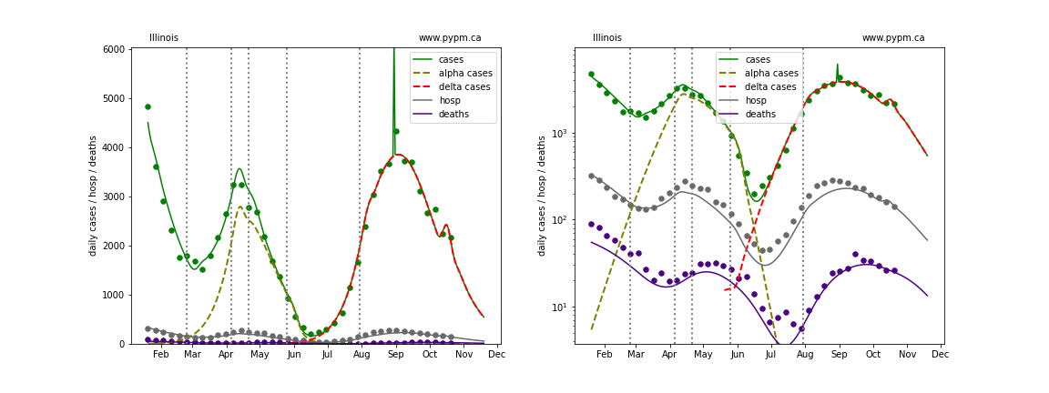
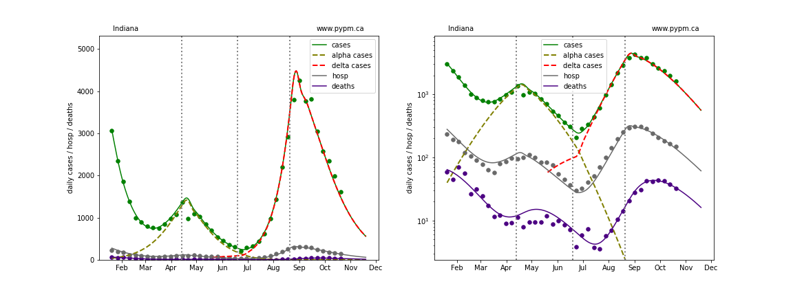
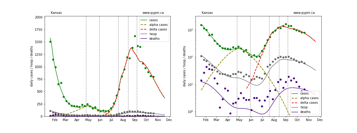
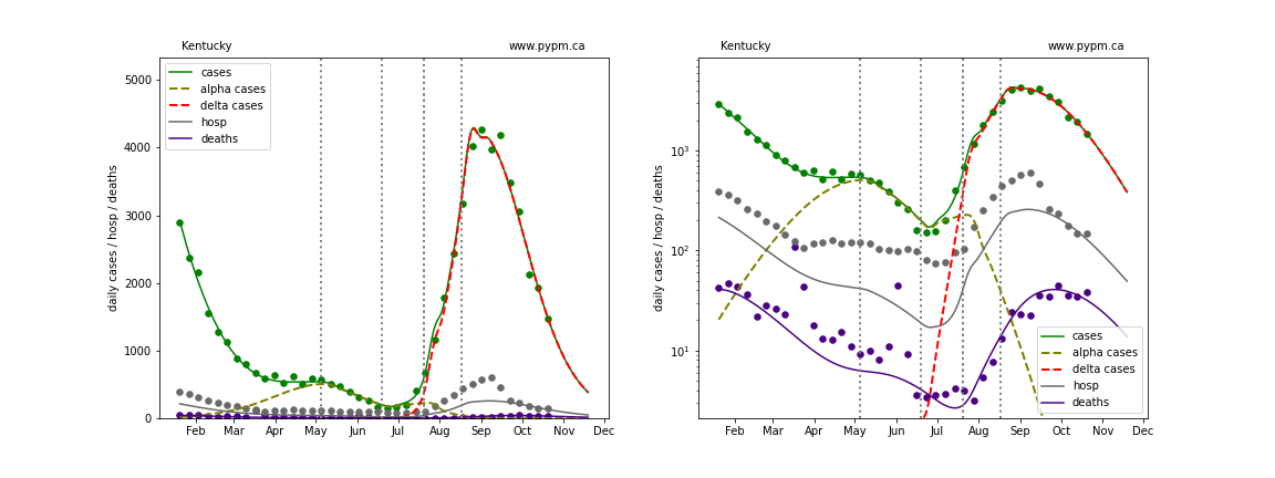
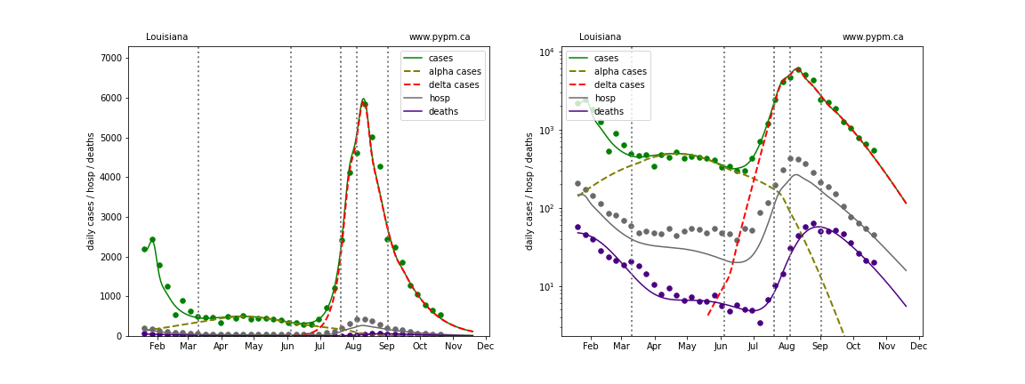
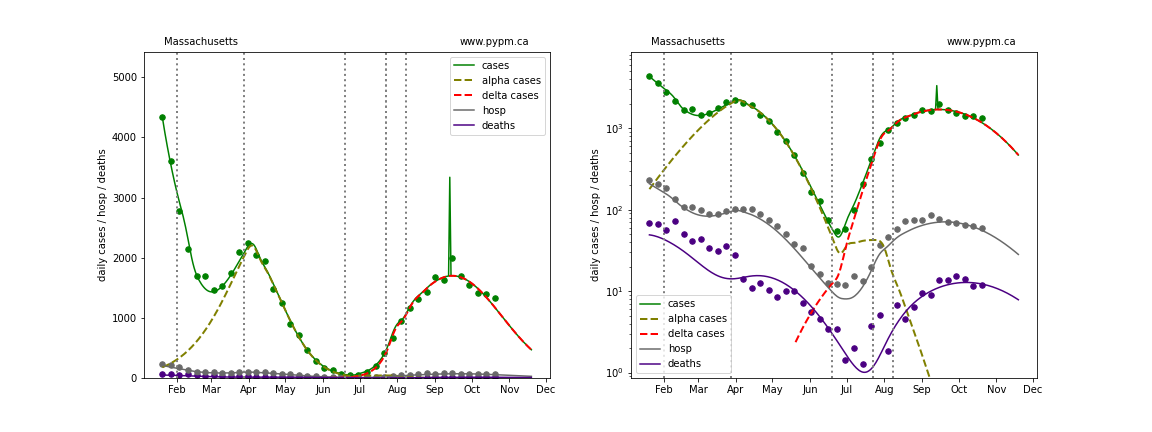
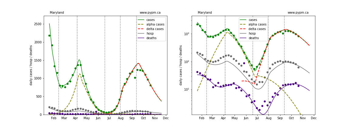
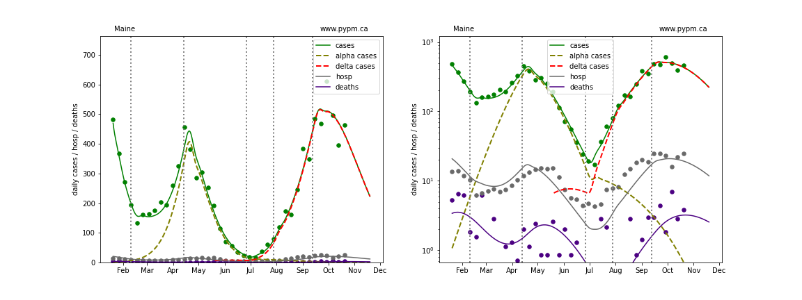
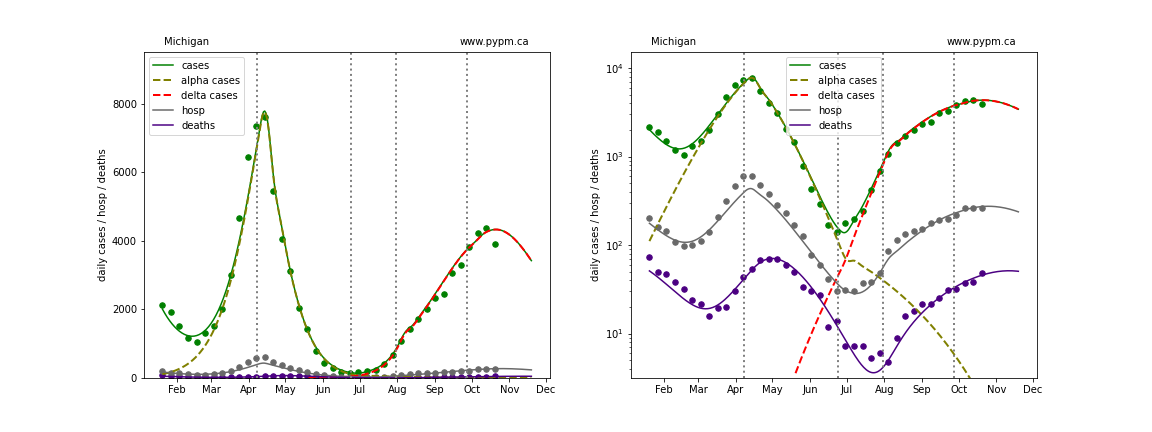
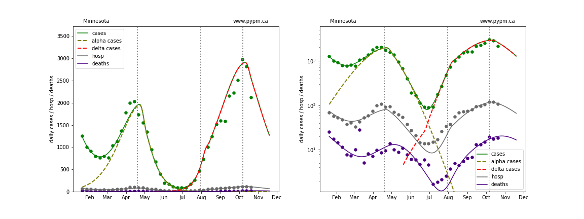
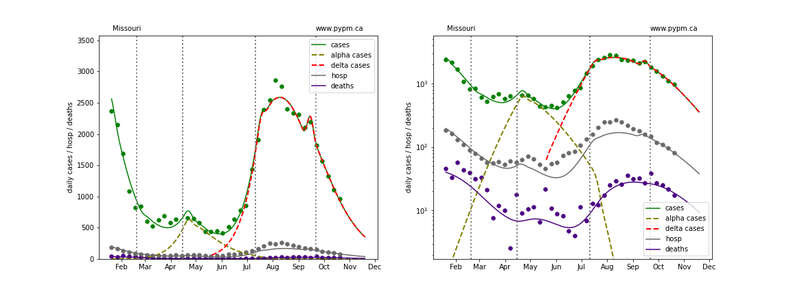
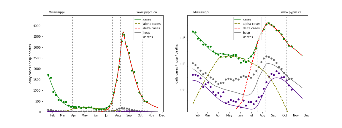
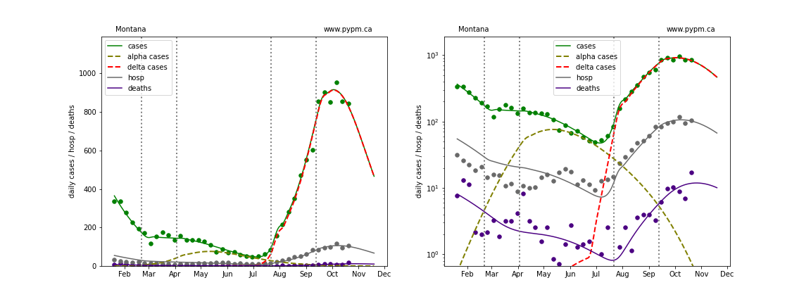
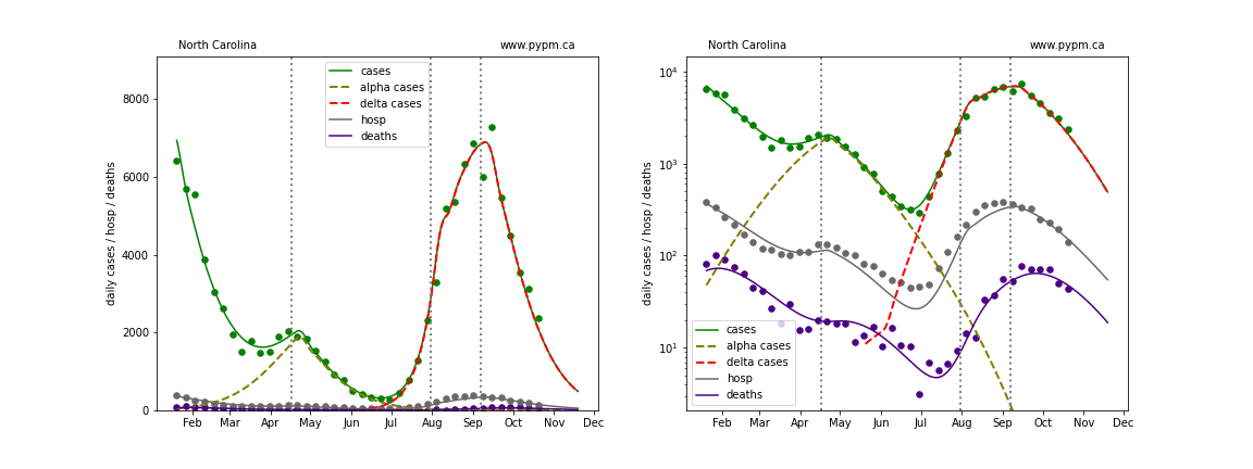
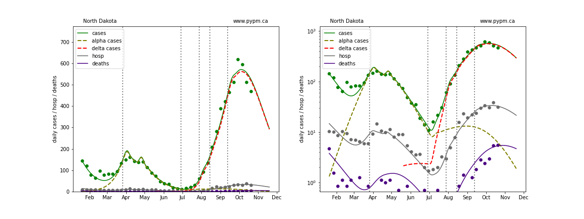
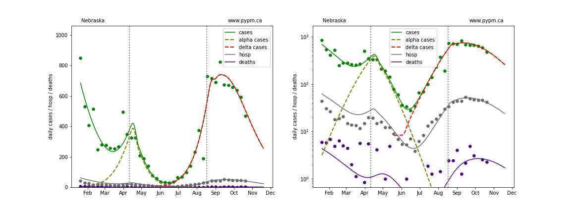
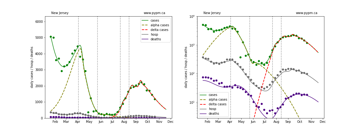
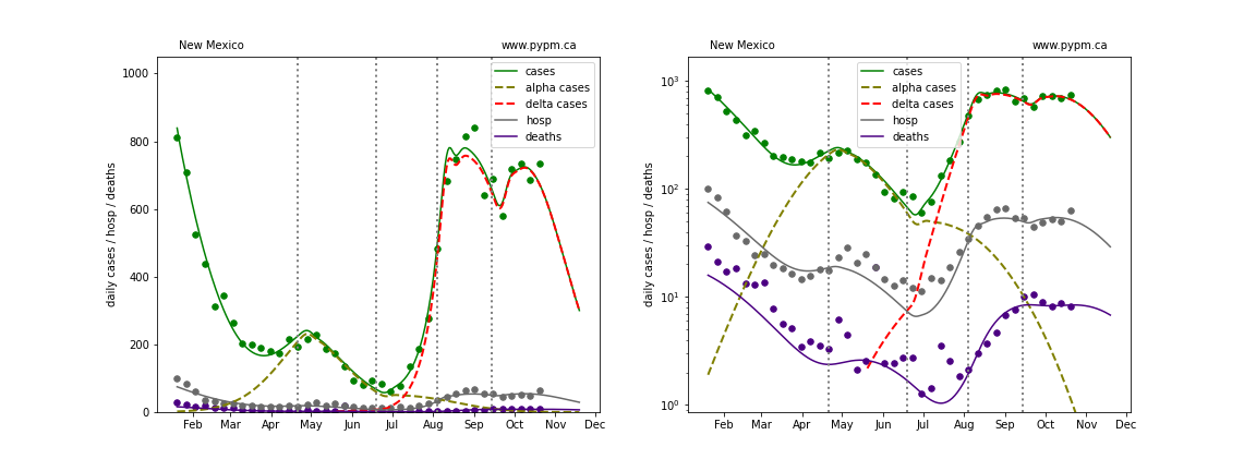
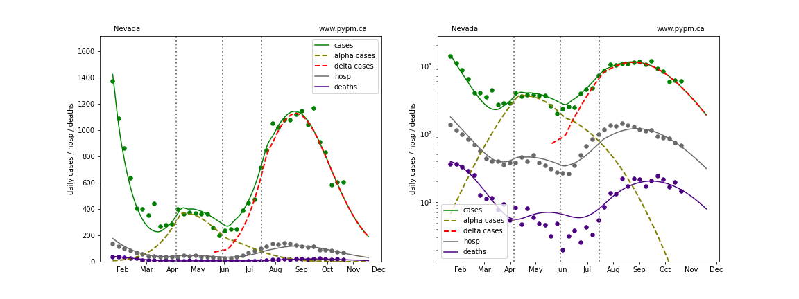
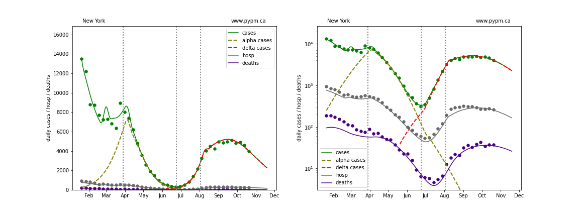
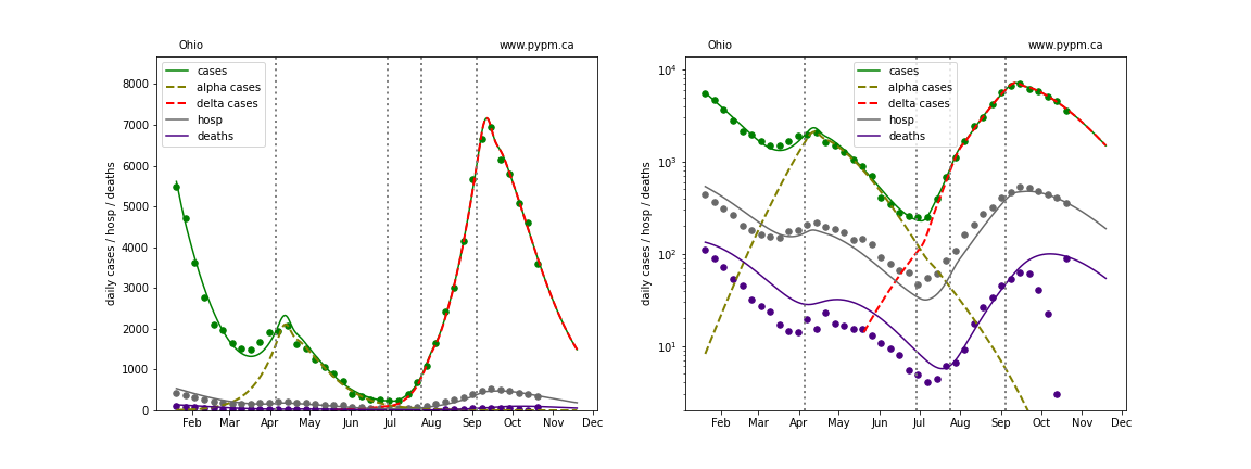
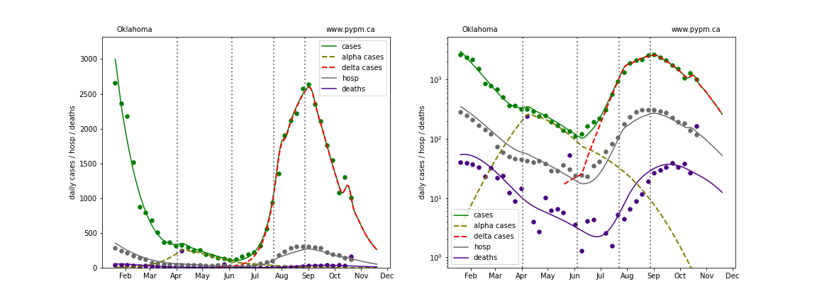
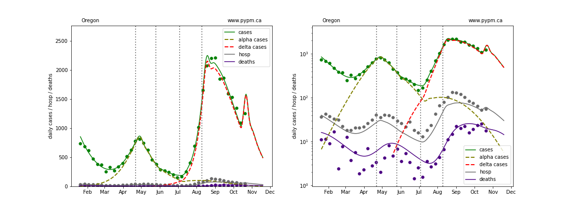
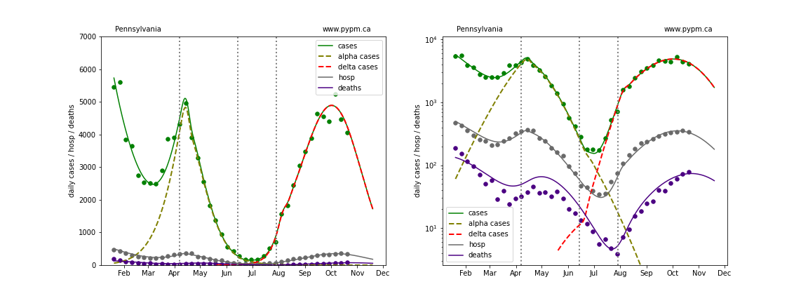
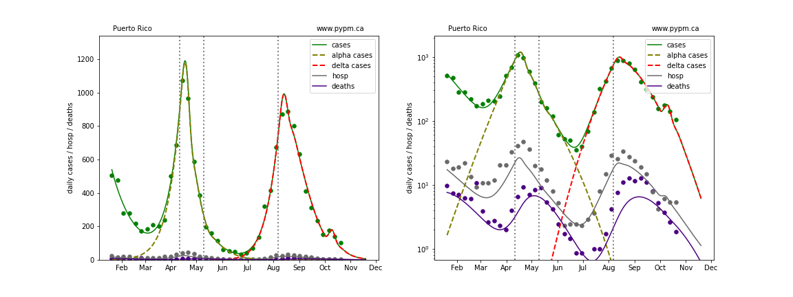
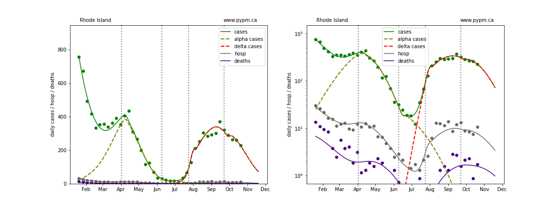
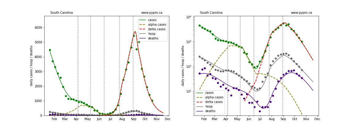
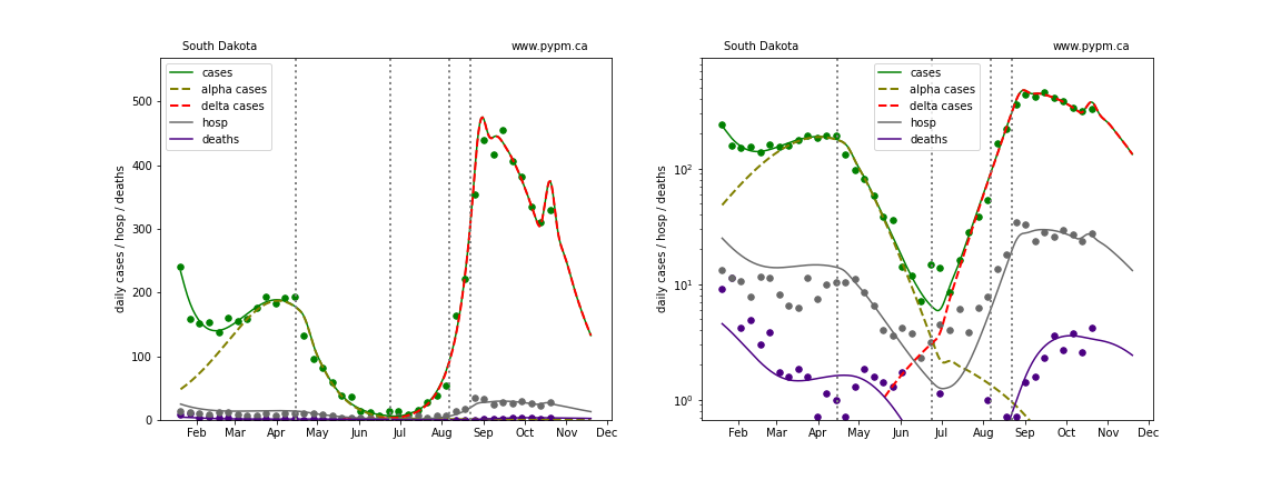
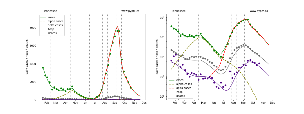
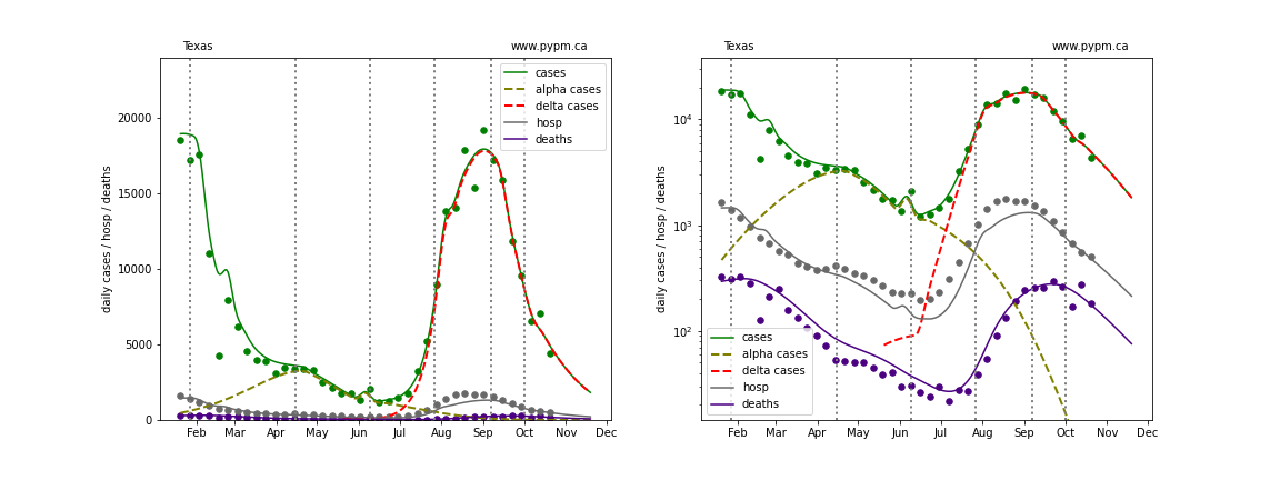
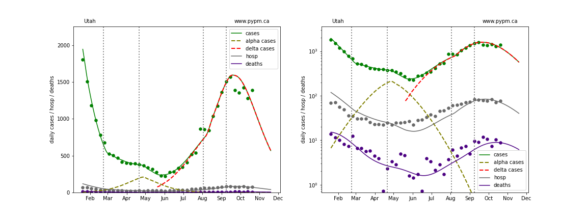
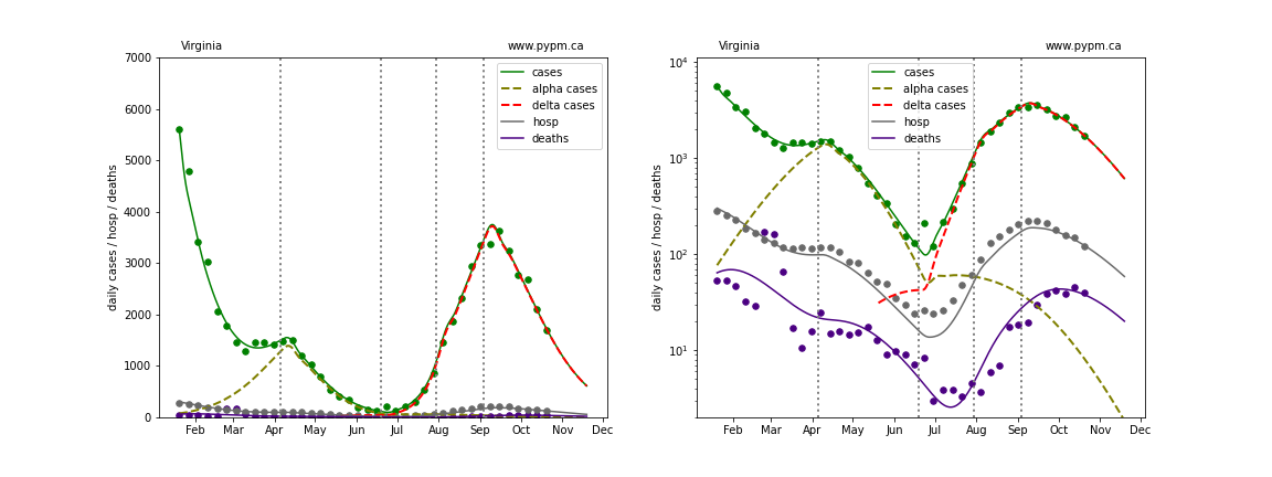
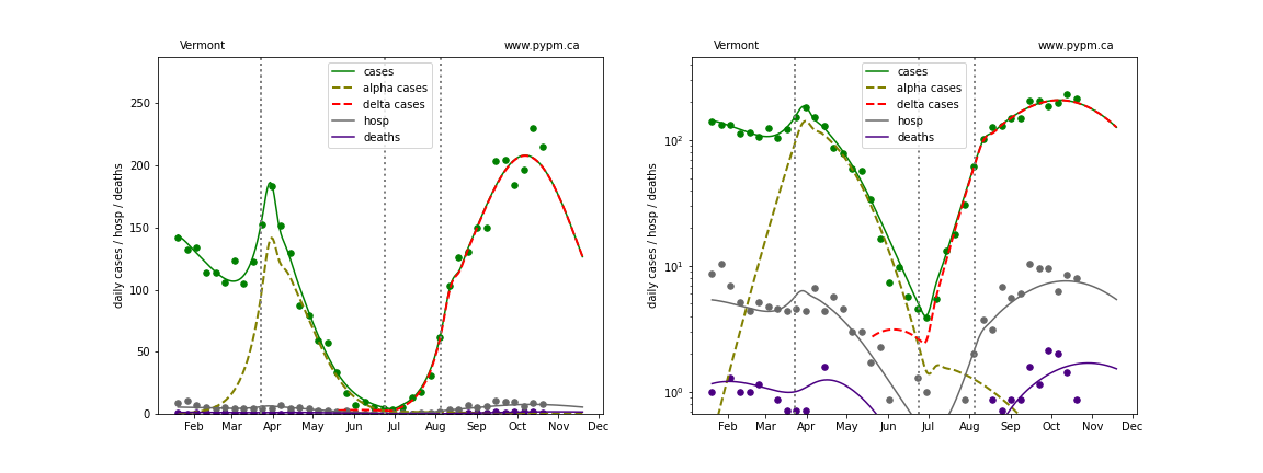
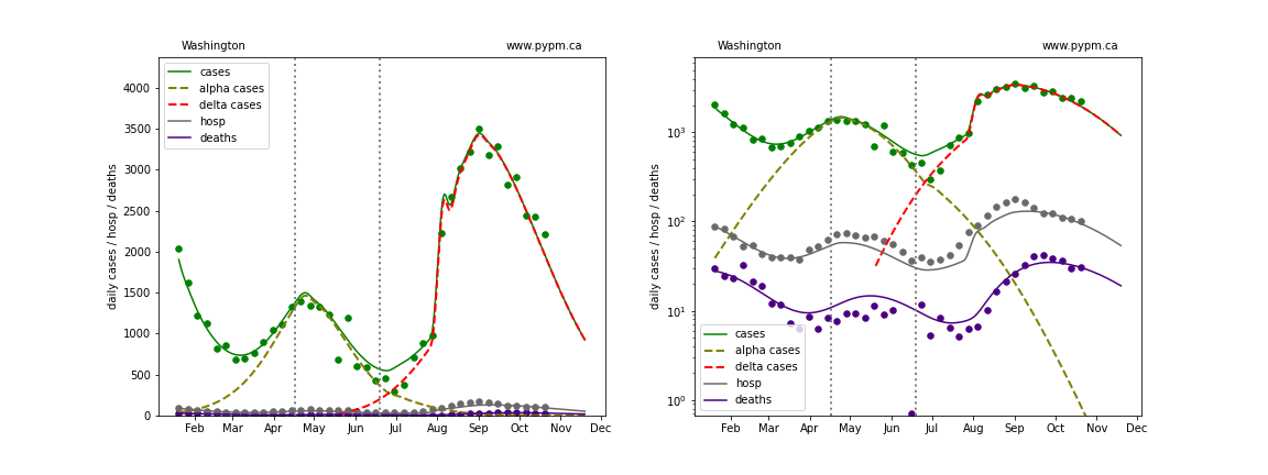
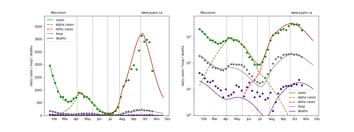
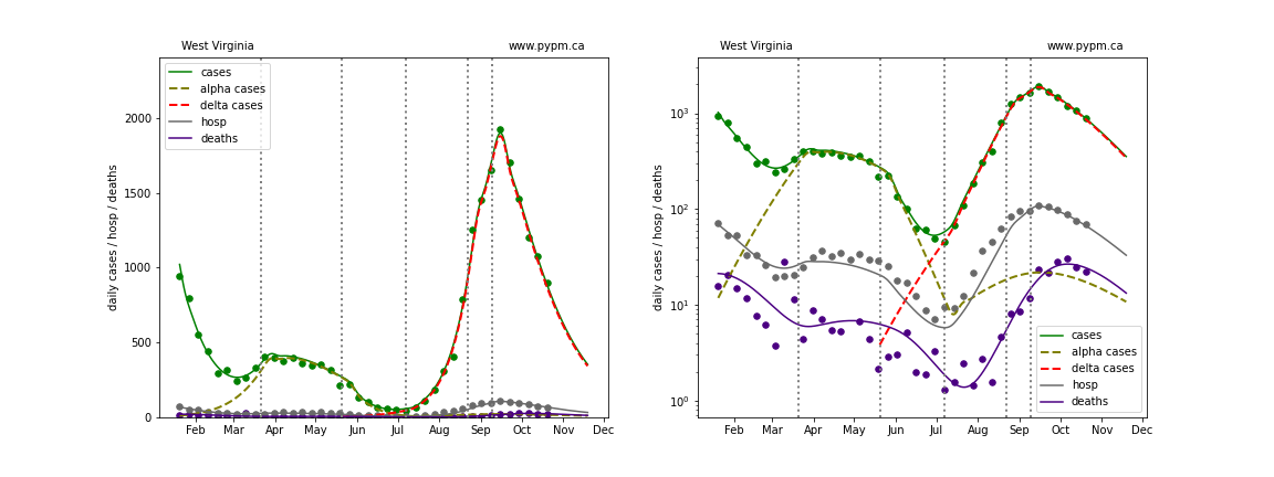
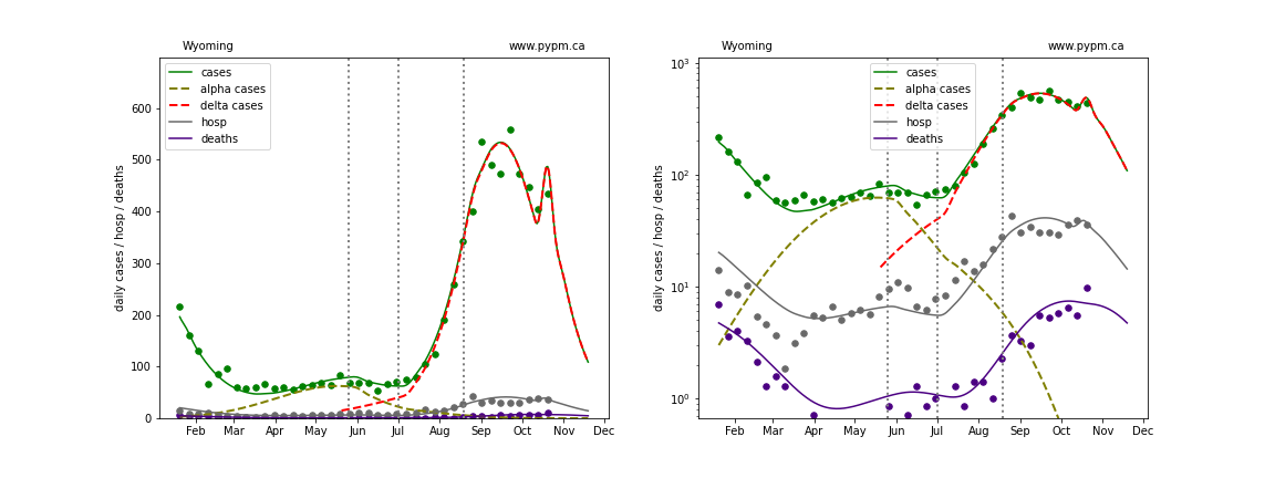
The plots below show the case / hospitalization / deaths data for all 50 states, DC, and PR. The data fits were done using data up until October 23, 2021.
An infection model is setup for each state, calibrated using the case data from that state. Given the time history of infections, projections for hospitalization and death are calculated and shown as curves in the plots below. The degree that hospitalization and death data following the model projections, indicates the ability of this approach to forecast future hospitalization and death.
The green points are the daily cases, the grey points the daily hospitalizations, and indigo points are the daily deaths (each averaged over a week). The case data are used to define the periods for which transmission rate appears to be constant. The vertical lines show where the transmission rate is changed. If the susceptibe fraction is constant (immunity not changing quickly), constant transmission rates lead to steady exponential growth or decline during, which appear as straight lines on these log-scale plots. With immunity growing, these lines are no longer straight - bending downwards due to the herd effect. The curves are the model expectations for cases, hospitalizations, and deaths, and all three are determined from the case data.
The dashed curves separately show the reported cases from the original strains and from variants of concern, divided into two types B.1.1.7 (alpha) and B.1.617.2 (delta).
At the bottom of this page, plots showing the combined forecast for the US are shown.
Alaska
Alabama
Arkansas
Arizona
California
Colorado
Connecticut
District Of Columbia
Delaware
Florida
Georgia
Hawaii
Iowa
Idaho
Illinois
Indiana
Kansas
Kentucky
Louisiana
Massachusetts
Maryland
Maine
Michigan
Minnesota
Missouri
Mississippi
Montana
North Carolina
North Dakota
Nebraska
New Hampshire

New Jersey
New Mexico
Nevada
New York
Ohio
Oklahoma
Oregon
Pennsylvania
Puerto Rico
Rhode Island
South Carolina
South Dakota
Tennessee
Texas
Utah
Virginia
Vermont
Washington
Wisconsin
West Virginia
Wyoming
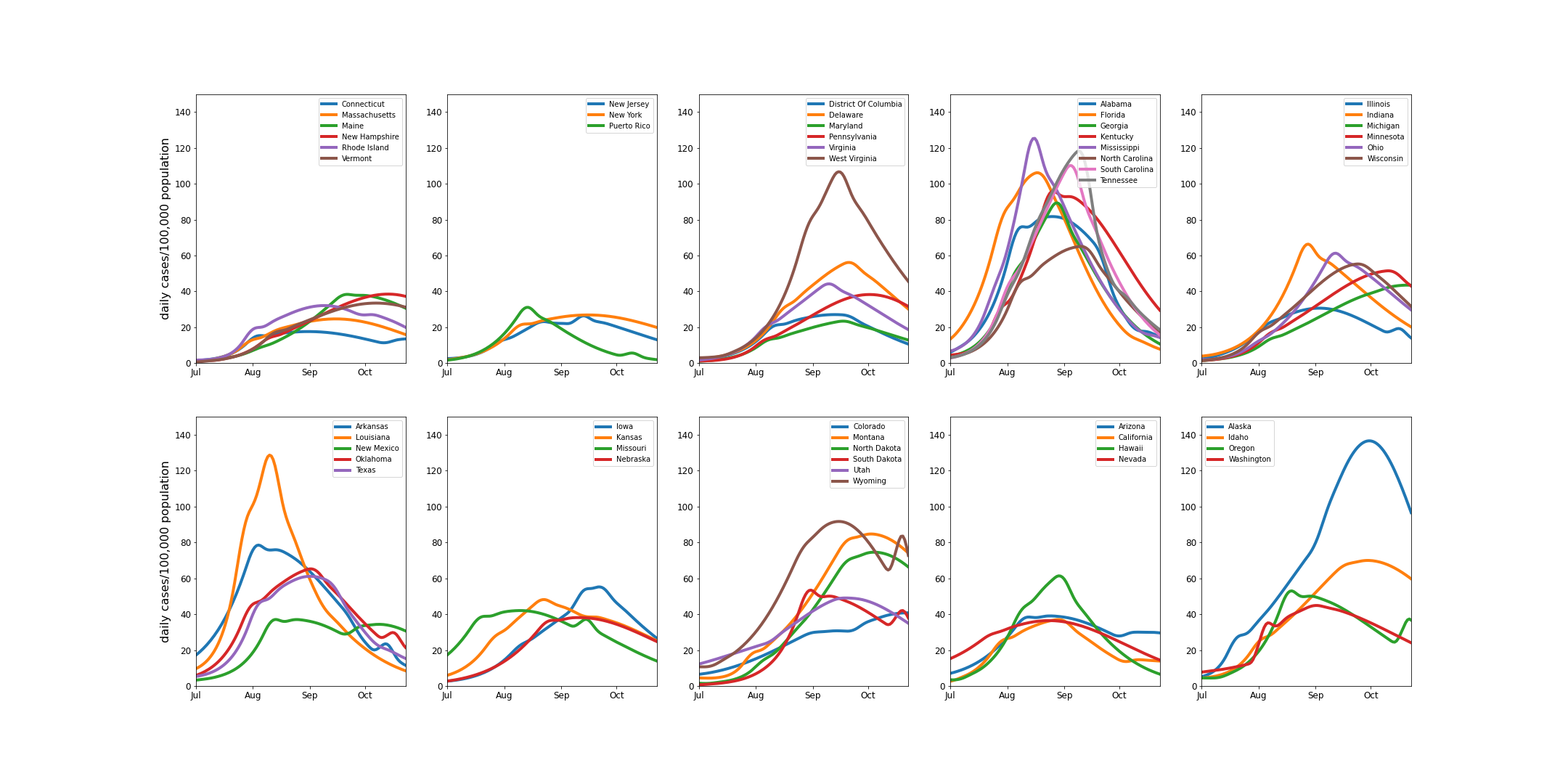
Comparing prevalence between states
The following plots show the daily cases per 100,000 people in each state, grouped according to the 10 standard federal regions.
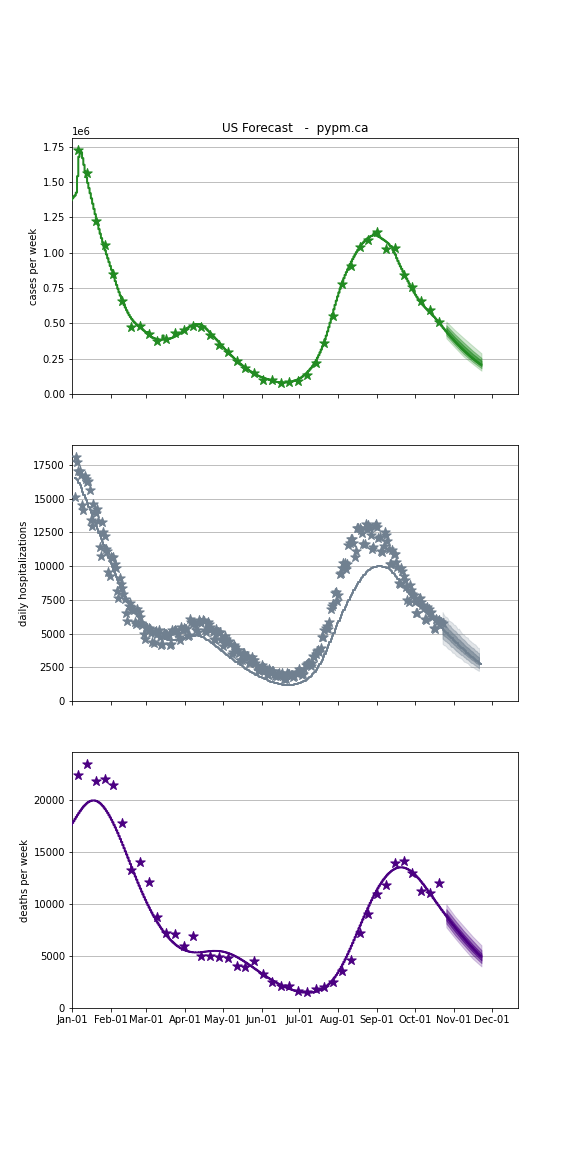
USA Forecast
The following plots show the combined US 4 week forecast. The shaded areas are 50%, 80%, and 95% intervals. Overall, case rates, hospitalizations, and deaths are forecast to continue to decline.
USA