October 4, 2021 Analysis of Canadian provincial data
This summarizes analyses of data from the Canadian provinces with substantial cases. The model includes additional infection cycles to represent the alpha and delta variants of concern. Past vaccination rates are included in the models.
Current fits to data
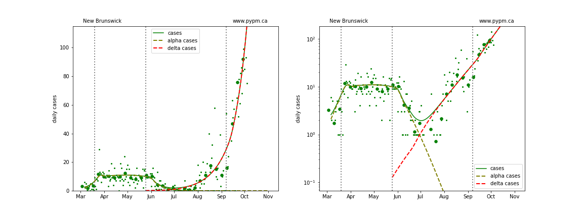
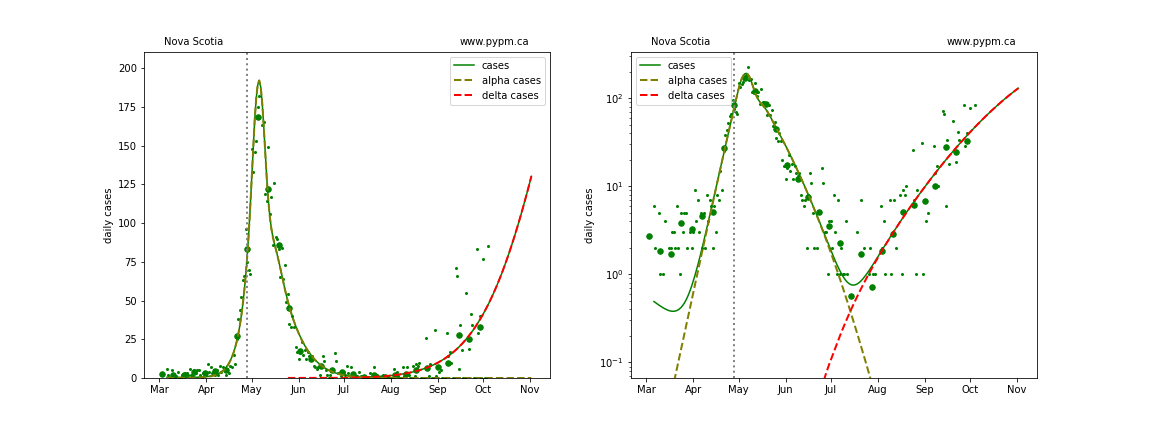
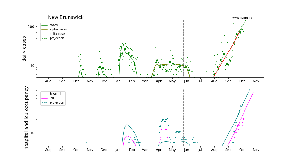
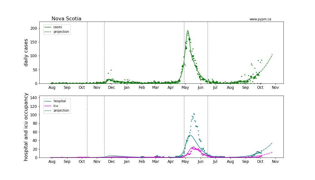
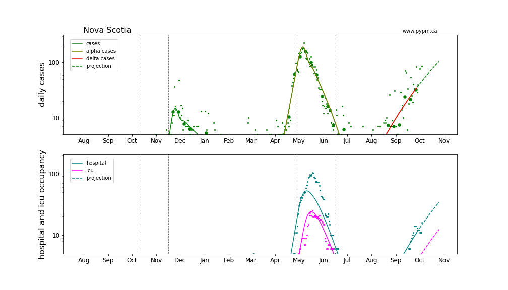
The delta variant produced rapid growth in most provinces, at a rate of 5% or more per day. That growth rate has subsided in the large provinces, due in part additional health measures. New Brunswick and Nova Scotia are now experiencing rapid growth.
European nations have experienced similar transitions to rapid growth due to delta and most have been able to reduce or turn the growth around. The rapid growth was also seen in all US states, and the growth continued for a long period of time, before recently subsiding. Model fits to EU and US states can be found here.
Generally cases are used to define the infection model, since they have the highest statistics and are widely available. Starting August 2021, it appears that testing policy has significantly affected the fraction of infections that are reported as cases. The study establishing that connection is shown below. For Alberta, after August 1 2021, daily hospital admission data is used in place of cases.
Updated model fits to provincial data are shown below on linear and log-scale:
BC
Detailed BC analyses are reported in the BC analysis page.
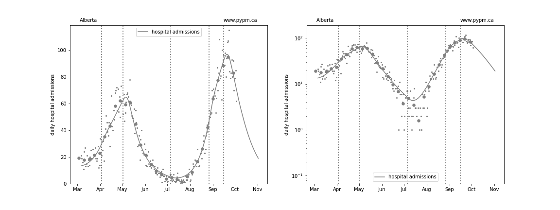
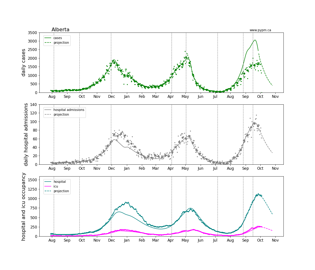
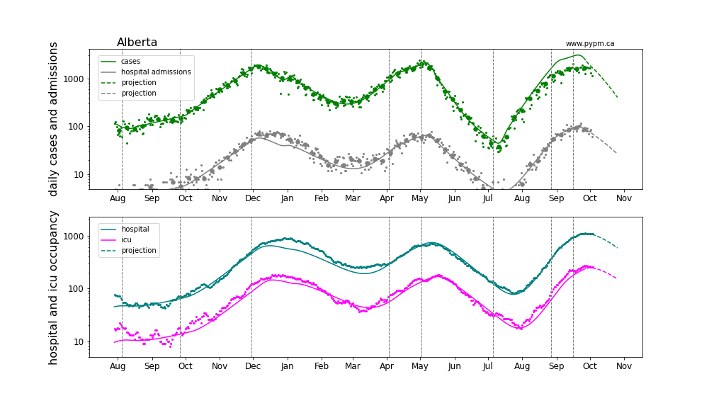
Alberta
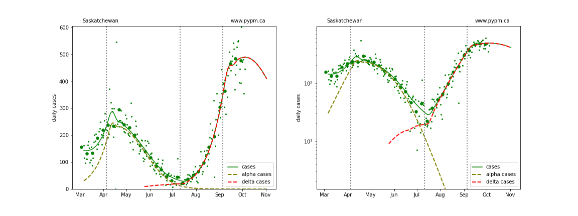
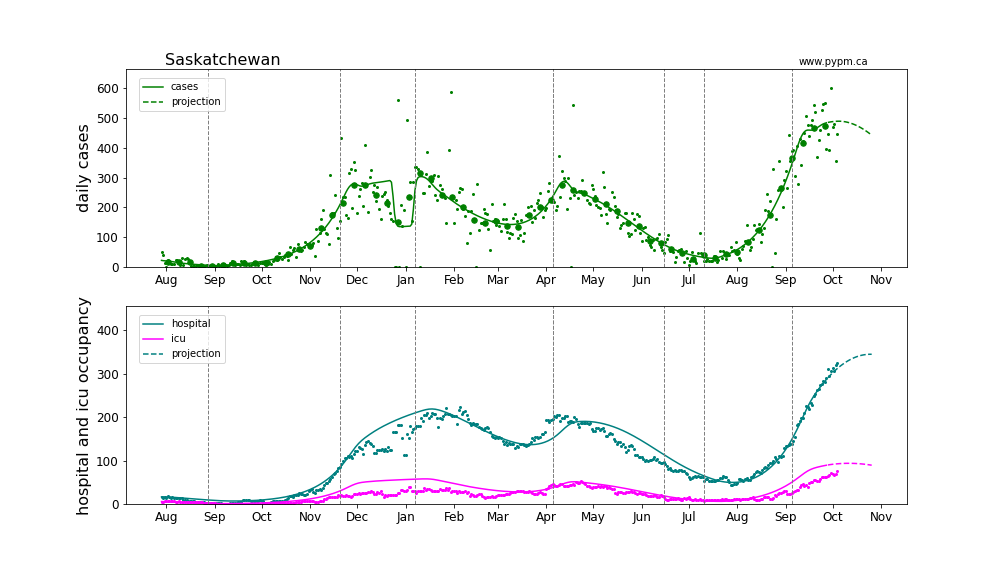
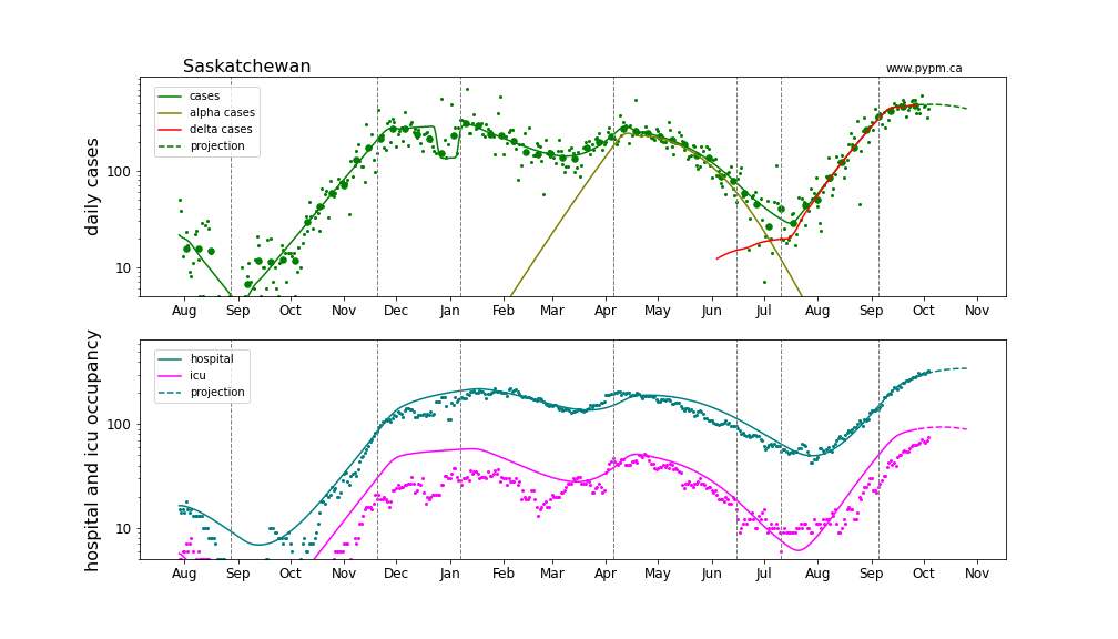
Saskatchewan
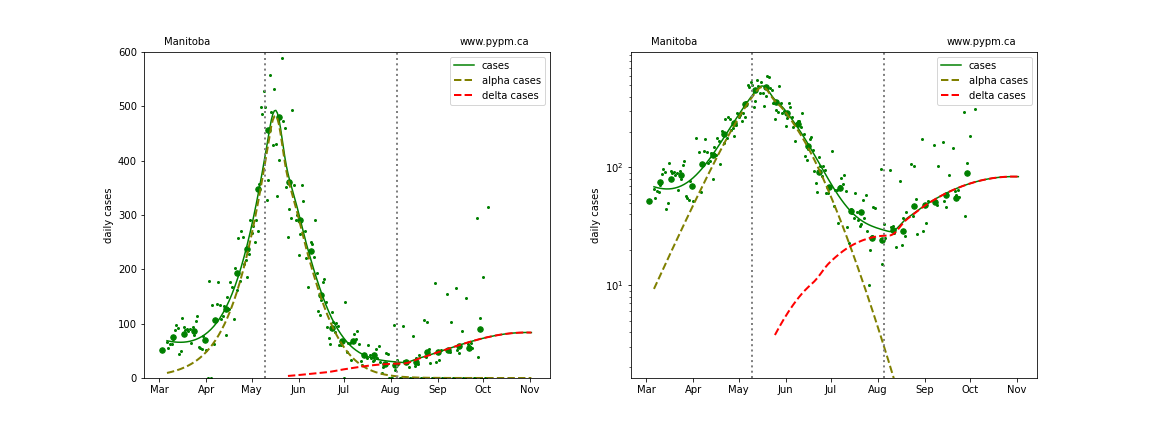
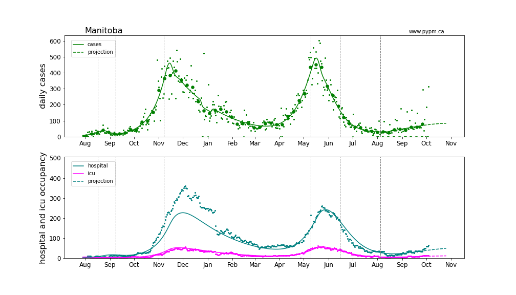
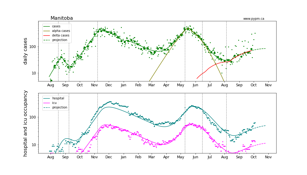
Manitoba
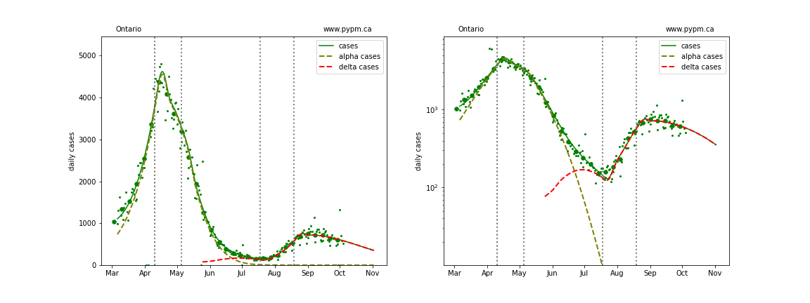
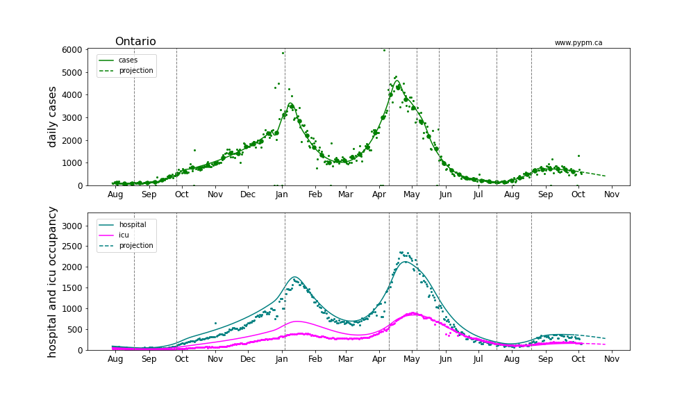
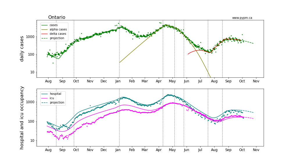
Ontario
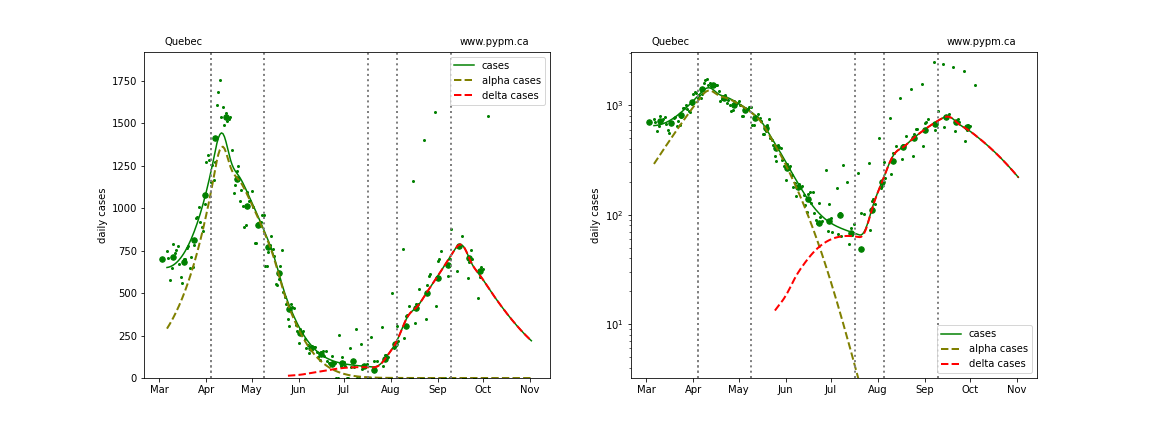
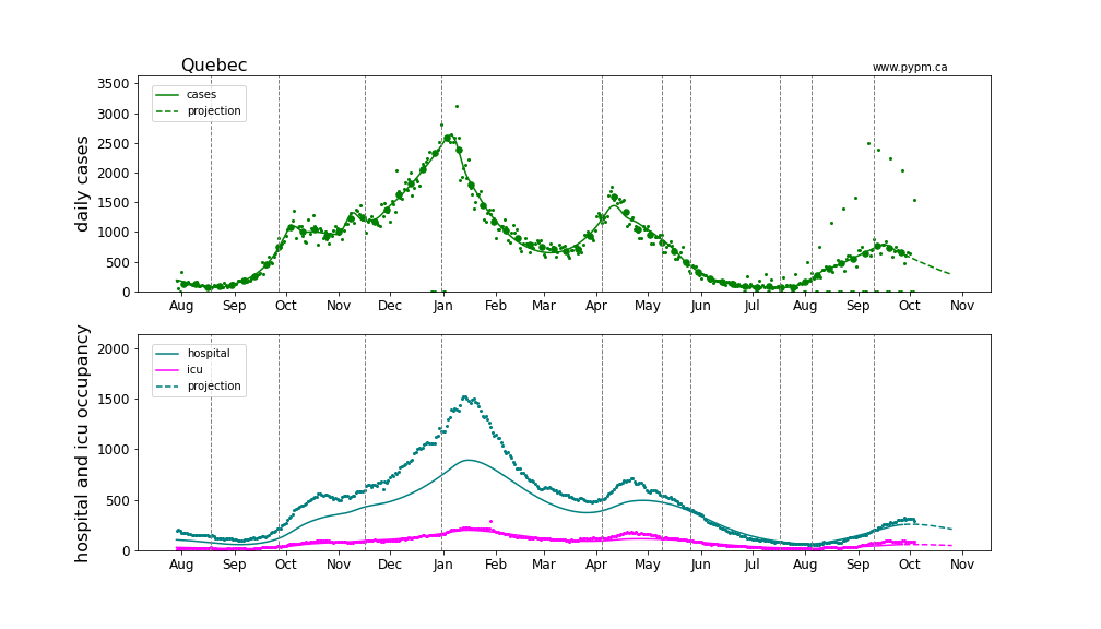
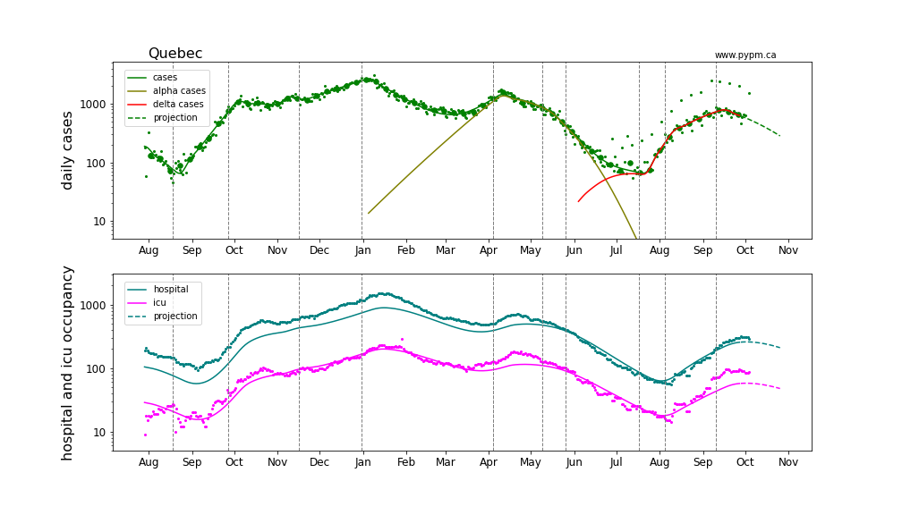
Quebec
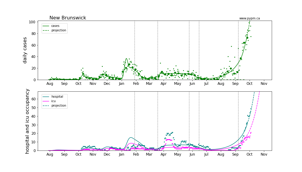
New Brunswick
Nova Scotia
Current growth rate
The table below indicates the growth rates (% per day) for each province for recent analyses
| Rpovince | Aug 30 | Sep 7 | Sep 13 | Sep 21 | Sep 28 | Oct 4 |
|---|---|---|---|---|---|---|
| BC | +2% | +1% | +1% | 0% | -1% | -1% |
| Alberta | +6% | +4% | +2% | +2% | +1% | -7 +/- 3% |
| Saskatchewan | +5% | +5% | +4% | +2% | +1% | 0% |
| Manitoba | - | - | +2% | +1% | +1% | +1% |
| Ontario | +4% | +3% | +1% | 0% | -1% | -1% |
| Quebec | +4% | +4% | +2% | +1% | +1% | -2% |
| New Brunswick | - | - | - | - | +5% | +5% |
| Nova Scotia | - | - | - | - | +5% | +4% |
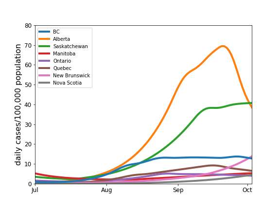
The plot below compares the daily cases as a proportion of population, indicating the serious situations in Alberta and Saskatchewan. The Alberta calculation uses hospital admissions, and the curve corresponds to the expected number of cases had testing not be changed in Alberta in August 2021.
Provincial histories and projections with hospital occupancy
Linear and log scale are shown to see details. Generally, hospitalization is rising in accord with the model projection that assumes the fraction of cases that lead to hospitalization is constant throughout the year. The hospitalization projections for the Atlantic provinces are hampered by low statistics.
Alberta
The Alberta analysis uses hospital admission data to estimate the growth of infections after August 1, 2021. The case projection exceeds the number of observed cases, with the difference being cases that were missed in Alberta due to changes in testing policy.
Saskatchewan
Manitoba
Ontario
Quebec
New Brunswick
Nova Scotia
Testing rates in Alberta by zone
As shown above, hospitalization in Alberta for the 4th wave exceeds the projection that is based on case data and on hospitalization during the 3rd wave. One possibility is that testing is identifying a diminishing fraction of infections during the 4th wave.
During a period of stable testing policies, the number of tests performed each week is a combination of a baseline number (not depending on the current infection levels) and a number that increases with infection levels. There is a multiplying effect in the latter because not only do symptomatic individuals seek tests, but when a test is positive, that leads to tests being performed on close contacts.
In other words, the expected number of tests each week (Nt) can be approximated by a simple function of the number of cases that week (Nc): Nt = a Nc + b N, where “a” is a constant (multiplier), N is the population, and “b” is the fraction of people who seek a test in a week (for reasons unrelated to an actual infection).
The figure below shows the weekly tests and cases in Alberta and its five zones for each week in 2021. The data from the third wave (period shaded in red) are used to estimate the coefficients, “a” and “b”. The blue curve shows the expected number of tests given these estimated coefficients and the cases each week. The simple model agrees well with the weekly number of tests during the third wave. It appears that in the fourth wave, however, that fewer tests are being performed than expected for North, Central, and South zones (using the 3rd wave as a reference). Many of the recent hospital admissions are patients from those zones. It is possible that reduced testing in these zones is partly responsible for the hospitalization projections to be lower than the observed hospitalizations.
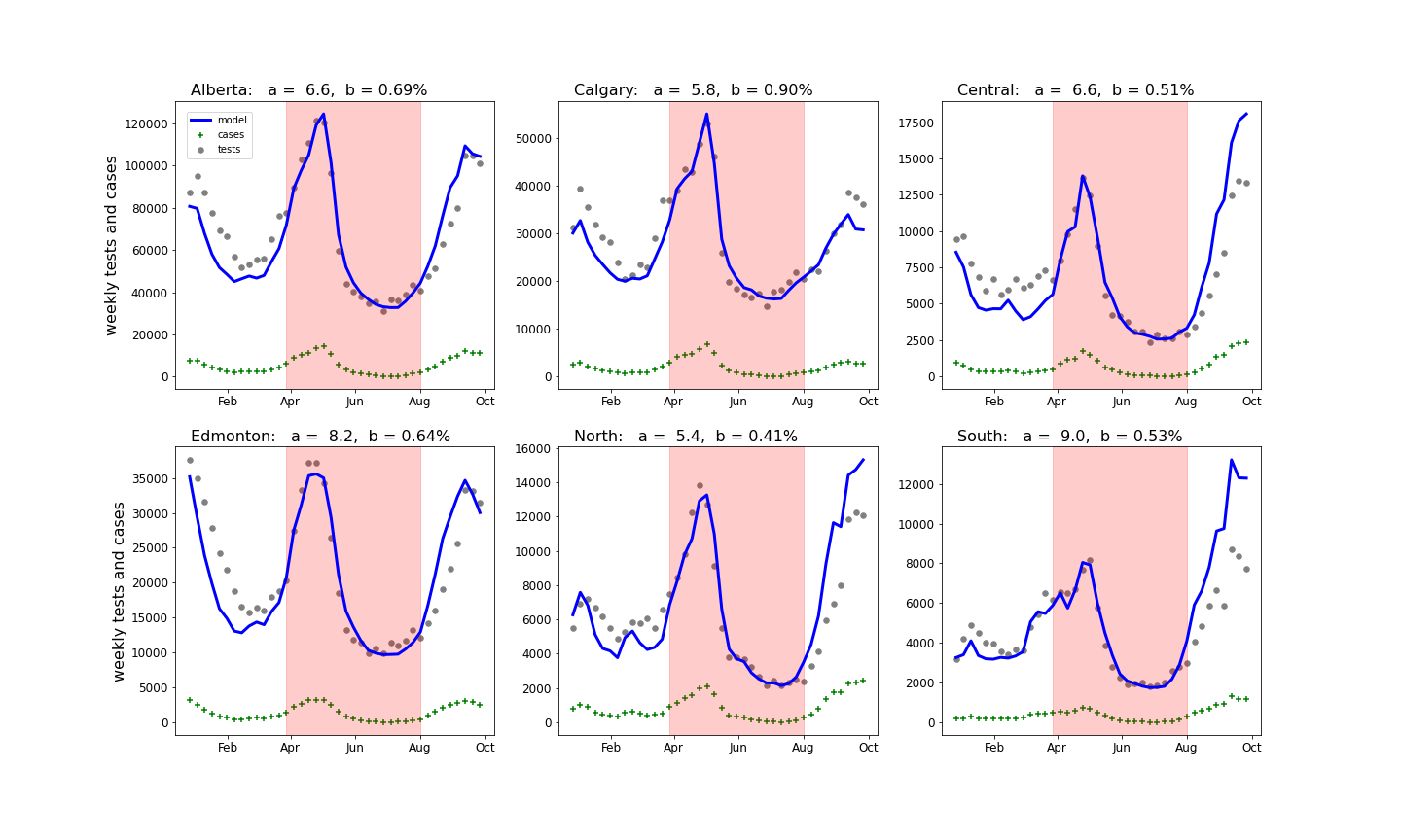
The estimated coefficients are shown in the headings in the plots above.
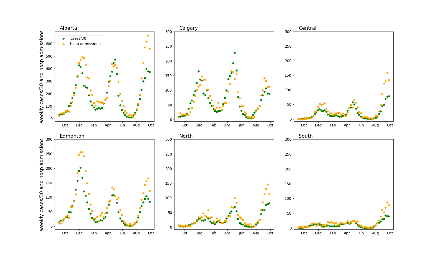
Hospital admission rates in Alberta by zone
The figure below compares the weekly hospital admissions to weekly cases for Alberta and each zone. Unlike hospital occupancy, the admission data does not have a significant lag compared to cases, so there is no need to apply a time offset: to compare, cases are scaled down by a factor of 30.
The rural zones are contributing a significant number of hospital admissions on both a per-capita basis and on an absolute basis. The ratio of admissions to cases is significantly larger in all regions for the 4th wave, except Calgary. The study on testing rates (see above) suggest diminished testing for the 4th wave except in Calgary, so lower testing rates could be a contributing factor in understanding the larger than expected hospital load given the number of cases in the fourth wave.
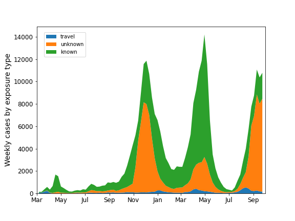
Unknown exposures
The figure below shows the breakdown of cases according to exposure: known, unknown, and travel. The large increase in cases from unknown exposures may be the result of reduced contact tracing in the province.